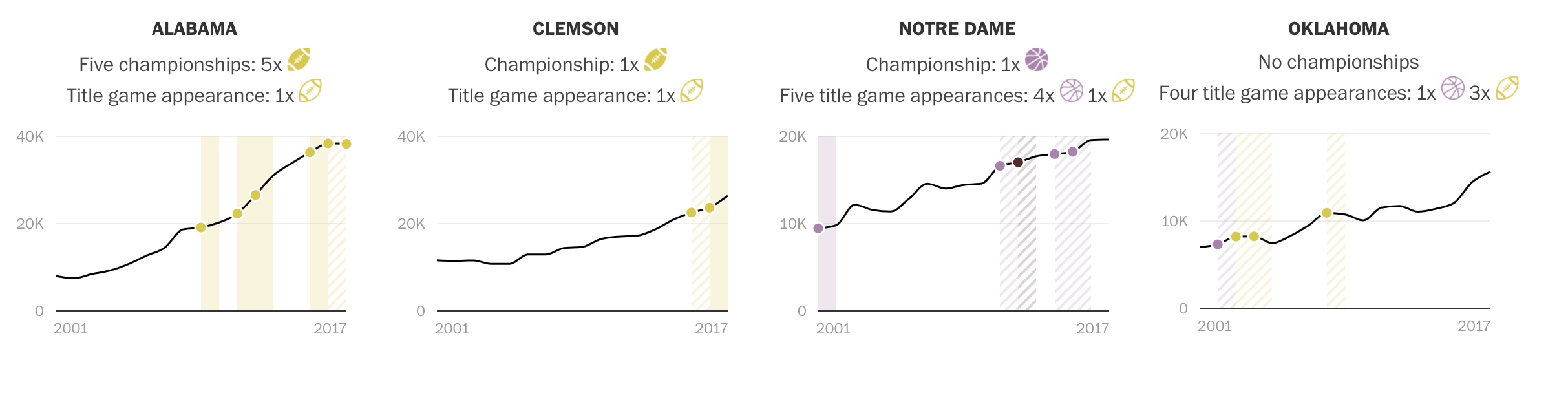
Benchmarking
There are a few kinds of bench marks used when comparing data. Internal is when a company may use information from past years and all within the companies data to compare to itself. Then their external bench marks that look at other sources for data and compare it to their own. What is a bench mark? A bench marks is basically an average score of data and seeing what sources have hit that average and what hasn’t. Like you can see below.
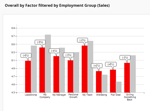
The gray bars are the average while the red is how that company actually did. This is a clear view of what could have been projected for the company and let viewers see if the company did good or bad that year.
Benchmark Graph Data Comparisons
Benchmark graphs are a great data visual to allow companies to compare their own performance with their competitors or even their own set goals to reference points to improve new insides and improve their processes.
Investment Comparison
In this benchmark graph shows the data between US(Ford, General Motors) and Japanese(Toyota and Honda) and their manufacturing production rates of vehicles within Canada. This chart’s main focus is to show the increased production within Japanese that evaluates the growing performance, sales, and attention their vehicles have been in Canada. In showing this data they want to make an attempt in increasing the amount of investments Canada should make compared to the amount they make for the US.
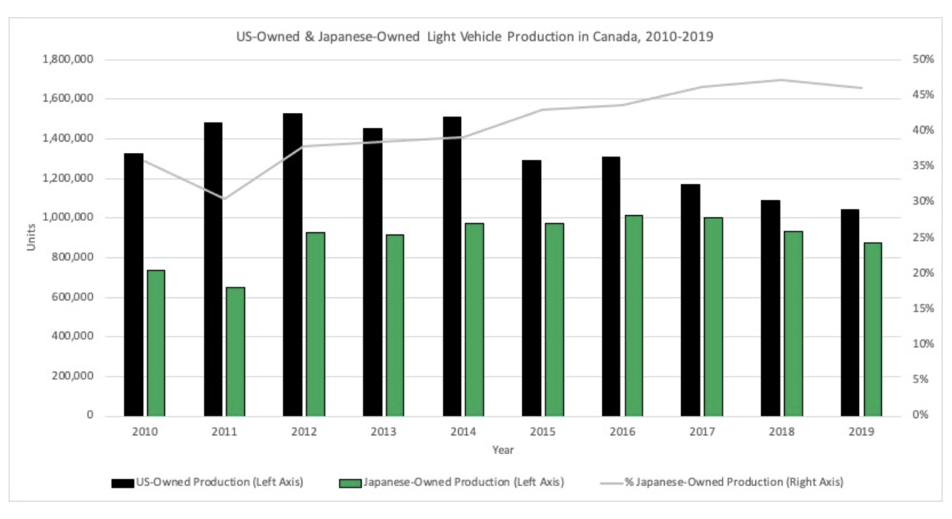
The graph shows an effective comparison between the two countries and their production rates. I like how they used a span of almost 10 years which shows the increasing rate Japan has developed compared to the US who has ben decreasing. I also like how the also included their percentage of owned products within Canada that is combined with all manufactures which is also larger than that compared to the US and is increasing through the years. This shows that they have a positive and effective rate of change in their products and are very popular in Canada.
Video Streaming Data Comparison
In this graph represents the total, revenue, gross profit and net income with Netflix they have been increasing in all categories with the last 3 years. This graph is used to show in the article that even though many competitors are coming up with unique and reliable resources for popular video streaming apps they can still be on top and have a high popularity rate of users and are still continuing to rise to the top
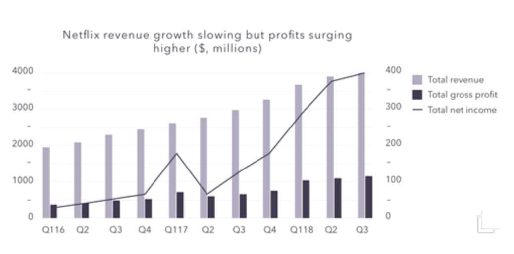
I like how they break down each category and make it simple to comprehend using labels on each side because the amounts between revenue and gross profit are large in comparison and would be hard to comprehend if only one y axis. I also like how they use the years but also break down each section into the quarters where their finances are calculated to show a precise estimate of the money they have made. This chart shows a great representation of how well Netflix has done in a small span of time and they are still continue to increase their sales.
Benchmarks
Benchmarks are used very often in the world we live in. One company, Wall Street Journal, uses benchmarks in more of a business fashion. I went to their market data section of their website and found a graph where you could input different options. Some of these options were gold futures, crude oil futures, yen, S&P 500, etc. All of these were line charts with a solid benchmark line in different locations. I noticed that the New York Times was very similar with how they used graphs and displayed benchmarks. Overall, benchmarks are a great way to enhance a graph or visualization.
The Washington Post and Data Visualizations
Many different sites use certain things to differentiate between their data. An example I chose is from an article written by Brittany Renee Mayes and Emily Giambalvo.
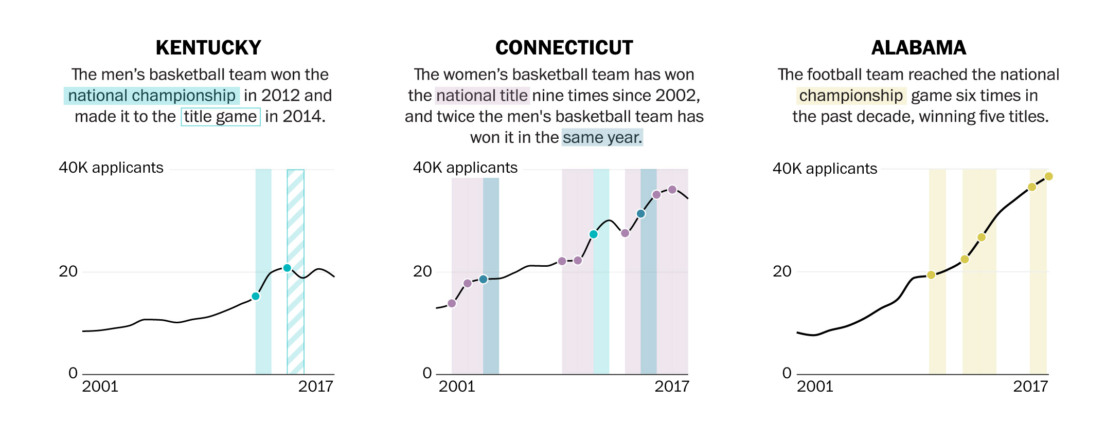
In the illustrations above, you can see the author use colors and solid or gridded squares to compare their data. They even go as far as to highlight the category within the text with the corresponding color on the graph.
In this visualizations, you can see they use symbols, such as the highlighted and unhighlighted football, to compare their data.
Data Comparisons- Climate
As the winter months are quickly approaching climate change begins to appear more in many environmental spaces. The projection of the weather this season will be interesting to hear about, as each year the changes are becoming more and more drastic. Not only are the winter months getting colder, but the summer months are only getting hotter. CNN’s, Jen Christensen, wrote the article “With climate change what will your city’s climate feel like in 60 years?”.

The data in the image uses segments to connect the cities in which NYC will feel like in the future. This helps the audience understand how climate is changing by comparing climate of other places. If the author simply wrote that NYC would be 10 degrees hotter in 2080, that may be frightening. When it is compared to a city that already exists and people live in it brings it down to a simple, easily understood level. The images use simple, bold colored line segments to show a clear connection, and dotted lines of the same color to explain the data with a caption.


Podcast: Play in new window | Download
Differences between Charts.

Here above is an example of a line graph from the NewYorkTimes that I found. I will also post another example of a similar but different visual ofthis same graph.
Here is the same type of graph but with a target line in it to show what the average or should be line for the data.
It’s very interesting to see how many ways data can be graphed into these types of graphs/charts. The same type of graph can produce so many different visuals and data representations that it is unreal! Thank you for checking out my blog on this.
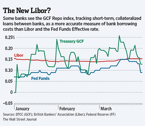
Benchmark
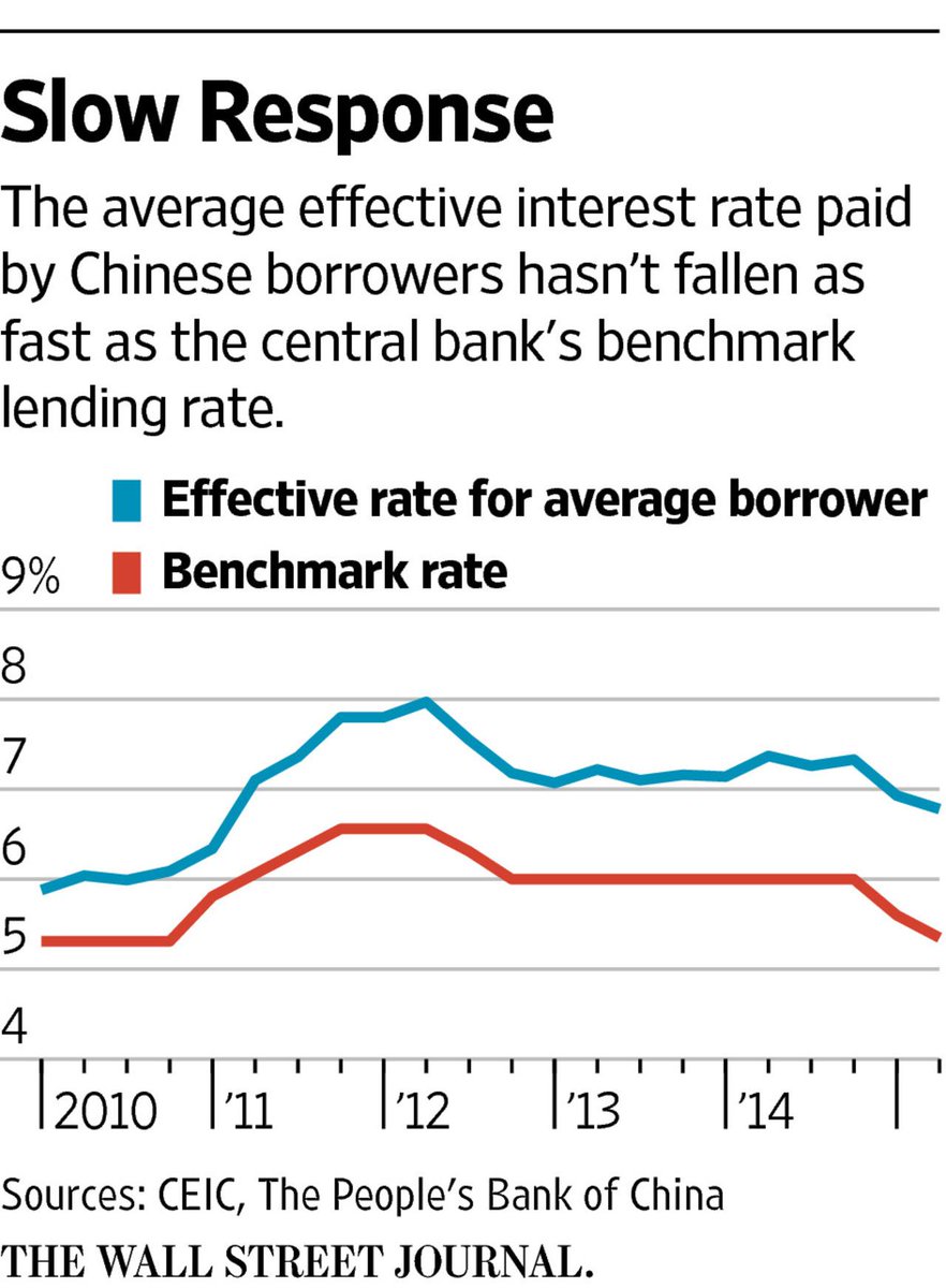
This is a graph from the wall street journal showing the effective rate vs the benchmark rate. We can clearly see that the effective rate is not meeting the benchmark rate.

I also feel like this is another good example because it shows the benchmark as the x axis
Visual Benchmark Comparisons
Benchmark comparisons are some of the most important visualizations used in everyday applications. Some of these applications include business sales performance, educational performance, and investment analyses. Regardless of the situation, all benchmarks are used to show a comparison that allows the viewer to make a conclusion such as under or over performing.
Investing Applications
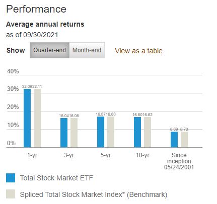
One real world example of a benchmark comparison is in investment analyses or stock performance graphs. As available from Vanguard.com, they have a performance graph that compares the average annual returns of their Total Stock Market ETF (VTI) with a benchmark Spliced Total Stock Market Index across multiple chunks of time. In this case, they used a bar graph to visualize the difference where the data of interest is highlighted in a vibrant blue color and the benchmark is in a less distracting grey shade.
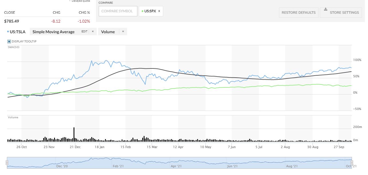
Another investment application is in the performance comparison graph between Tesla (TSLA) and the S&P 500 (SPX) from MarketWatch.com This graph is more complicated but it has a greater difference between the two that gives the viewer a better visualization of which one had a greater performance.
In this case, MarketWatch outlines Tesla’s stock price performance in blue while the price performance of the S&P 500 is in a vibrant green color. As seen in the graph, Tesla clearly outperformed the S&P 500 by a wide margin in the past year but it was much more volatile throughout the year.
Other Applications
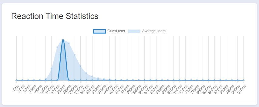
Another application of benchmark comparisons is with performance of bodily functions such as reaction time. There are various websites that have reaction time tests and will provide statistics based on a user’s results. The website I used is HumanBenchmark.com where I scored an average reaction time of 203 ms. The graph that is generated shows your score highlighted in a dark blue with the average of all other users in a lighter blue. Based on the graph, my score was almost directly in the middle of the bell curve that seems to be skewed to the right. I can conclude that my reaction time is right around average compared to other users.
Benchmarking Displayed in NYT Article
New York Times Company (The) Net Promoter Score 2021 Benchmarks | Customer.guru
In this article by the New York Times, there is a graph depicted that entitled “Net Promoter Score for Top Brands Compared with New York Times Company. The way that they benchmark is not only with the change in direction in which the data is facing, but there is a dark shaded dot on the graph to put emphasis on the data change.
Visualizing Benchmark
Identifying areas of improvement and understand the performance of the company is also done when showing comparison benchmarks using data visualization. Using comparisons benchmark helps with determining the best possible strategies and take advantage of where to gain competitive advantage.
As discussed on The Data School.com, there are ways to find the best the visualizations for your metrics, and showing comparison effectively. With a bar graph, assisting in determining when revenue is greater than cost or how much revenue differs across months. It is easier to compare with Data Visualizations, than just numbers. Understanding the data is easier after being placed in a visual context.

Which is easier to understand?
1 OR 2
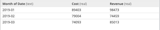
1.
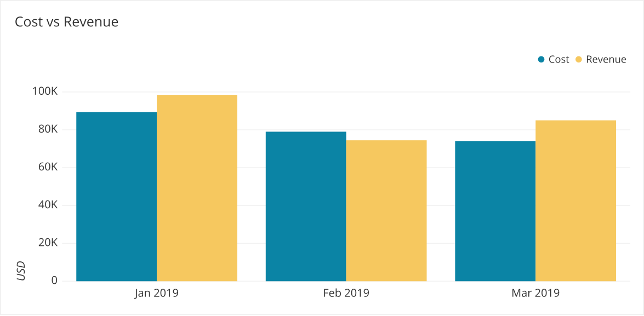
2.
The Data School discusses the best way to visualize your numbers, and how creating these data visualizations for the decision makers to determine future operations is very beneficial for companies. When there are different goals or benchmarks for each category, you can use a combo chart or the many different combinations to represent the information best.
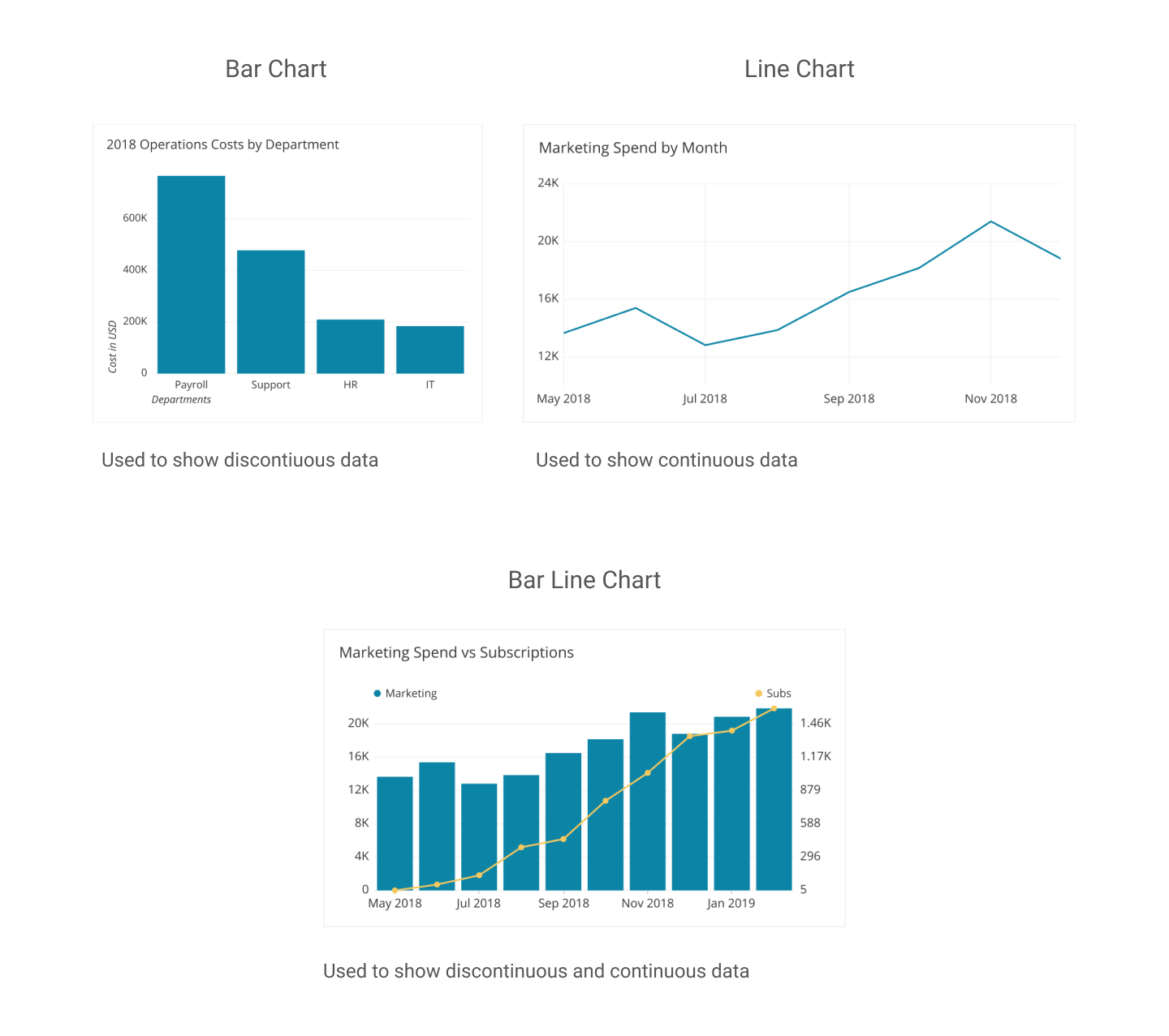
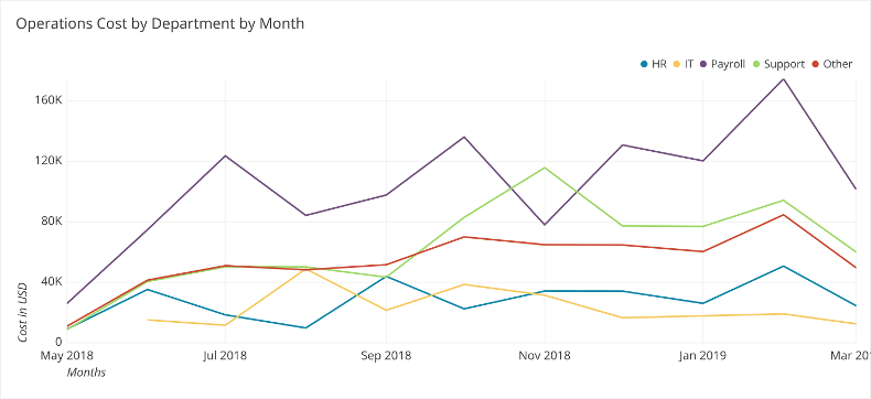
Showing comparison to meet expectations for future, the most direct method for adding comparison on your graph is using a line. This works especially well when all the data share the same comparison point or goal. For example, operation cost by departments in the following data visualization. Including different colors and comparison give the audience a better insight on performance, and this specific charts shows operations costs per month by departments assisting in decisions in future operation costs in multiple departments.
THE DATA SCHOOL : FIND THE BEST VISUALIZATION FOR YOUR METRICS
Recent Comments