Many different sites use certain things to differentiate between their data. An example I chose is from an article written by Brittany Renee Mayes and Emily Giambalvo.
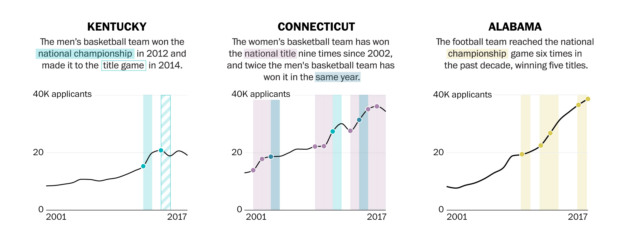
In the illustrations above, you can see the author use colors and solid or gridded squares to compare their data. They even go as far as to highlight the category within the text with the corresponding color on the graph.
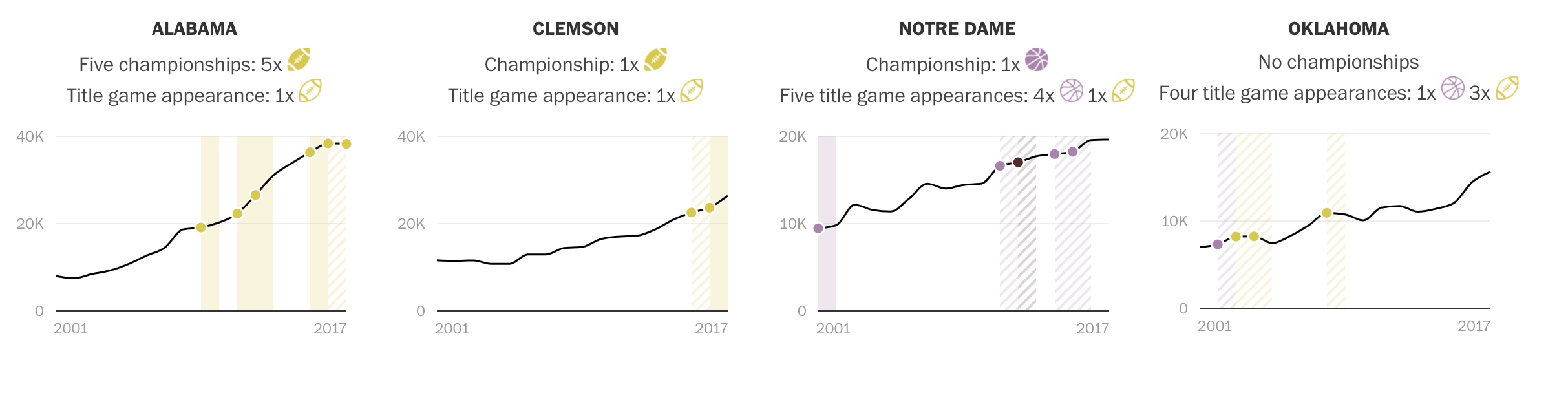
In this visualizations, you can see they use symbols, such as the highlighted and unhighlighted football, to compare their data.
This is a great blog post! I like how you used two different graph selections for college data, this is a great way to tailor a blog to peers. I was wondering what kind of other type of graph would you find appropriate for this specific dataset? One suggestion I have it to just explain what the original article was about just to give a little context. Good job!