There are many different types of charts that can be successful at portraying data. Today we will be looking at a pie chart and what kind of data would work with this kind of chart most successfully.
Pie charts are used when a presenter wants viewers to see the relationship between parts of their data and all of their data as a whole, because as we know pie charts are usually based out of 100% and all of our small slices add to that 100%. Pie charts are especially useful visually, the viewer can clearly compare the small fragments to the large. Like we can see below.
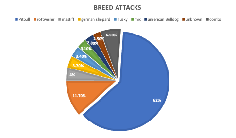
When looking at this pie chart we can see a clear winner on what dog breed is the most aggressive, Pit bulls are taking up more than half the chart at 62% in dog attacks. Then we can still clearly see Rottweilers have the second biggest slice putting them right under pit bulls in attacks. After these two statistic the viewer can further their part to whole understanding by seeing the rest of the data is almost all equal making no clear smallest slice. Data labels play such an important part of pie charts when the slices aren’t enough to convey the data just visually then we can read to find out more information. The data labels above reveal our unknown category is the smallest.
It’s sad but most of these dog breeds are a circumstance to how they were raised compared to their actual breed’s intense behaviors