Home » Benchmark
Category Archives: Benchmark
Benchmark comparisons
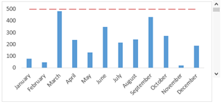
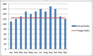
These were the few benchmark graphs that I have found and are slightly different in each graph. The first graph is similar to the last a regular benchmark line but it is dotted instead of solid. This graph is the easiest to understand and visualize it right away because it is simple.
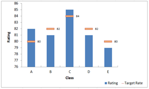
The middle graph has multiple straight lines rather than one just across. The benchmark isn’t the same as the others that’s why they are all individual. There was another like it but the line went up and down it was all connected and was actually more difficult to visualize it.
Benchmarks
Benchmarks are used very often in the world we live in. One company, Wall Street Journal, uses benchmarks in more of a business fashion. I went to their market data section of their website and found a graph where you could input different options. Some of these options were gold futures, crude oil futures, yen, S&P 500, etc. All of these were line charts with a solid benchmark line in different locations. I noticed that the New York Times was very similar with how they used graphs and displayed benchmarks. Overall, benchmarks are a great way to enhance a graph or visualization.
The Washington Post and Data Visualizations
Many different sites use certain things to differentiate between their data. An example I chose is from an article written by Brittany Renee Mayes and Emily Giambalvo.
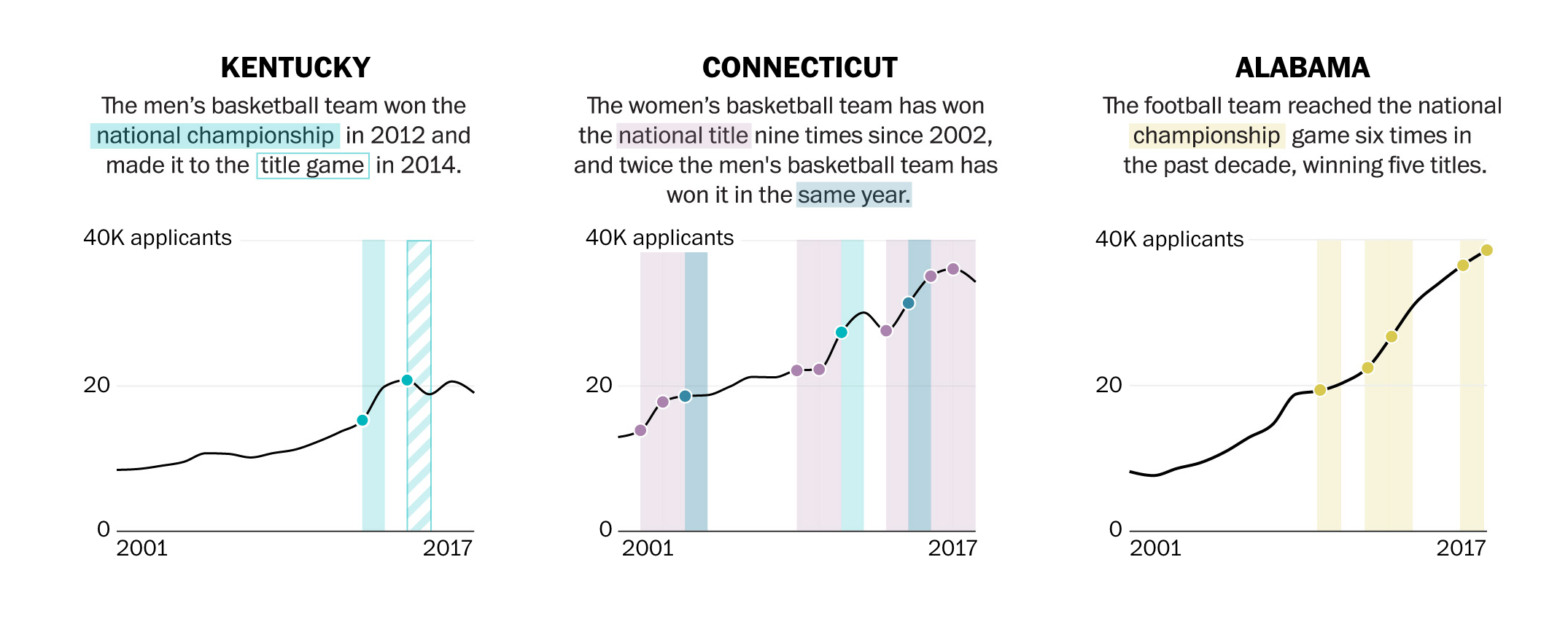
In the illustrations above, you can see the author use colors and solid or gridded squares to compare their data. They even go as far as to highlight the category within the text with the corresponding color on the graph.
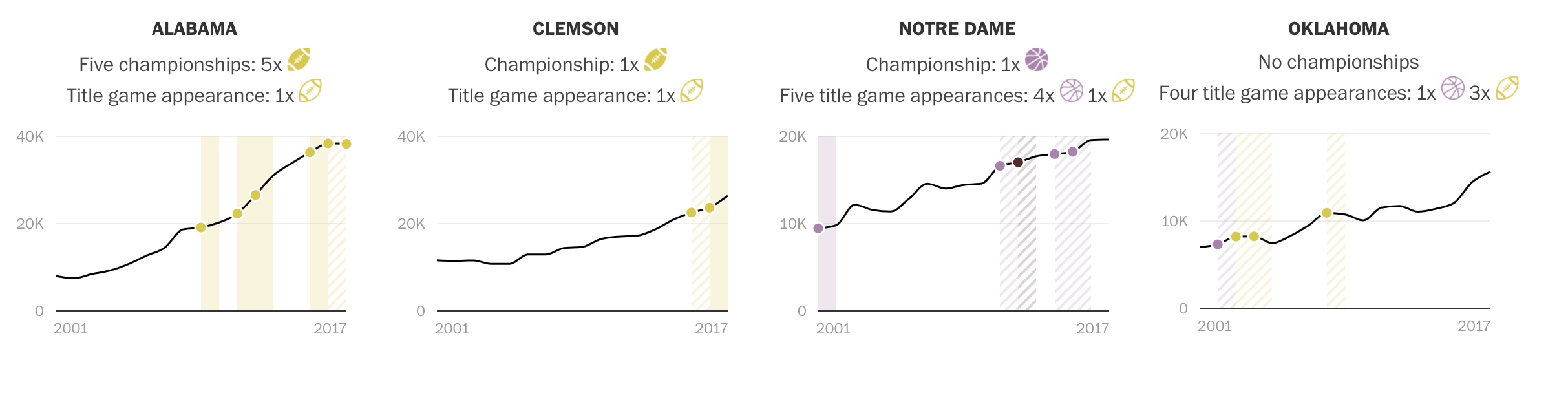
In this visualizations, you can see they use symbols, such as the highlighted and unhighlighted football, to compare their data.
Benchmark Comparison
There are many different ways to make benchmark comparisons in data visualizations, its really all about the creators preference. The most common and easiest from what I’ve seen is using a consistent color for all the data points except for the one that the main focal point of the comparison. This is to ensure that that stands out to the viewers compared to the other data in the visualization. The better a data entry stands out in relation to the rest of the data set makes it easier for the view to distinguish what is trying to be compared a long with the message that is trying to be conveyed to them.
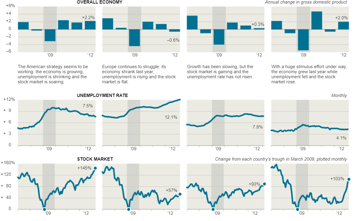
For example, take the visualizations that were displayed in the New York Times article, Three Measures of Central Banks’ Effectiveness. Here they were showing the effects of the financial and economic crisis of 2008 and 2009. In their visualization they placed a light grey highlight around the 2009 column to create a greater contrast to the other bars in the visualizations to let the viewers know this is the year that we are focusing on in relation to the others. This is effective because open viewing the visualization my eyes were immediately drawn to it.
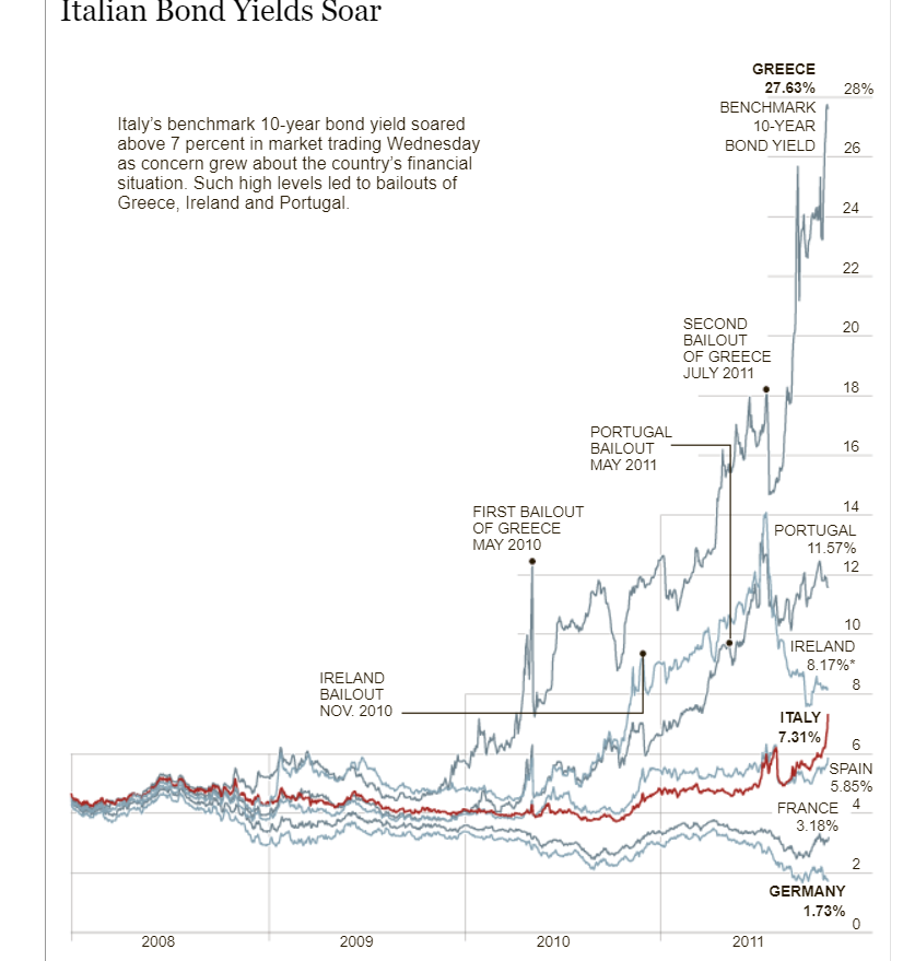
Furthermore, the Italian Bond Yields Soar visualization in the New York Times uses the same technique of changing colors in their crowded line graph in order to make the line they want to compare the data to stand out. The visualization keeps every line a consistent shade while using a darker red color on the Italian Bond line to make it stand out against all of the light grey lines allowing the viewers to easily follow and compare the Italian Bond to the others when comparing the growth rates.
Recent Comments