Home » Sankey Diagrams
Category Archives: Sankey Diagrams
Sankey
After exploring through the energy section of Sankey I was impressed. Sankey is a cool interactive tool to display information and educate anyone that may be curious. It has art work in the background relating to the topic which is not distracting, and interactive links with excerpts to get information from. You can click away and explore through a topic with ease. One of the things I learned is that “Electricity is called secondary energy because it is derived from other energy sources, mainly coal, natural gas, and nuclear reactions. About 39% of the total U.S. energy supply goes to producing electricity.”
Sankey Visualizations
In 1898, Matthew Henry Phineas Riall Sankey developed the Sankey Diagram when he wanted to visualize the energy efficiency of a steam engine. Since then, Sankey diagrams have been used in many different ways across various fields of study to show flow over time between stations. For example, in the webpage titled, “What You Need To Know About Energy” by The National Academies of Sciences Engineering and Medicine, the Sankey diagram is used multiple times to visualize the flow of energy sources throughout the United States and in specific states such as California.
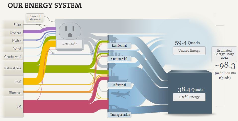
While this may seem very complex at first, it is really not too bad and it effectively visualizes the distribution of energy sources to their respective industries in 2014. It is very interesting to see how important the traditional oil, coal, and natural gas industries still are despite the large pushes towards renewable energies such as solar, wind, and hydro.
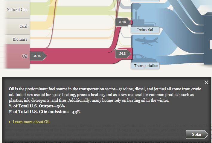
Another interesting thing I found on this site is the breakdown and visualization of CO2 emissions from each energy source. Of the nine energy sources, only three contribute to all of the U.S. CO2 emissions. They include, oil (43%), coal (29%), and natural gas (28%). This helps the viewer see and understand how the largest sources of energy are also the largest contributors of carbon dioxide emissions despite the “cleaner” alternatives that are available.
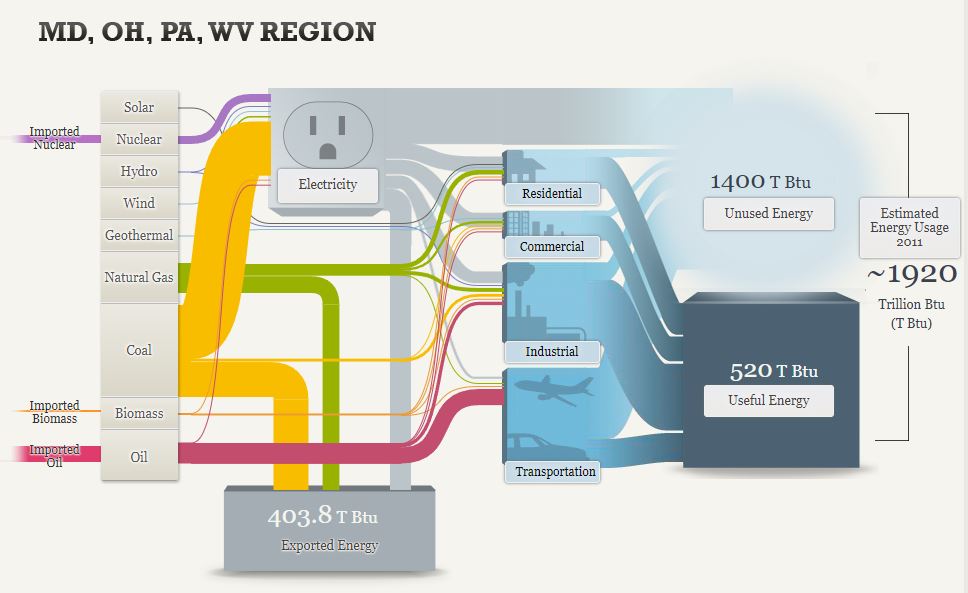
This Sankey diagram looks very similar to the first one but it is slightly different and covers the regional energy system of Maryland, Ohio, Pennsylvania, and West Virginia. In this diagram, it visualizes imports and exports as well as the general energy usage. You can see how the imported energy sources come in on the left and how they are distributed across the grid. It is also important to note how much energy is exported from this region through sources such as coal and natural gas. This is clearly shown from the divergence of these channels that contribute to almost 404 Trillion British Thermal Units of exported energy.
Overall, this is a very informative website that has great examples of effective uses of Sankey diagrams. There is a lot of good information about the energy systems of the United States but also more specific data on related topics such as energy efficiency and the pros and cons of different forms of lighting.
Sankey
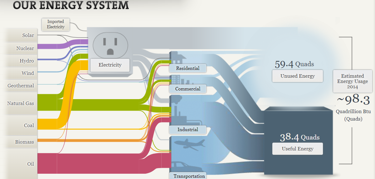
I liked the interactive aspects of Sankey’s visualizations, but or the visualization that you see above of the U.S energy system is a bit confusing. The reason that I find it confusing is all the lines that stem from the energy sources to other destinations are hard to follow due to the sheer amount of other lines and sizes that are present. This in turn makes it harder for viewers to follow the flow of energy from one source to another, which does hinder their understanding. To combat this issue the small thin lines should have been made bigger so they are easier to follow and when intersecting the bigger and fatter lines they should run over the top of them so they can still be followed easily. This does not only apply to the U.S. energy system visualization, it can be applied to the regional energy systems visualization and the California state energy system.

Continuing on, I feel that there were too many interactive visualizations. Take this for example under the understanding efficiency tab there are multiple tabs to click on for television, lightbulb, washing machines, and car usages. In each section there is also a dial with other options to click on that changes the visualization. What seemed cool originally turned into an annoying process for me when viewing the visualizations. It elongated the process of analyzing the visualizations when they could have just displayed all the visualizations for that tab on the page with titles indicating what it was presented instead of adding extra steps to see all of them. I did like the way that they chose to represent that data. I thought it was easy to read and compare the different models.
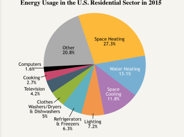
The pie chart above is very cluttered which serves as a distraction to the viewer sincethere are too many slices. If its possible they should combne slices that are related in order to reduce the number of slices making the visualization more appealing. I think this visualization would be better suited as a bar graph rather than a pie chart. I feel this is the right choice since they could represent and compare all the points better in that form rather than this cluttered part of a whole depiction.
Recent Comments