Helpful Infographic Tools
In order to create an efficient display of information to the reader, one has to make a chart that has the right format. Here is a list of tools that can help create useful graphics from given data that will be needed to be shown to the viewer.
Google Sheets
Google sheets is a free-to-use service from Google that is able to create tables and graphs. This service offers a variety of simple graphs for the user’s disposal, but some functions will require prior experience of similar interfaces. In order to use Google Sheets, you must already have a Google account.
Canva

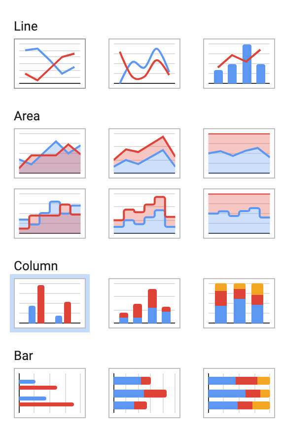
Canva is another free infographic creator and has a variety of pre-designed charts that are ready to edit that only need the data to be put in and minor adjustments.
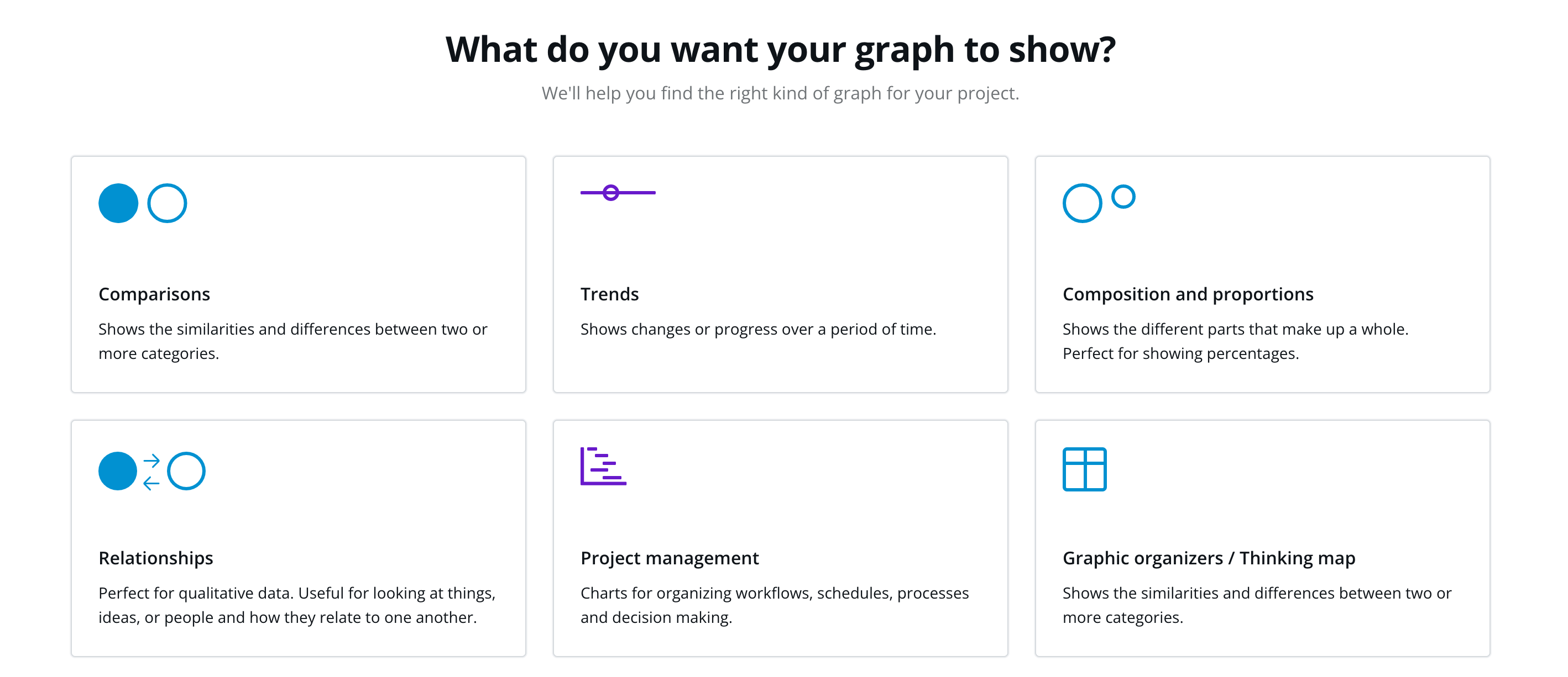
By clicking on “create my graph now” on its table page, the website will give you a questionnaire that will guide the user to creating a chart best fit for their needs.
This website is more beginner-friendly and is useful for many other topics like social media, cards, and designs.
URL: https://www.canva.com/graphs/
Visme
Visme is another website like Canva and has a variety of charts and graphs to choose from. The only drawback of this website is an account needs to be created before accessing the templates and some can only be used with a paid membership. After making an account, the user is able to edit a template, input their data, and save it for their use.
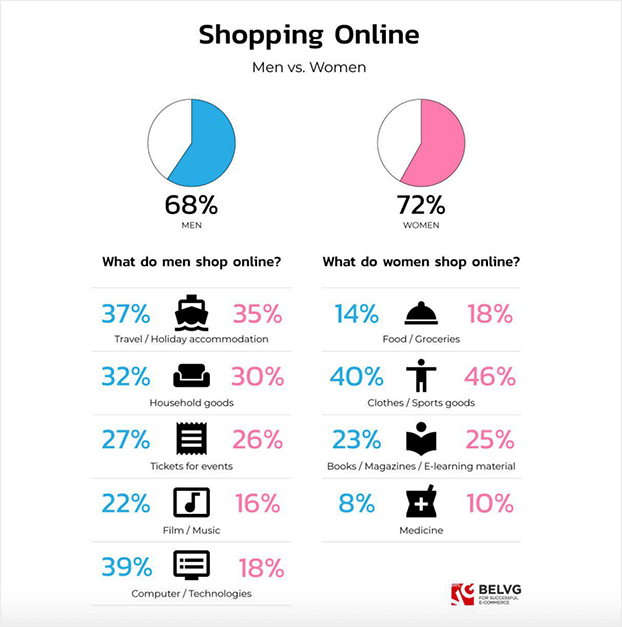
Comparing Percentages of The Most Common Reasons Both Genders Shop Online
Here are statistics based on men vs. women shopping habits online. The pie charts above, blue resembles men and pink resembles women, signify the entire percentage of each gender that shops online. Then, they pull it apart and separate it within the common reasons men shop and common reasons women shop. Finally, as they collect that percent, they then compare the opposing gender’s percent on that same shopping reason. After observing this data visualization, it is quite interesting how most percentages are close between both genders, except for technology. Men spend more time and money wanting computers/technologies than women by almost half percent of the women’s side. Furthermore this information/numbers can definitely help business/marketers and the world see who shops more online and in what category.
https://belvg.com/blog/men-vs-women-who-runs-the-online-shopping-world.html
VizHealth
What an inspiring website. The infographics shown on this website are phenomenal. This website provides great assistance when one needs to create a specific infographic or display to make a point. As shown below on the VizHealth website the user is allowed select categories detailed towards the health statistics specific to the presentation.
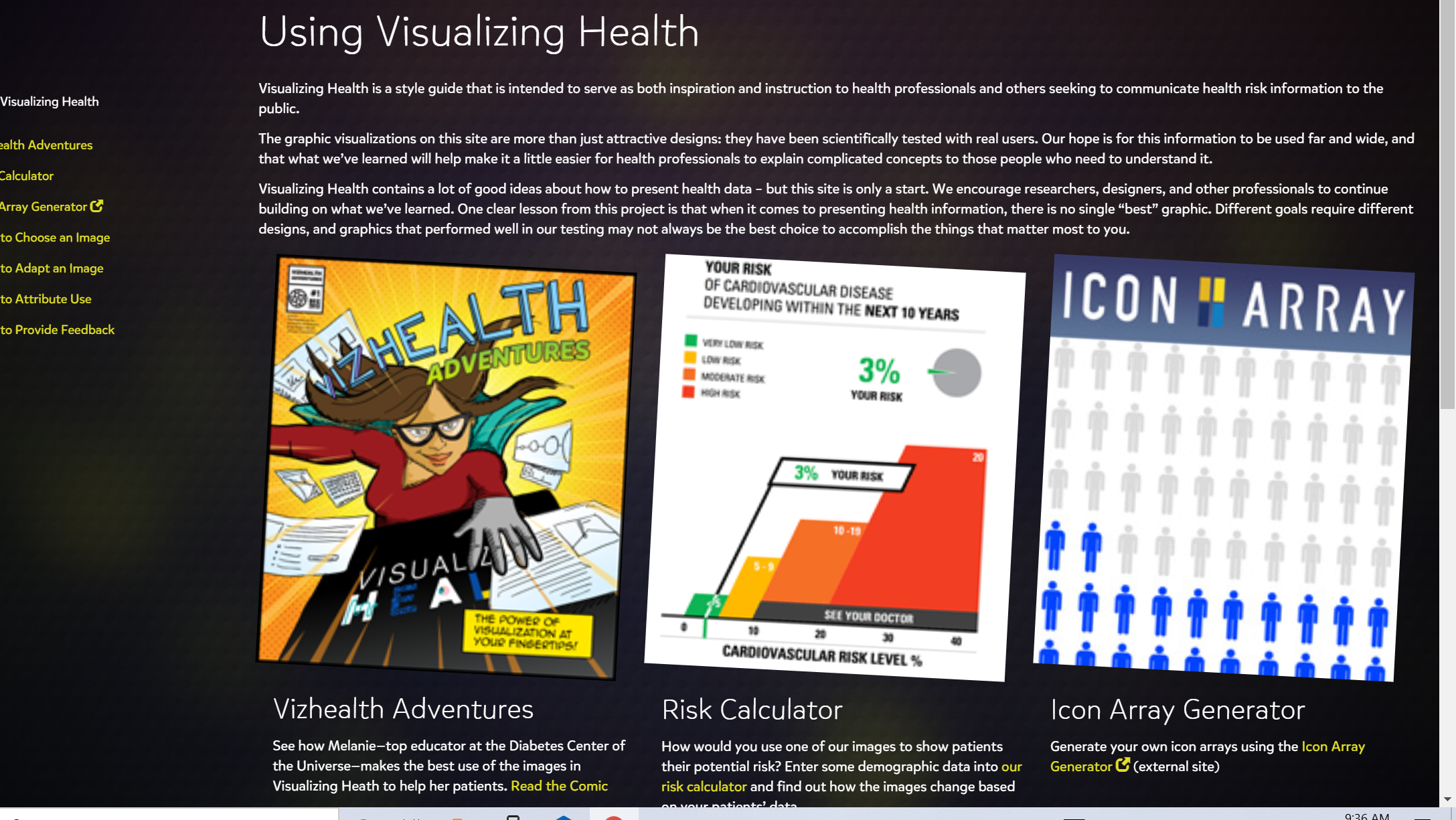
The website Vizhealth is a beautiful tool when creating a presentations. The website generates vibrant images to be used when displaying pertinent information to viewers. The variety of selections available really can help users become creative and select and image best suited for the audience.
Creating a presentation is not an easy task. VizHealth does the hard part for the one presenting. Generating bold pictures with easy to read statistics can be half the battle. The user simply needs to click the categories that apply to the presentation and the infographic is created. A great tool in the health field or in health classes to teach people of positive and negative impacts ones decisions have on a persons health backed up with statistics.
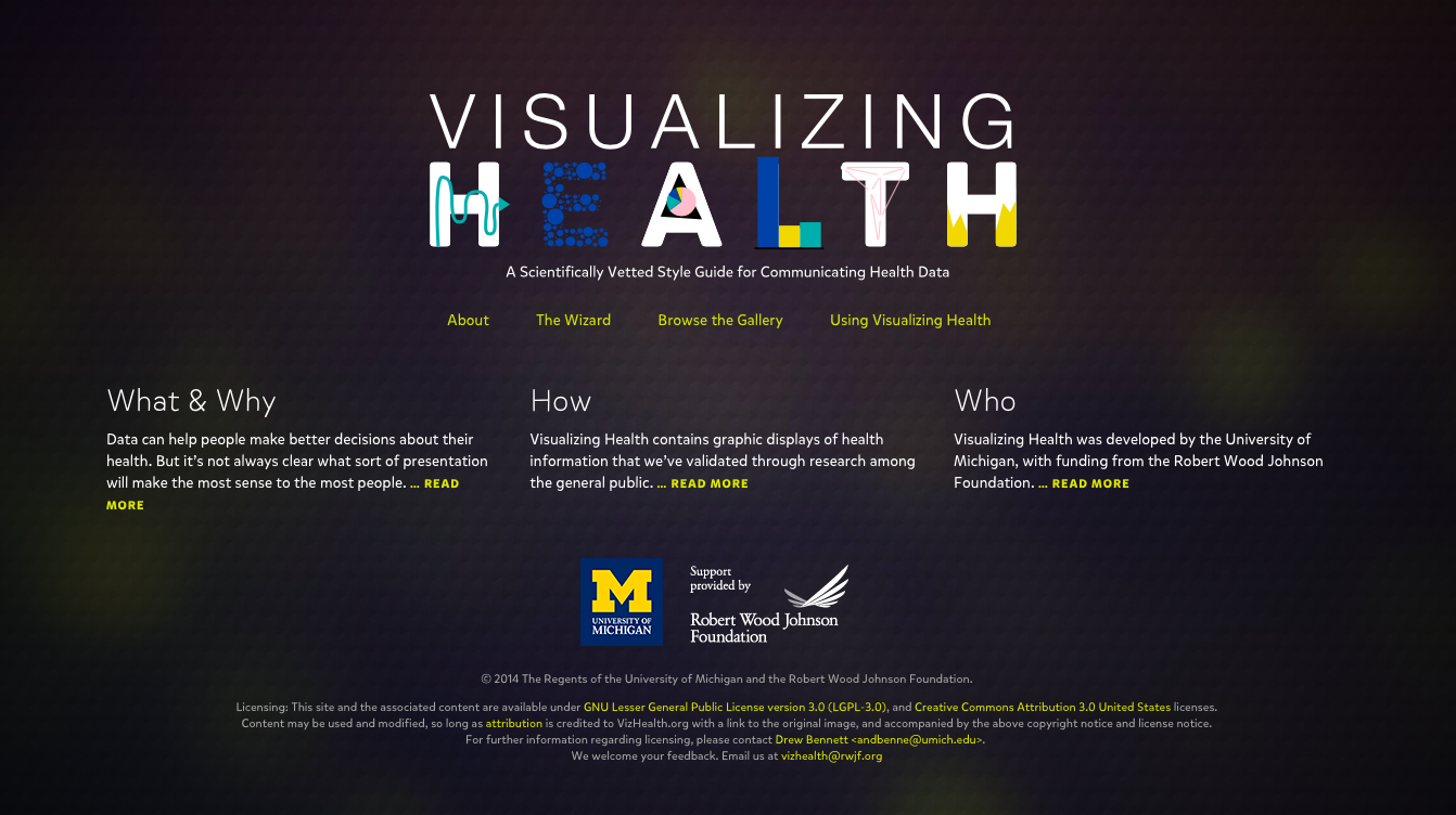
Visualizing Health
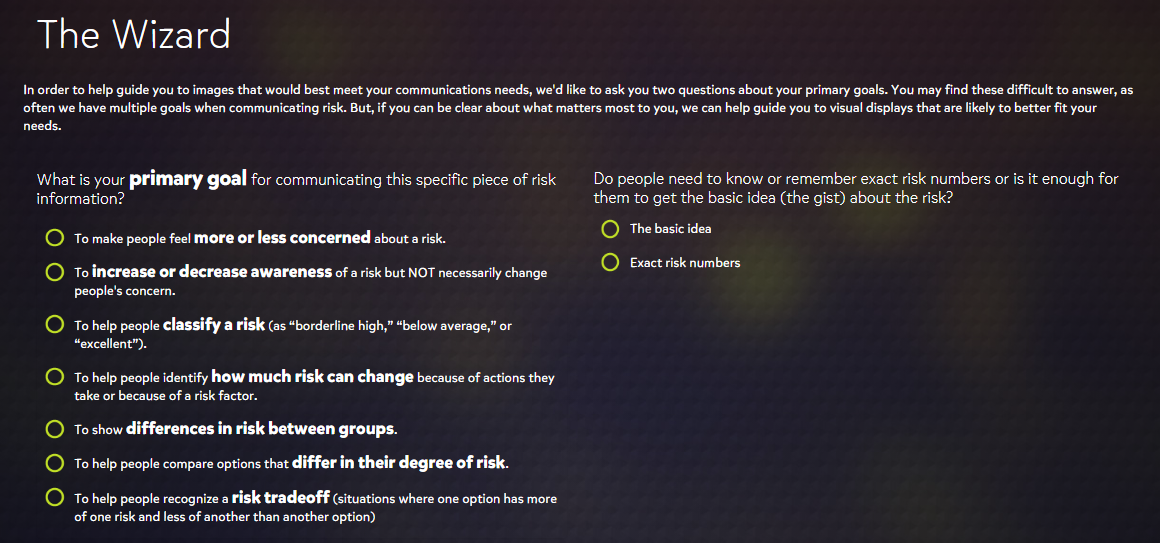
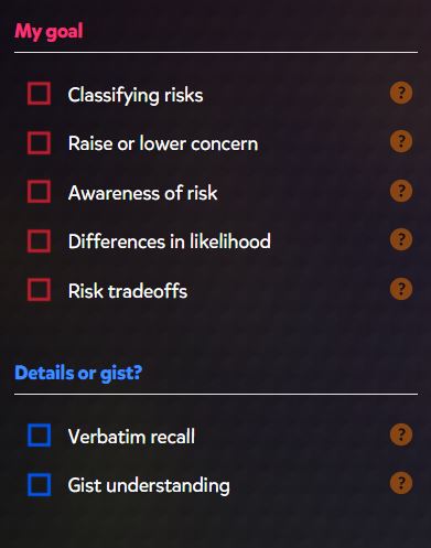
The Visualizing Health website offers a very professional feel to its wide variety of visualizations that assess health risks based on available data. It guides users through a wizard to gather information about what their goal is for communicating risk.
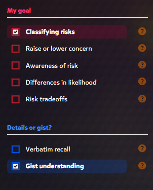
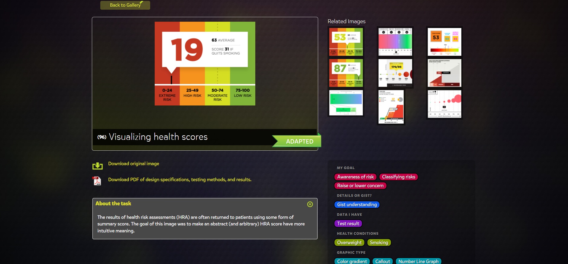
Upon completing the wizard guide, the website brings you to a great page that offers various criteria on the left side with corresponding graphics to the right. The criteria include goals and details that were prompted in the wizard guide that can be easily changed if a different result is desired.
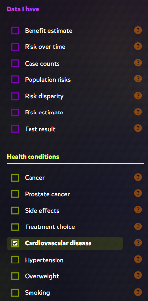
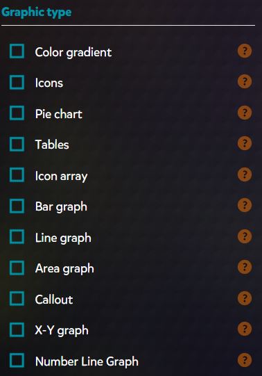
Some of the other specifications include available data and the health conditions of interest. Depending on what boxes are checked, the website will display a bunch of colorful, informative, and effective graphics. The graphics range from pie charts, to histograms, and even to simple statistics that are offered in an efficient visual presentation.
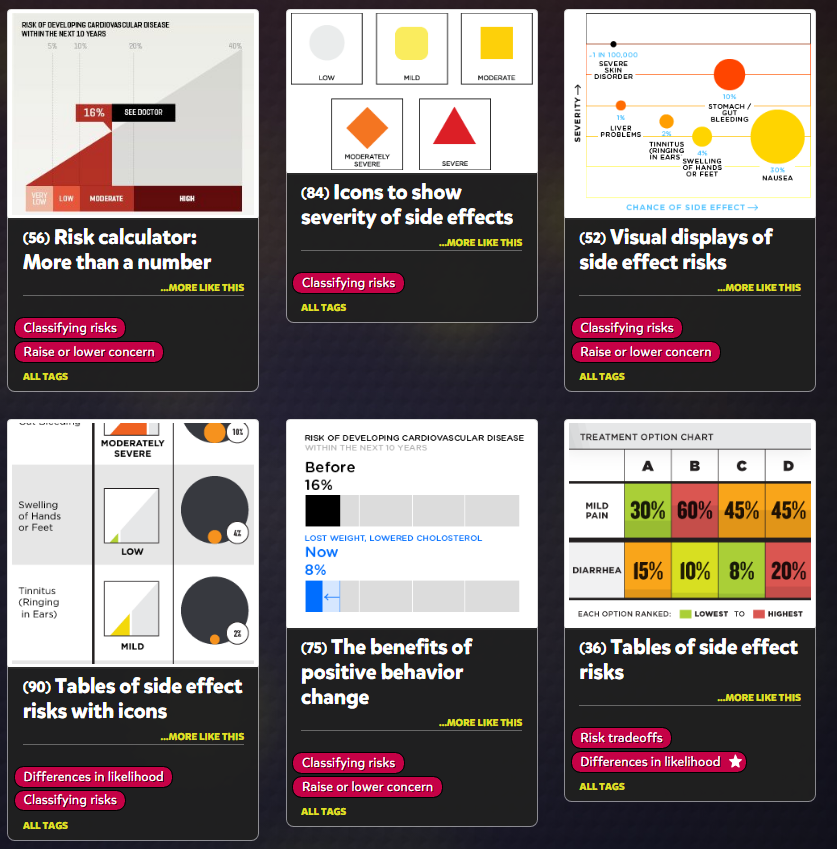
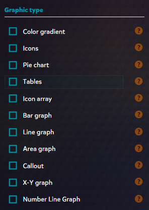
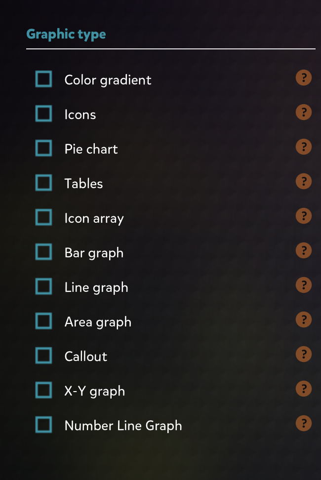
Another great feature that the website offers is the ability to change what graphic type you prefer. This is useful for narrowing down how you want to present your data for certain health risks. For example, a bar graph would be preferred for showing risk of certain diseases over time and this tool lets you filter for exactly that.
Overall, I think this is a great website not only for visually communicating health risks but also for learning how to use visualizations effectively. I was very impressed by the amount of features offered as well as the general design. The colors of the text, lines, and shapes are high in contrast with the dark background which makes the presentation visually pleasing. Everything is also organized neatly which makes this a great tool for all users.
Vizhealth: Frank Figurelli
I think this website is a really cool time saver. Vizhealth created a gallery of easy and simple graphs, charts, and images that effectively communicate risk information. I think this is crucial for people because personal health is something that is usually very neglected in this country, especially during the pandemic. The “wizard” section of the website is the most important. It asks you your primary goal of what you are looking for, and if you need exact risk numbers or the basic idea. This narrows down the data and search criteria which will end up giving the user more accurate and useful information. Data visualizations should be quick, easy, and efficient. This website is the prime example of all of those words and is an incredible tool for data visualization and health. Everyone should be looking after their health and certain risks they may have and this website allows people to do that while saving lots of time. I cannot stress enough how useful this site really is. (6) Visualizing Health – YouTube
Visualizing Health
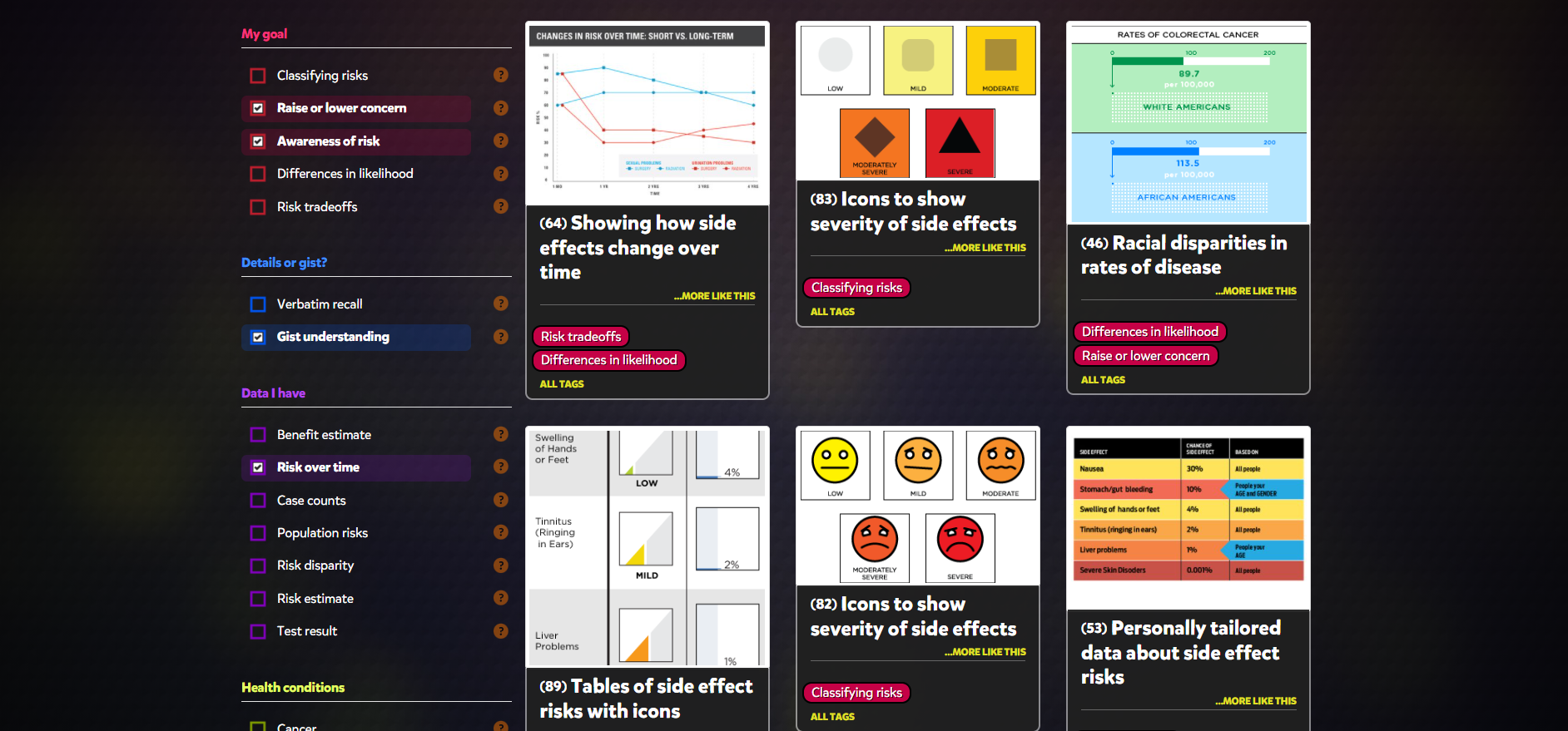
The Vizhealth Wizard upon entering introduces the visitor to a gallery of different graphs with a plethora of information concerning risk and personal health.
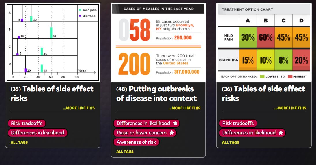
I was quite impressed with the categorization on different topics. The screenshot posted does not do the categories justice, having more than 5 different subjects and specified tabs for each of them.
Another impressive feature is the amount of charts provided by Vizhealth and the ability to filter different kinds of charts to fit your liking. Not only that, but the design and customization of each graph makes each of them feel truly unique.
Seeing elements of what we learned so far in the course really shows how valuable infographics truly are and how they can make a positive difference, in this case.
Immediately when looking at the Visualizing Health website page I could tell that this site is very advanced in its graphics and knew that the infographics it would present me would be very successful in its use of data presentation with visuals.
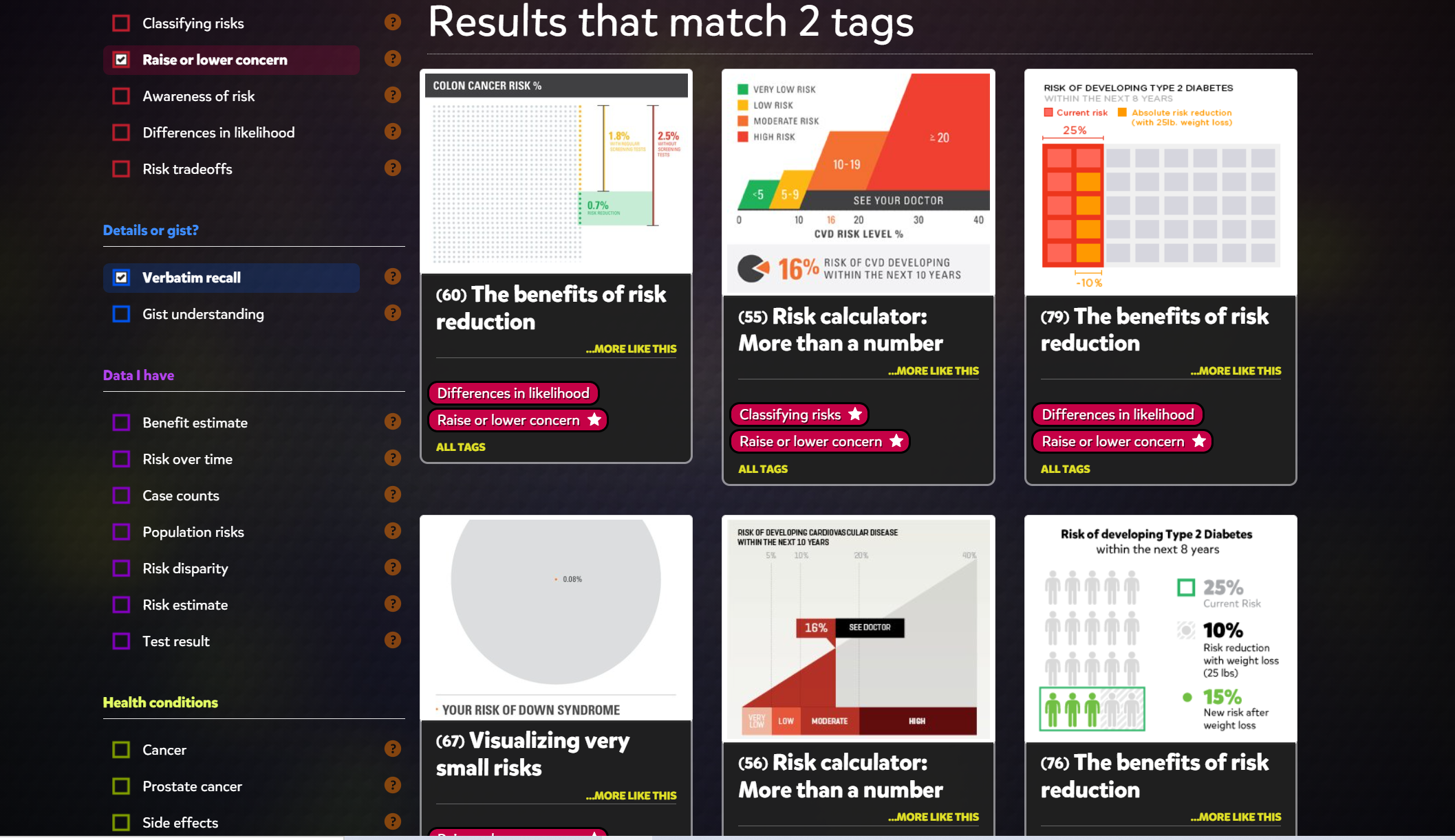
Its homepage is clear and shows where you can go to find more infographics on health data. After clicking on the wizard the site asks a couple questions based on what you are looking for. When you get passed the specifics it brings you to an array of different health infographics. I chose to look at infographics that show differences in risks between groups and doesn’t focus on exact numbers.
Above you can see all the different infographics this site provides as well as filters you can apply to the left. You can apply filters to narrow down your goal, health conditions you are researching, data you are looking for, and even what kind of form you would like to see the data in.
This site overall has very useful tools for not only those interested in infographics but those looking for easy and clear information on medical health.
Visualizing Health

Visualizing Health
My experience on Vizhealth.org developed a better understand of how beneficial visualization can be. This website was very clear, informative, and very user friendly. The website generates visualization designs for patients to understand in a quick and effective way, for doctors who are trying to communicate some complicated information. The primary goal is communication, and the “wizard” is available to explain the giving data with the best design options. Visualizations help lead to decisions and when facing health issues these visualizations below very helpful. The following video was published on their site, and explains how many different health concerns can be confusing. With this easily accessible visualization of health designed by Robert Wood Johnson Foundation and the University of Michigan Center for Health Communications Research , is to give them a better understanding on the goal and the purpose.
I had no issues with the user-friendly navigation of the site and gained a lot of insight from the many ways of presenting data. This site explained to me that different goals or communication needs requires different designs and graphics for the reader to understand and grasp the concept.
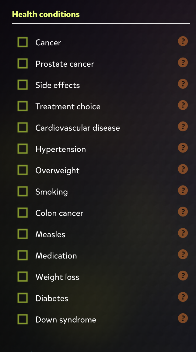
The “wizard” is an assistant in meeting communication needs, and meeting the goal when it involved risk information. It gives multiple ways to design the data, what is best and most comprehendible. With options to input data and edit for example, specific health conditions, different forms of cancer, and if you smoke or are overweight.
Allowing the doctor to input these different aspects and generate the basic idea with options. The ability to edit data and choose the best visualization, including the most relevant information will help assist in explanations. The patient understanding the data in the most effective way is the goal, and there are many options to choose from. The gallery is available to see the best designs and displays a wide range of designs assisting in the determination of what visualization is best.
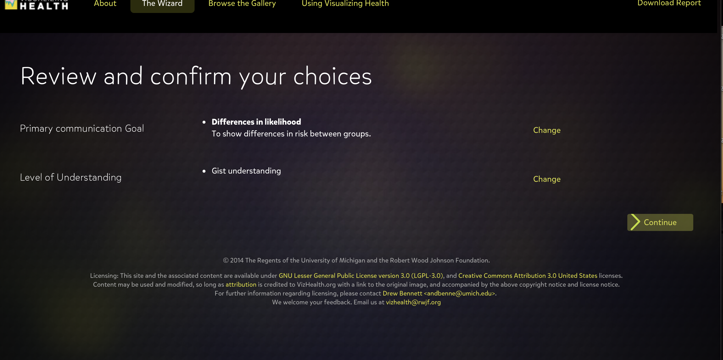
This tool rapidly generates results to choose from to assist in visualizing health issues. Making the patient have a better understand of the risks of their issues and what is the best approach to medications, treatments, and other medical decisions. Visualizing Health gives options for the primary communication goal, and the level of understand whether you want to give basic information or exact numbers.
This site is beneficial to both doctors and patients when communicating life threatening sicknesses, medications, raise or lower concerns, and inform about the risks. The wide variety of helpful visualizations, and my overall experience with this scientifically vetted style guide for communicating health data was simple yet very informative. I grasped the concept of visualization in a more effective way, understanding the many possible ways to present data and how someone will interpret it based on the design.
A Commentary on “Visualizing Health”

Visualizing Health is a program that hopes to alleviate the burden put on healthcare professionals when they need to communicate information about a person’s data-rich bodies. Likewise, for individuals, it hopes to clear up what the numbers presented to them mean. Graphics can be a great way of visualizing this data, making it easier for both parties. However, not all visualizations are created equal.
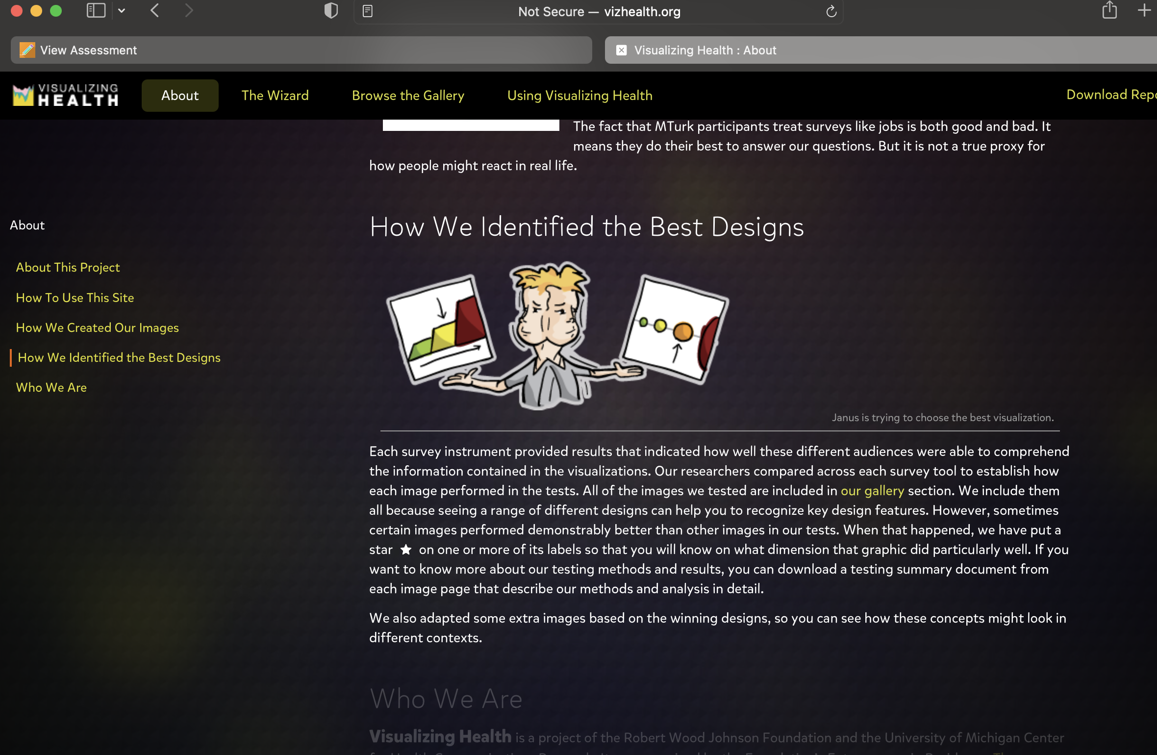
The program beings with “The Wizard”. It only needs to know two things: what the graphic’s primary goal will be and whether or not exact statistics will be used in achieving that goal. From the selections made, the program sifts through its collection of 54 tested visualizations. It then returns the ones best suited to achieve one’s specific goal.
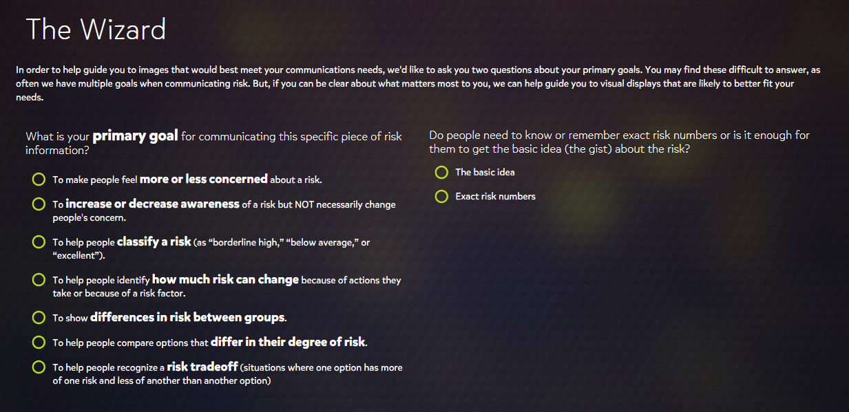
After the initial results, one can make further refinements through the selection of tags that take other factors into consideration. These include the type of data that is available, which specific health conditions are being looked at, and which type of graphic is desired. The selection of more tags yields recommendations better suited for one’s topic and purpose.

Each graphic appears to adhere well to the principles of good chart design that have been explored so far through class assignments. The data is well presented with appropriate, attractive graphs and color schemes, and there is no “chart junk”. Rather, every element has its specific purpose. As these graphics were designed with the medical field in mind, this would be expected.
When it is a matter of a person’s health, there is no benefit in making information ambiguous or hard to follow. The health conditions that Visualizing Health focuses on – cancers, diseases, genetic disorders – are grave topics. Often matters of life or death, the more effective one can be in communicating data about these conditions, the better. Visualizing Health, therefore, provides an immense service to healthcare professionals and patients alike.
However, its utility does not end there. Its expertise in data visualization can extend beyond the field of medicine. As mentioned, many of the principles used in the graphics were introduced before Visualizing Health. They are universal, in a sense, and can apply to any discipline. Every graphic can benefit from the ideals of conciseness, eye appeal, and a “less is more” mindset. What’s more, there is the matter of finding the right visual. Through practice with this program, and with help from “The Wizard”, these tasks become less taxing, making one’s visuals all the more effective.
Recent Comments