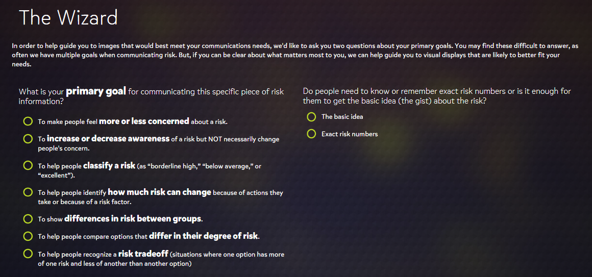
The Visualizing Health website offers a very professional feel to its wide variety of visualizations that assess health risks based on available data. It guides users through a wizard to gather information about what their goal is for communicating risk.
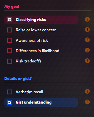
Upon completing the wizard guide, the website brings you to a great page that offers various criteria on the left side with corresponding graphics to the right. The criteria include goals and details that were prompted in the wizard guide that can be easily changed if a different result is desired.
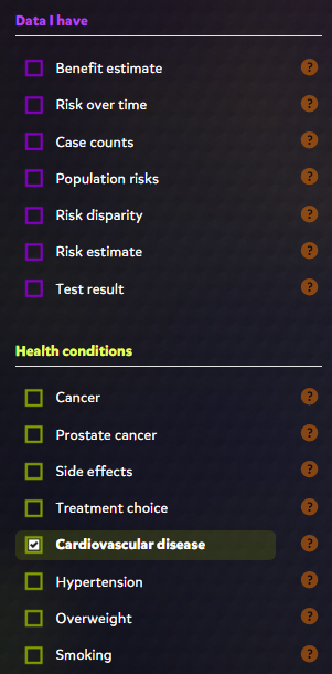
Some of the other specifications include available data and the health conditions of interest. Depending on what boxes are checked, the website will display a bunch of colorful, informative, and effective graphics. The graphics range from pie charts, to histograms, and even to simple statistics that are offered in an efficient visual presentation.
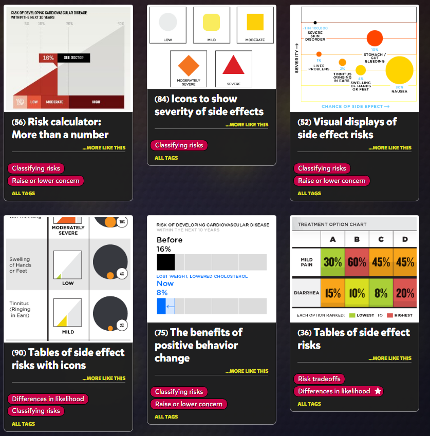
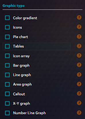
Another great feature that the website offers is the ability to change what graphic type you prefer. This is useful for narrowing down how you want to present your data for certain health risks. For example, a bar graph would be preferred for showing risk of certain diseases over time and this tool lets you filter for exactly that.
Overall, I think this is a great website not only for visually communicating health risks but also for learning how to use visualizations effectively. I was very impressed by the amount of features offered as well as the general design. The colors of the text, lines, and shapes are high in contrast with the dark background which makes the presentation visually pleasing. Everything is also organized neatly which makes this a great tool for all users.
Recent Comments