Benchmark graphs are a great data visual to allow companies to compare their own performance with their competitors or even their own set goals to reference points to improve new insides and improve their processes.
Investment Comparison
In this benchmark graph shows the data between US(Ford, General Motors) and Japanese(Toyota and Honda) and their manufacturing production rates of vehicles within Canada. This chart’s main focus is to show the increased production within Japanese that evaluates the growing performance, sales, and attention their vehicles have been in Canada. In showing this data they want to make an attempt in increasing the amount of investments Canada should make compared to the amount they make for the US.
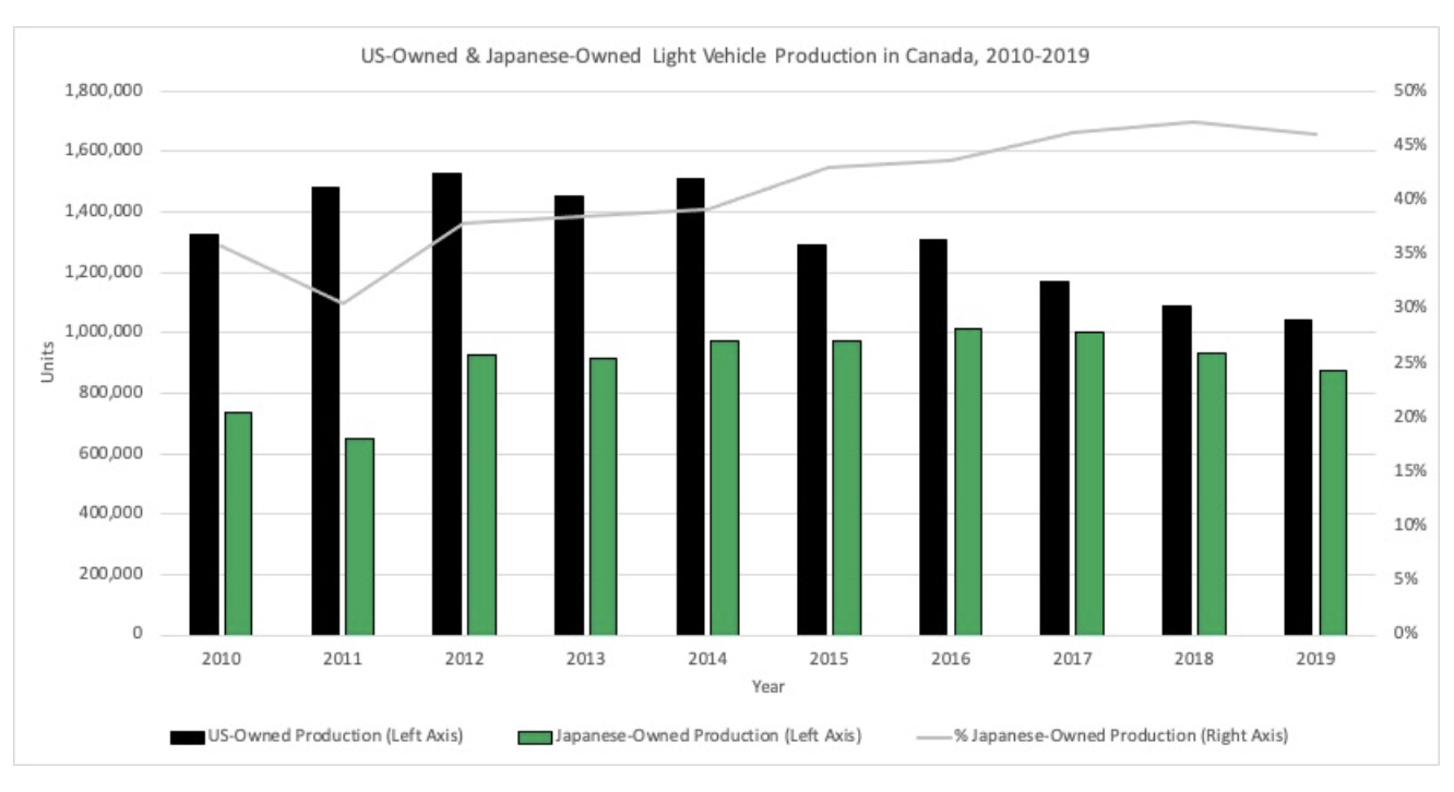
The graph shows an effective comparison between the two countries and their production rates. I like how they used a span of almost 10 years which shows the increasing rate Japan has developed compared to the US who has ben decreasing. I also like how the also included their percentage of owned products within Canada that is combined with all manufactures which is also larger than that compared to the US and is increasing through the years. This shows that they have a positive and effective rate of change in their products and are very popular in Canada.
Video Streaming Data Comparison
In this graph represents the total, revenue, gross profit and net income with Netflix they have been increasing in all categories with the last 3 years. This graph is used to show in the article that even though many competitors are coming up with unique and reliable resources for popular video streaming apps they can still be on top and have a high popularity rate of users and are still continuing to rise to the top
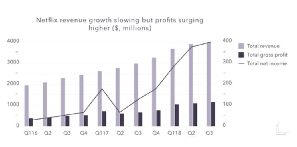
I like how they break down each category and make it simple to comprehend using labels on each side because the amounts between revenue and gross profit are large in comparison and would be hard to comprehend if only one y axis. I also like how they use the years but also break down each section into the quarters where their finances are calculated to show a precise estimate of the money they have made. This chart shows a great representation of how well Netflix has done in a small span of time and they are still continue to increase their sales.
This was a very well written blog post. I enjoyed reading this because you spoke about the data, showed the visual aspect, then went one step further to give your opinion and reflect on the information. One suggestion would to just to compare both graphs in one blog post just to keep it under the same topic, but great job!
Thank you I worked really hard and it actually took me awhile to find the right data that was easy to read. Thank you for the suggestion I will take your advice for next time.