Home » LolliPop Chart
Category Archives: LolliPop Chart
Lollipop Charts
Lollipop charts are very similar to bar charts and can be used to show how data behaves over time or to compare data sets. The design is rather self-explanatory where the chart has lines with circles at the end to represent data points which resemble lollipops.
An example of a lollipop chart is one I created after researching data on what the most popular car colors are in the United States.
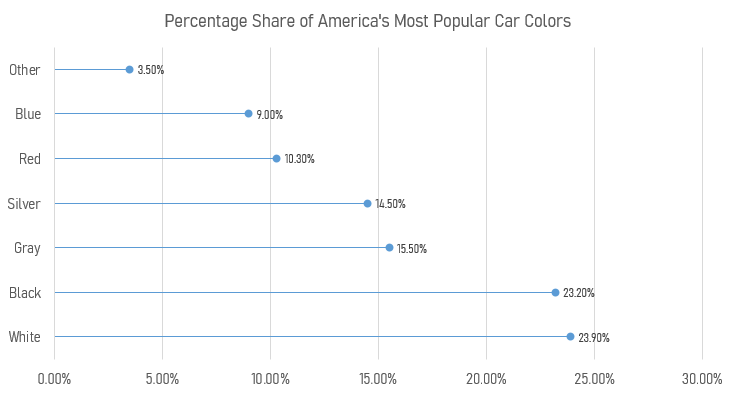
Using this chart creates a minimalistic and readable display of the data that clearly shows that white, black, and gray are the top three colors. Lollipop charts are very versatile and can be a very effective way of visualizing data.
Lollipop Charts
Lollipop charts are minimalistic graphs the are based on line, scatter, and bar graphs. The lollipop chart is easily identified by its long stick with a dot at the top which usually has a percent either inside of the dot or above or in front of the dot depending upon the orientation. Lollipop chart orientations could either be vertical or horzontal. This type of chart is best used for displaying survey data since it shows the percent of responses from a survey group based on the questions asked. They can also be used to make any comparison between two different items or categories. Additionally. they can be used to rank or show trends over time.
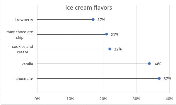
In my lollipop chart, I chose to depict survey results for people’s favorite ice cream flavors. The survey posed the question of which flavor people liked the most out of the most popular answers that people have, which are, chocolate, vanilla, cookies and cream, mint chocolate chip, and strawberry.
Recent Comments