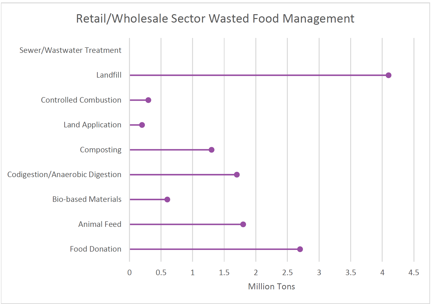
Lollipop Plot
This type of chart is very similar to a column or bar chart, however it consist of a line running from the x-axis and a dot at the top to pin point the value of each category. The visual replicates as a lollipop hence the name due to its long line as the stick and the point at the top to form a circle.
Common Uses:
- Visual alternative to side by side bars
- Comparison between categories
- When displaying more than 10 categories making it more legible.
Easy and Effective
The example below of a Lollipop data chart displays data of how much retail and wholesale organizations manage and dispose of their waste in 2018. This chart is easy to manage and create way to effectively arrange your specific data. that allows the presenter to create unique designs and templates while allowing it to be used for various data forms.
This is a very nice blog post with just enough detail and pleasing visuals. Your use of bullets and different text colors helps organize and differentiate all of the information. What program did you use to create your lollipop chart? My only suggestion for this would maybe be just to add data labels to the lollipop chart so the audience knows the exact values for each data point. Otherwise I think this was overall a very good post!