Home » Infographics
Category Archives: Infographics
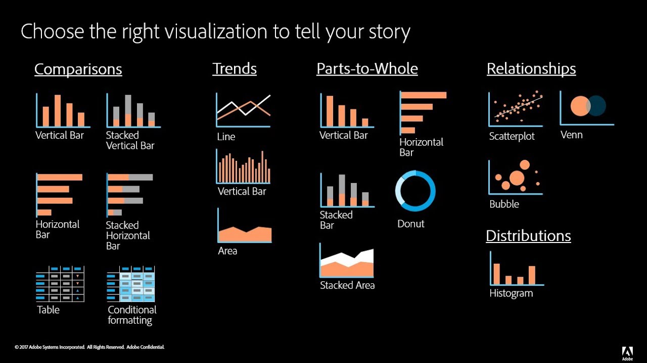
Comparing Data
Choosing the right chart is crucial when deciding how you want to compare your data. There are do’s and don’ts when selecting the right visualizations.
This article does a nice job at offering advice on choosing the correct graph to compare data and offers a good do’s and don’ts list for those hard to make decisions.
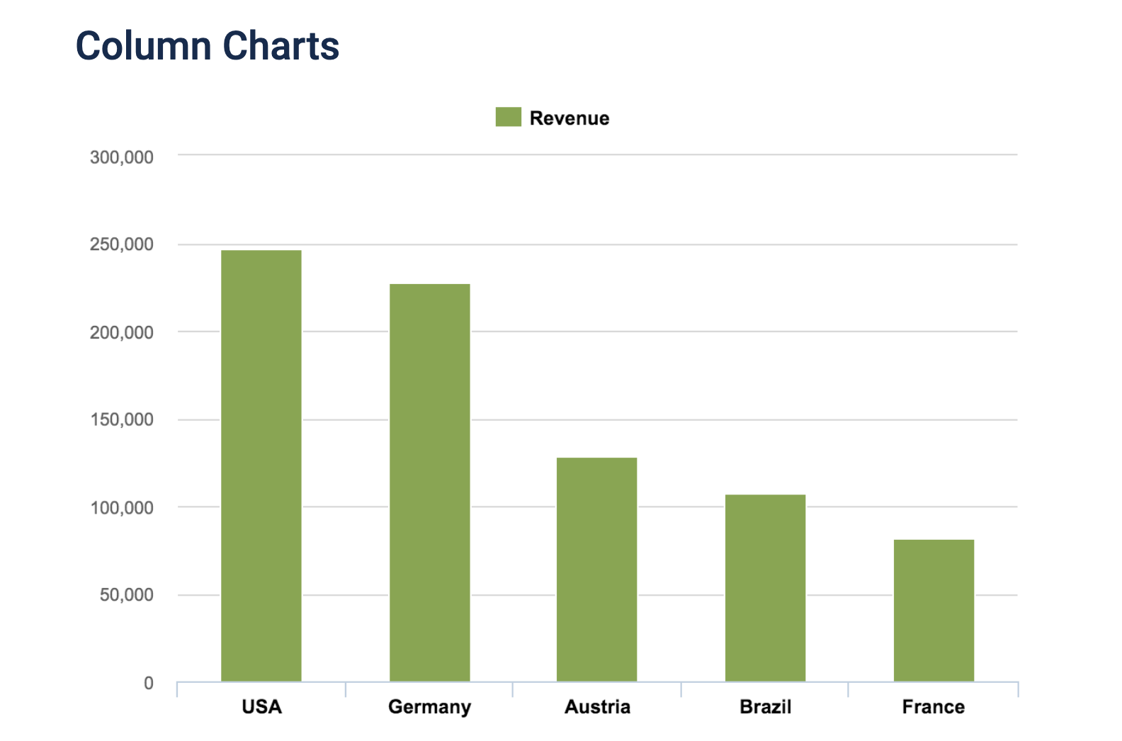
Every type of data has a visualization that would present it best, and it is up to you as the presenter to choose the right one.
Vizhealth
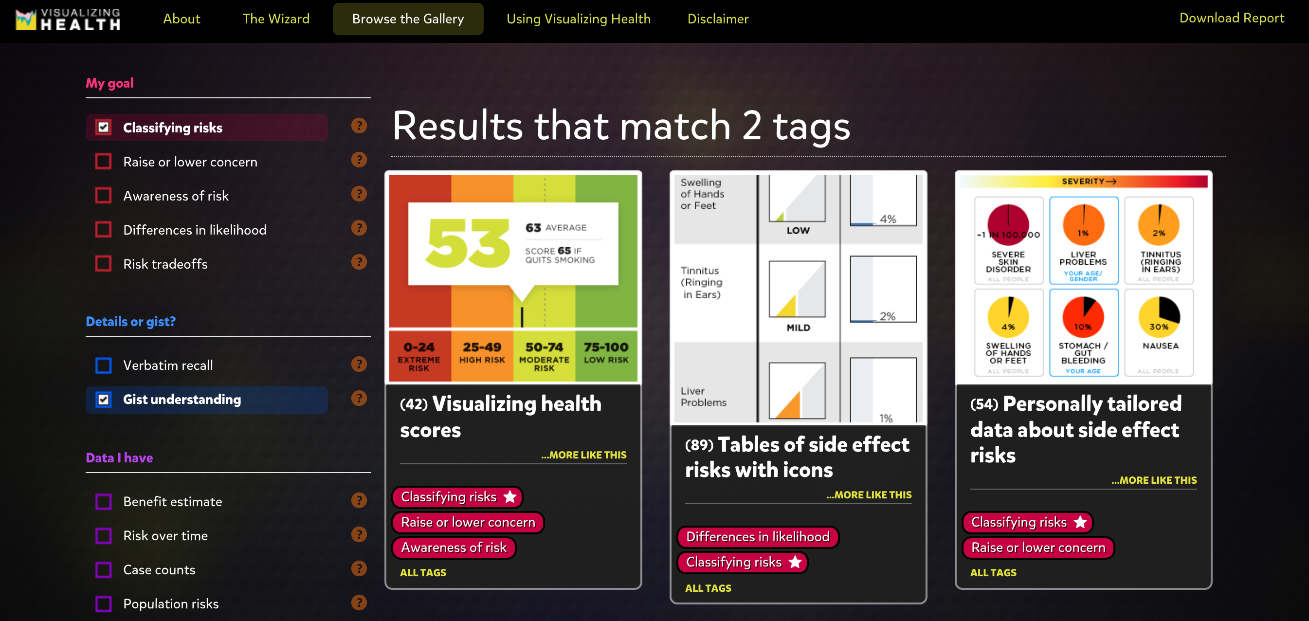
I found this site to be extremely beneficial when exploring graphics. It allows you to select options to narrow down the best fit visuals for your data, which is very helpful.
I would definitely utilize this site if I was finding it difficult to pick a correct visual for my data and how I want to present it.
Tools that may help us construct Infographics.
Infographics is a really fun and effective visual way to display any information. Infographics are the visual presentation of information and facts supported by graphics, charts, text, and diagrams. The video in the hyperlink shows how easy you can create a well designed effective infographic about any information. There are a number of tools that you can use to create interesting infographics. Some of those tools are:
Canva- Is a go-to tool for editing and touching up images for different social media platforms. Canva offers hundreds of design elements for creating infographics. They have grids, icons, illustrations, and many charts to represent figures in you info graph.
Piktochart- Is another infographic maker that can create interesting infographics. With Piktochart, you can create interactive charts, maps, and graphs. All you have to do is import your numbers, choose the chart or map you want to use for your infographic and you’re done.
Infographic tools:
One of the best tools for infographics that I found is Infogram. Infogram is a data visualization tool that has over 20 ready made design themes to choose from. It allows people to create customized brand themes with colors, cool logos, and fonts. Infogram also lets the designers create informative charts and maps. This tool also allows the user to create eye-catching designs in a short amount of time which is the most important thing with infographics. They are supposed to be short and to the point while also grabbing the attention of the viewers. Infogram offers subscription based service for personal use or business. Another tool that I saw is called Visme. Visme is free and allows the user to create engaging infographics and presentations. The free tool offers over 100 free fonts, millions of free images, and thousands of quality icons. They have a premium option for more advanced service, but the free option is still great. Overall, finding tools similar to these ones are huge when creating infographics. It saves the user a lot of time while also helping the user create fun informative infographics. Simple and creative is the goal when creating one of these, and that’s what these tools allow. 
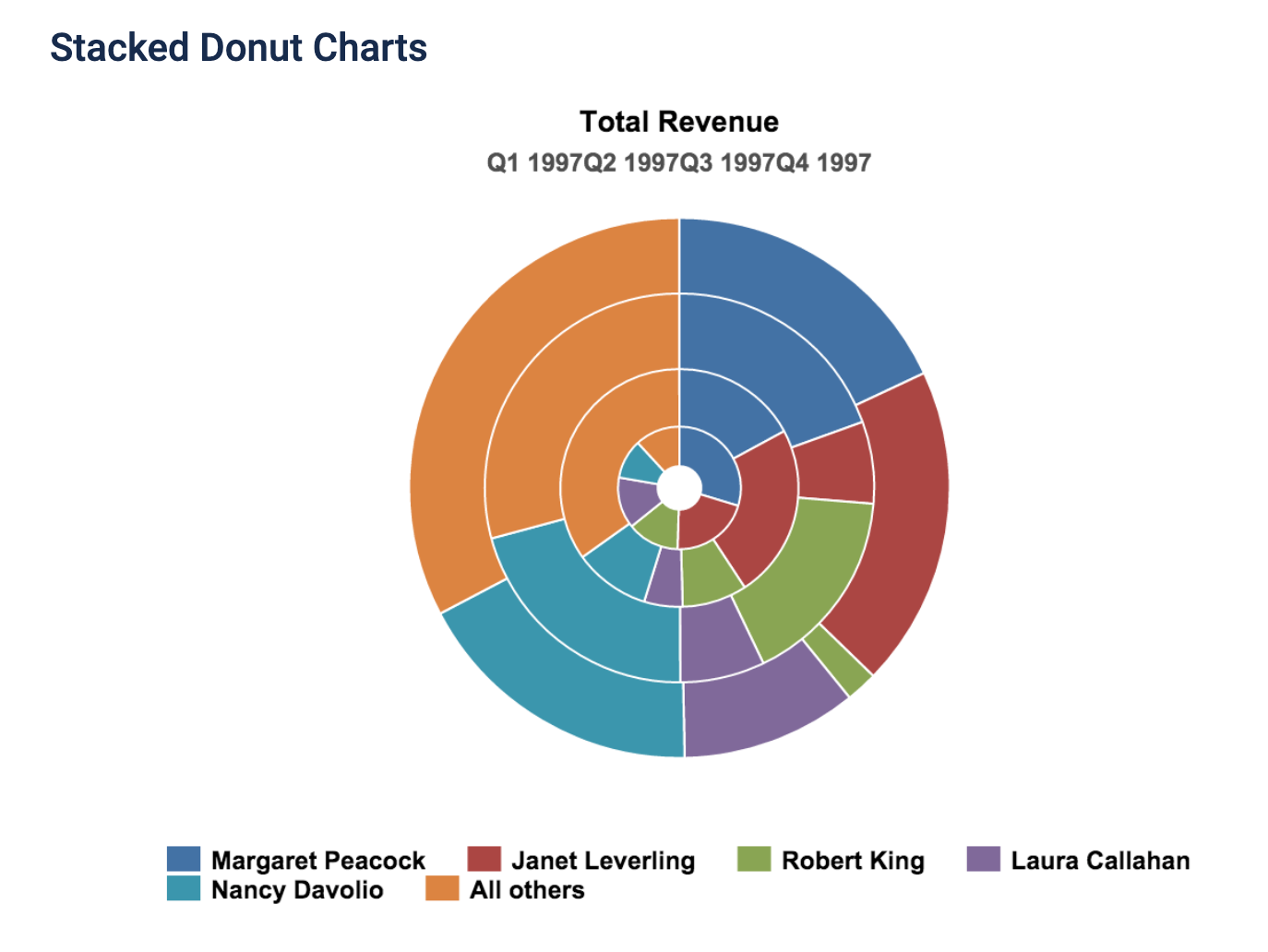
Examples of Insightful Data Visualizations
Visualization is critical to data analysis
This is a great example of data visualization
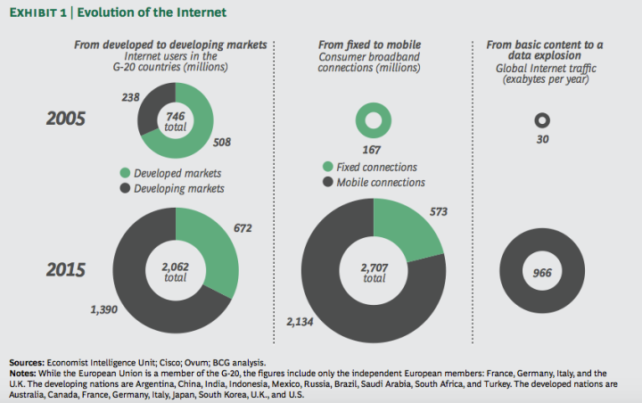
“Data visualization is a little like herding cattle — it’s expensive and time-consuming, but, ultimately, necessary if you want to generate profits from your cows.” -Angela Hausman, PhD
Using data visualtization the proper way can greatly increase market performance, audience engagement, and overall understanding of the said topic.
Below is a great video explaining what data visualization is and its benefits
Data Visualization (Infographic)

This is an infograph from the 2010 NFL season prior to the Pittsburgh Steelers and the Green Bay Packers playing in Super Bowl 45 comparing the 2 teams defenses during the season compared to the rest of the league. There are multiple infographics comparing both of these teams in the link.
Constructing Infographics
There are many tools at our disposal (both free and not free) that the public can use in order to construct infographics. There is a free site and app that can be used in order to create infographics, with no prior experience necessary
Canva | Infographic Maker | Design Compelling Infographics | Try Canva Pro

Infographics: Using Canva
Infographics are a great tool to convey messages and data in a clear manner to viewers. A great tool to help create infographics is Canva. Canva is free but does have a paid subscription for more advanced features. It is very simple to use and only takes an average of 30 minutes to create an infographic. A reason that Canva is easy to use is because of its wide variety of templates that allow the user to input their own information on a prebuilt infographic rather than having to build one from scratch, but that is an option if you wanted to design your own.
Here is an example of a simple infographic create on Canva
I have had personal experience using Canva for the day of service last year with the honors program. We were tasked with designing infographics to teach people American sign language. Before that point, I have never used Canva before, but once I loaded the site it was super simple. It guides the user through each step. First, it’s either picking a template or design your own, then input whatever information or images you desire. Then finally once it’s complete save it to your computer and then you are ready to distribute your newly formed infographic. Canvas interface is easy to use and figure out and by being able to utilize such a simple site, projects you work on in the future will pop more since you will be able to make your own custom infographics.
Also, check out this video on using Canva:
Also, feel free to click here to check out 11 other tools to create infographics
Image link: https://upload.wikimedia.org/wikipedia/commons/f/f9/Platform_Canvas_Original.png
Examples of insightful data visualizations:
When creating data visualizations, one must be mindful of how their targeted audience will read their information, how easy it is to access, and if it can be interpreted easily without much background information or interpretation. Articles like these, explain how important it is to decide what graphic one will use when presenting their data. The author provides great examples such as websites to use, things to consider, and introduces and explains example graphs.
For beginners getting into data visualizations, Excel and Google Sheets may be a good starting point. Once you’ve learned more, it would be beneficial to use a software like SPSS or Tableau. These two softwares are helpful when needing to compile data into a visual, and adding different elements that Excel or Google Sheets may not have had.
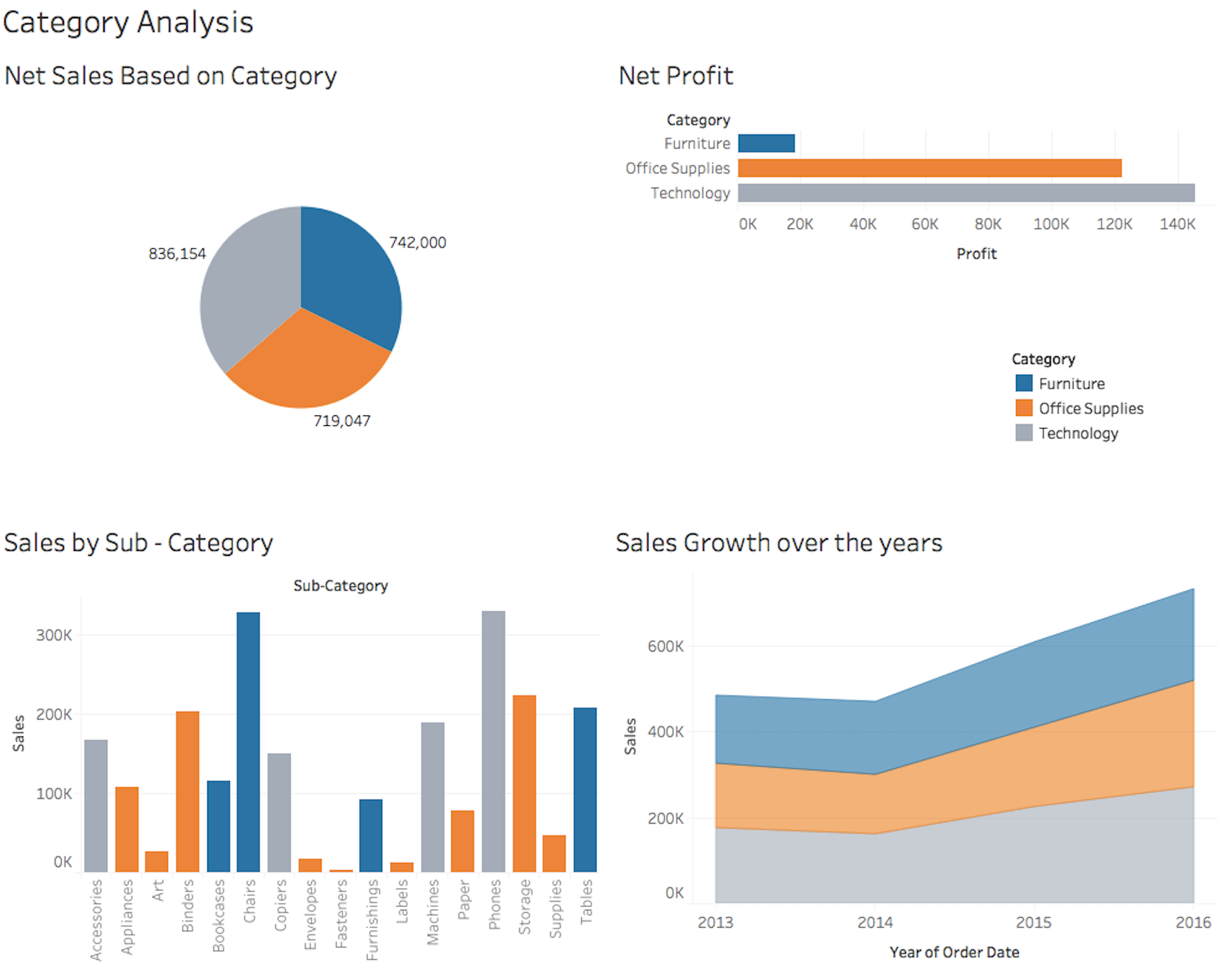
The visualization to the left is an example of what Tableau can produce when used by someone who knows the best way to visualize data. There is a pie chart, a bar graph, and a few other visualizations. It’s important to know that when creating such visualizations, coloring, font, size, and type all matter when determining how to best represent your data.
Recent Comments