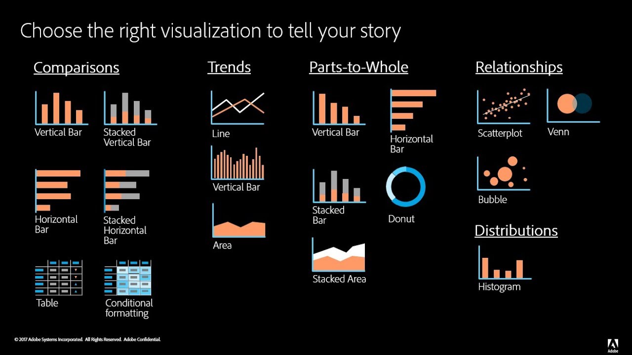
When creating data visualizations, one must be mindful of how their targeted audience will read their information, how easy it is to access, and if it can be interpreted easily without much background information or interpretation. Articles like these, explain how important it is to decide what graphic one will use when presenting their data. The author provides great examples such as websites to use, things to consider, and introduces and explains example graphs.
For beginners getting into data visualizations, Excel and Google Sheets may be a good starting point. Once you’ve learned more, it would be beneficial to use a software like SPSS or Tableau. These two softwares are helpful when needing to compile data into a visual, and adding different elements that Excel or Google Sheets may not have had.
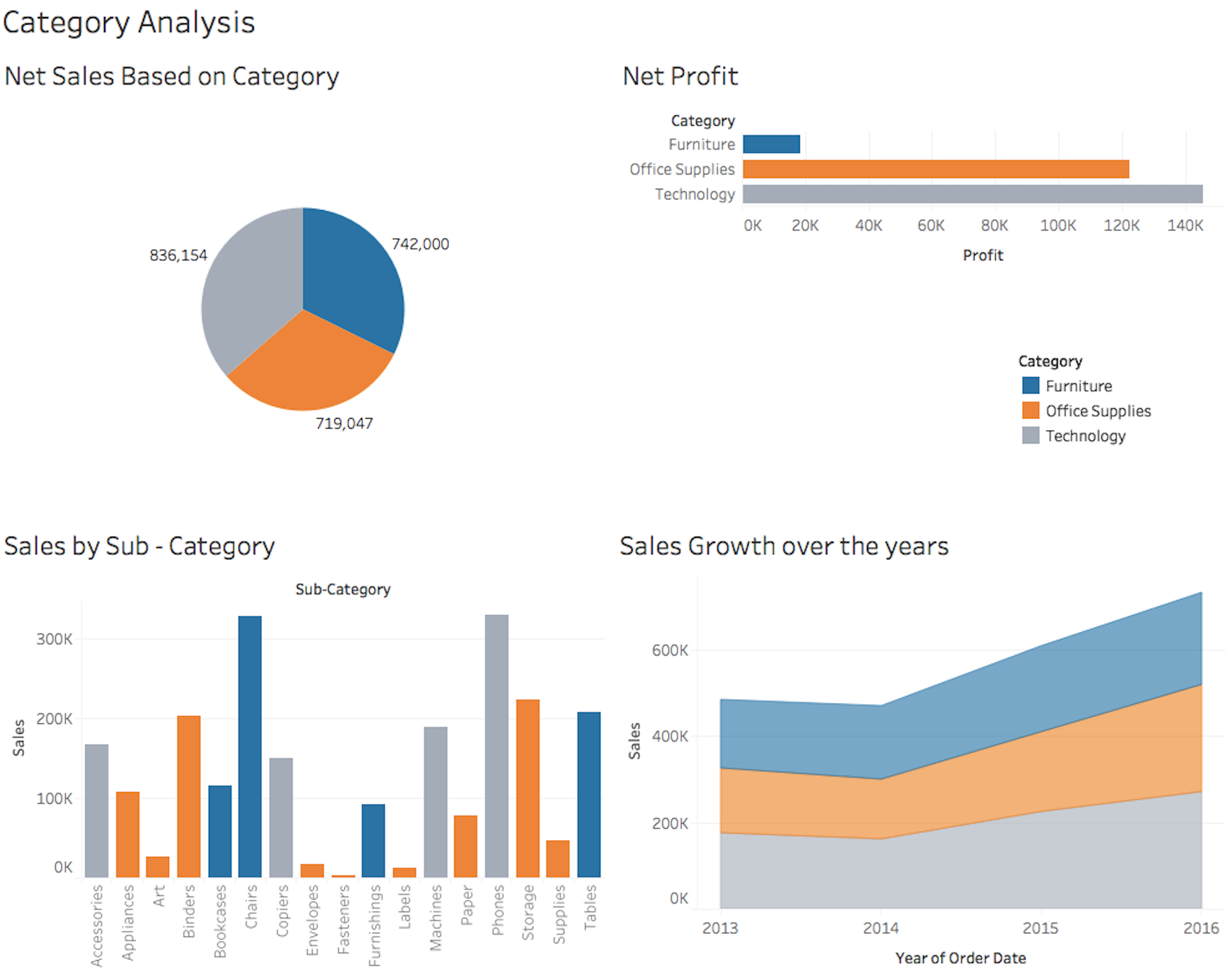
The visualization to the left is an example of what Tableau can produce when used by someone who knows the best way to visualize data. There is a pie chart, a bar graph, and a few other visualizations. It’s important to know that when creating such visualizations, coloring, font, size, and type all matter when determining how to best represent your data.
Recent Comments