Home » Uncategorized
Category Archives: Uncategorized
Pivot Tables
The pivot tablet is a value tool for any one who wants to present their data findings in different formats. Data that has many different components can be manipulated and shown to represent the information in any heading the user wants to highlight. For example, if the user has data that has several high points to represent say, sales of kitchen applicants. A pivot table can manipulate the header of the data by leading sales manufacture, must or least purchased applicants, or in any variant the user wants their data represented. This type of table can be a very useful tool when doing a presentation for a company that needs to know how sales for their company are doing, or to check on the competition’s sales on their different products. The pivot table can also be used for personal finances. A household budget can be entered and they can see the many ways their money can be saved or spent to keep them in healthy financial structure.
Family Budget
Business Sales Presentation

Infographic on Social Media
This infographic is a very relevant one to today population. Almost all people have some form of social media and this infographic clearly and successfully shows who has what and why these platforms are needed.
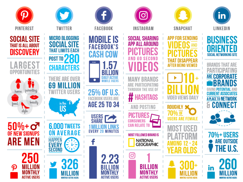
The different colors used is an excellent way to separate each platform while making it clear which data belongs to who. We can see that facebook has the most monthly users standing at 2.23 billion, and at the bottom of the other columns are other monthly user standings. This infographic is a great example of why infographics are useful when done correctly, it’s easy to read has relevant information and is eye catching.
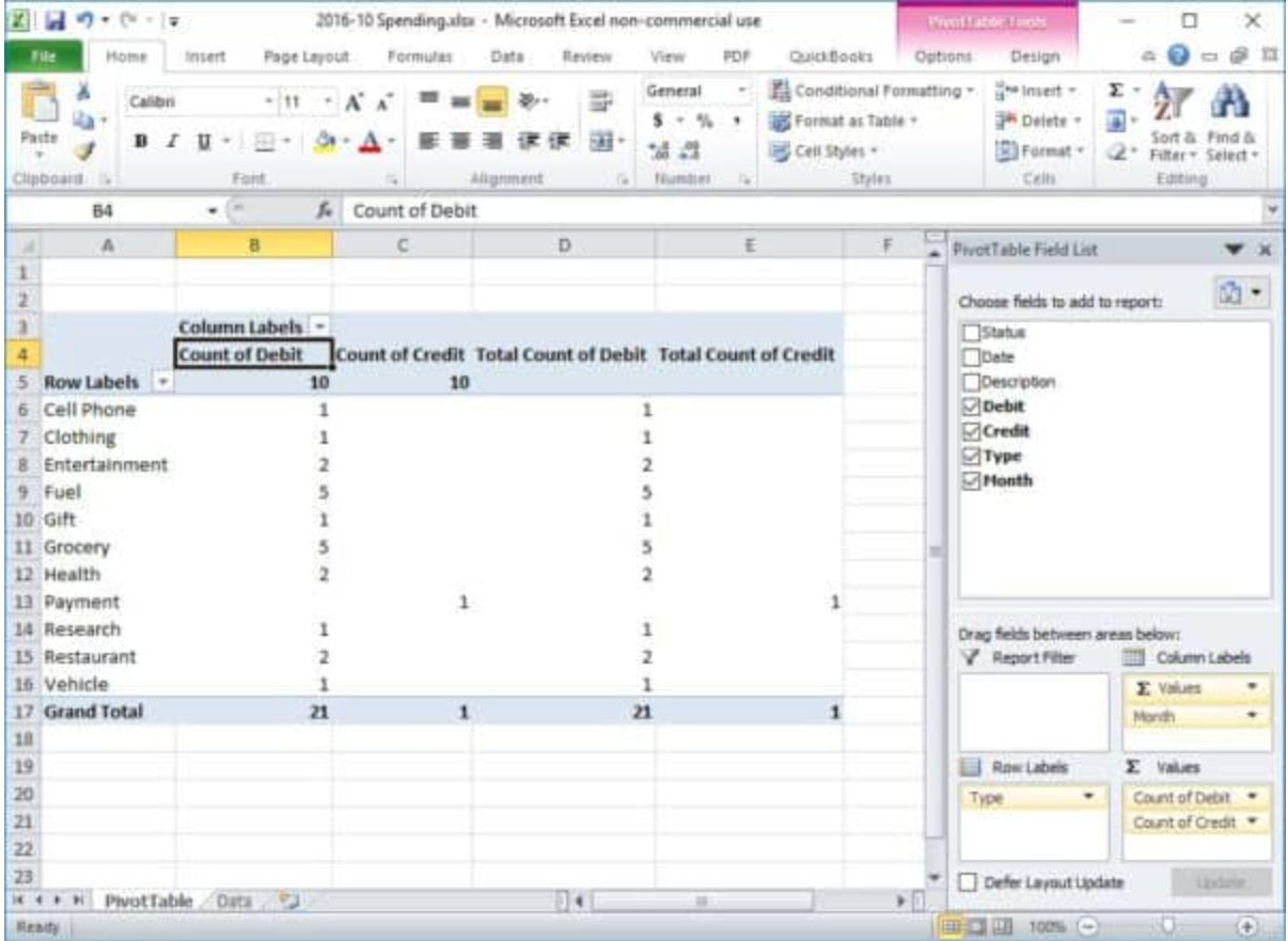
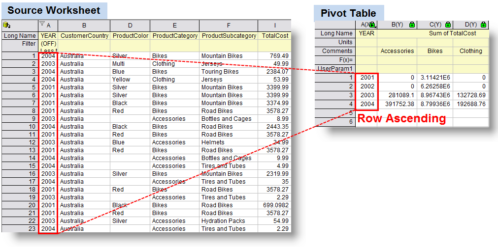
Pivot Tables
Pivot tables are similar to any other tables made to show data the difference is they are interactive. With just one click on data you can further and further break down that data into different categories.
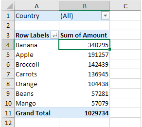
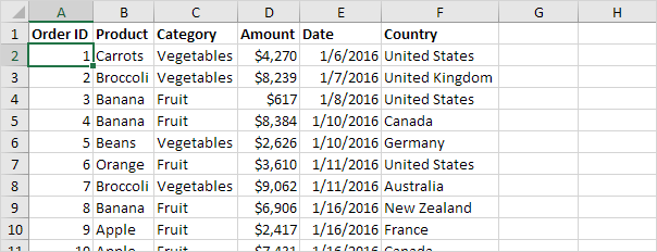
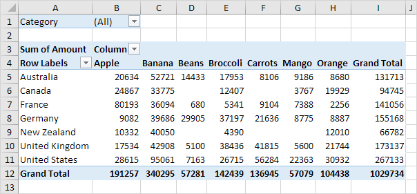
While the chart above looks simple its actually more complex than you think. More specific information can be filtered by clicking the drop down arrows and choosing information relative to what you need. Here we have fruits and how much each is sold for accumulative of all countries but let’s say we just want to see how much France is selling fruit for.
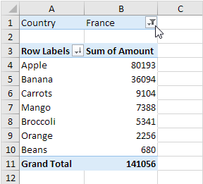
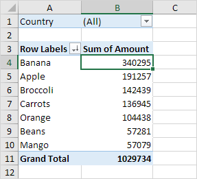
Just click drop down of countries and select France! Pivot takes a lot of data narrows it down or makes it very broad and general so the reader can chose what they want to see making these charts efficient data resources.
Pivot Table
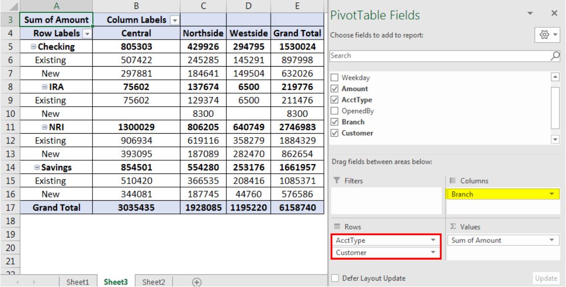
This Pivot Table is an impressive example of what you can do with Pivot Tables can do for you financially. With four labels in the first column, they do a good job showing the existing and new income for the four accounts. The columns labels seems to have to follow the same minimal style the row labels did and it works. It would be unnecessary to include too much information if it’s a simple budgeting and planning table like this. Having two grand totals (row and column) is a welcomed addition, as it provides the necessary detail for each bank account. For the untouched sections in the Legend, I’d be interested to see what the ‘Weekday’ would entail but find the ‘OpenedBy’ section unneeded.
Pivot Tables
When dealing with large amounts of data, it is often times difficult to organize and visualize everything in a manner that effectively arranges the data to communicate a clear message to the viewer. However, a very useful tool that can help in this situation is the pivot table. Pivot tables are best used to aggregate various values from a larger subset of values into a compact yet versatile table. Typically, they are also interactive with the ability to add or remove different categories or values to fit the needs of any given situation.
Uses
Pivot tables are often used in businesses to organize and present sets of data such as sales and inventory reports where there are hundreds and sometimes thousands of values that fall under many different categories.
Example
This data set consists of 213 records and 6 fields or categories. With the use of a pivot table, all of this data can be compressed into a more organized and readable format .
Now, all of the raw data is much easier to analyze through this pivot table that shows grand totals for each product, by location, as well as an overall total. While this is a very useful overview of the data, sometimes visualizing the entire data set can be excessive or simply unneeded. In this case, pivot tables really show their versatility with the option to filter the data to just the right specifications depending on what is needed.
Filters
In this example, the data from above is sorted by all locations and the totals for each product.
In this example, the data is filtered further to only present the totals for each product in the country of France.

Pivot Tables and It’s Importance
A Pivot Table is used to summarize, sort, reorganize, group, count, total or average data stored in a table. It allows us to transform columns into rows and rows into columns. It allows grouping by any field (column), and using advanced calculations on them. They give us the ability to get a summary or recap of the data rather than scrolling down to find each subtotal.
Here are some examples of Pivot Tables.
An important advantage of pivot tables is that it is easy to use. You can easily summarize data by dragging the columns to different sections of the table. The columns can also be re-arranged as you wish with the click of a mouse. With the help of excel pivot tables, you can handle large quantities of data in one single go. These tables allow you to take a large amount of data and work on it in such a way that you need to view only a few data fields. This helps in the easy analysis of large amount of data.
Pivot Tables

I chose this pivot table because it highlights some of the information, and is a good example. The higher percentage of email sign ups (18% and above) are shaded yellow, while the lower percentages are shaded blue. Pivot tables are primarily used to point out data. In this instance a good take away would be that email sign-ups in 2013 and 2014 are generally higher on wednesdays.
Pivot Tables
Spreadsheets can be intimidating. Although simple data sets may be more common, sometimes, there’s no way to prevent them from becoming complex as more columns and rows are added to accommodate additional information. To combat this, spreadsheet applications offer the option to include “Pivot Tables”.
A PivotTable is a powerful tool to calculate, summarize, and analyze data that lets you see comparisons, patterns, and trends in your data.
Retrieved from : support.microsoft.com.
In addition to providing basic instructions for a number of different spreadsheet applications, Lumeer mentions several uses for Pivot Tables. Throughout each example, however, it is evident how well the tool works at making otherwise convoluted data more intelligible.
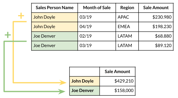
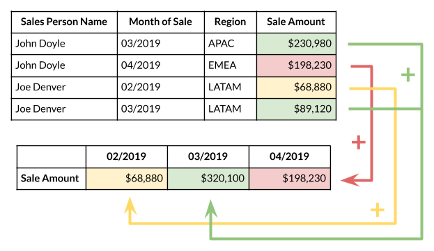
In this example, the original data set is altered to show the total sale amount of each salesperson across the timespan the data was collected from. This is only one possible adaptation of the data, however. If the sales amount by month is preferred, a different Pivot Table would fit the bill.
Depending on what factors a Pivot Table takes into consideration, the same data set can yield a multitude of different stories. While it may be a cliché to suggest that the possibilities are endless, that is exactly the appeal and purpose of Pivot Tables. With their help, any element can be added to a data set and be presented concisely.

In this spreadsheet, data spread across 135 cells take factors such as transaction type, method, status, method, and date into consideration. With earlier examples in mind, it is easy to imagine how any number of Pivot Tables can represent the data. By isolating desired information, they are an invaluable tool for displaying and sharing data in ways that are more effective than the original table on its own.
Pivot Tables
What is a pivot table?
A pivot table is somewhat like a report, however it gives you an interactive view of the data. It allows use to specifically categorize small portions of data into separate units.
Importance of a Pivot Table?
A pivot table is very useful in excel, it allows an individual too easy and effectively create and organize a wide variety of data. I can be used to create reports and analysis within a large data set.
This example pivot table shows various categories of the state and county as a focal point, and then shows the population as well as the square miles of both land and water. This example is a good explanation of how. you can organize and create specific categories to compare side by side while still keeping it in relation to a specific topic in this case it’s the state. As you can see the comparison between census(population) in the 2000’s compared to the. 1990’s.
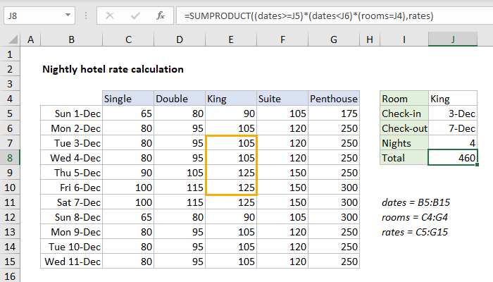
This pivot table is a great example of cost comparison as well as defining them through specific dates within a month. As you can see there are 5 categories defining the specific room type for each date and as the room size gets bigger the price increases. This is a great data set used by hotels, or any company that has packages within their business.
Link to create your own pivot table:
Pivot Tables
After reviewing the link on www.contextures.com,
I found useful information to assist me in trying to format a organized pivot table. In excel, pivot tables are known to be the most powerful, useful, and beneficial for large data sets. They summarize, sort, and organize information in tables that are easily adjustable. They allow you to interact and explore data in different ways and look at the same data with different perspectives.
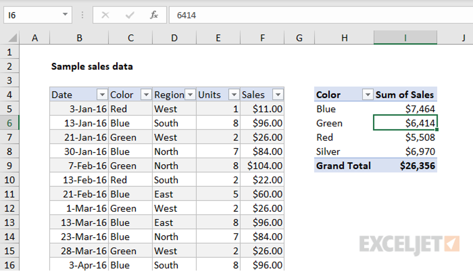
An example of a sales data set, from ExcelJet includes a pivot table that is easy for adjustments because in this case data changes frequently. There are many other benefits to using Pivot Tables, they are easily changeable or flexible. They are accurate, take less time, and you can create pivot charts from the pivot table.
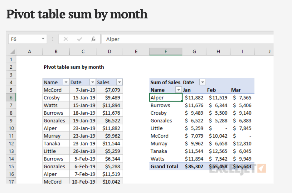
With pivot tables there are many ways to summarize and group data, for example the pivot table sum by the month using the data grouping feature on excel.
Recent Comments