Home » Data Visualization and Art
Category Archives: Data Visualization and Art
Comparing Numbers
One of the best methods to compare numbers/data is a bar graph. They are bars that are used in vertical or horizontal form to represent numbers/data. The length of the bar is used to display the value and the color of the bar is used to label what the number is representing. Bar graphs are the best and simplest way to represent and compare data among different groups easily. Bar graphs can show the major changes in numbers and values in data over time.

Examples of Insightful data visualizations that compare numbers
Sometimes using regular text instead of data visualizations is the best way to compare numbers.
1/10 people in the United States have a substance abuse problem
However using data visualizations could make the information more appealing to the viewer.

https://www.displayr.com/12-visualizations-to-show-a-single-number/
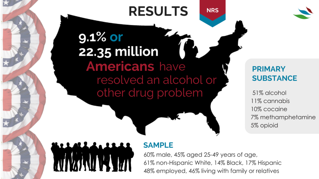
https://www.recoveryanswers.org/research-post/1-in-10-americans-report-having-resolved-a-significant-substance-use-problem/

https://www.displayr.com/12-visualizations-to-show-a-single-number/\
Data visualizations are a great way to display data and compare numbers!
Comparing Numbers
Google Analytics is a good free to use site that allows for good data visualizations for business. It allows users to visualize and understand the sales of the business. The site builds visualizations based on data regarding the number of sales, location of sales; whether they are from multiple online sites or store locations, as well as profits, expenses. It is even good to use for marketing to analyze the feedback and receptiveness of the ads that companies are using. Using this tool allows for users and developing businesses to take advantage of free software that will better help them understand and improve different aspects of their business because the relevant data is presented to them in a clear concise manner that allows them to understand the full scope of their business. Other comparable sites do have more features, but they do come with a price tag. Google Analytics even though it is free it is intuitive enough to give users enough features and visual representations in order to help them visualize and compare their data to help them improve and expand as a whole.
Google Analytics may be a little complicated for new users, but the site has plenty of tutorial videos to aid users in creating the necessary visualizations that they require. Having multiple resource tutorials allows new users to not only learn how to use the site but also teaches them which visualizations are the best to convey the message that the data intends to. Users that have a better understanding and grasp of the site and the visualizations to accomplish their intended goal allows them to be in a better position to grow and expand compared to their competition that may not be comparing its data to see in what areas they can improve on to achieve that end goal.
Watch the video below to get a brief overview of Google Analytics:
Click here to read a more in-depth review of Google Analytics.
Vizhealth: Frank Figurelli
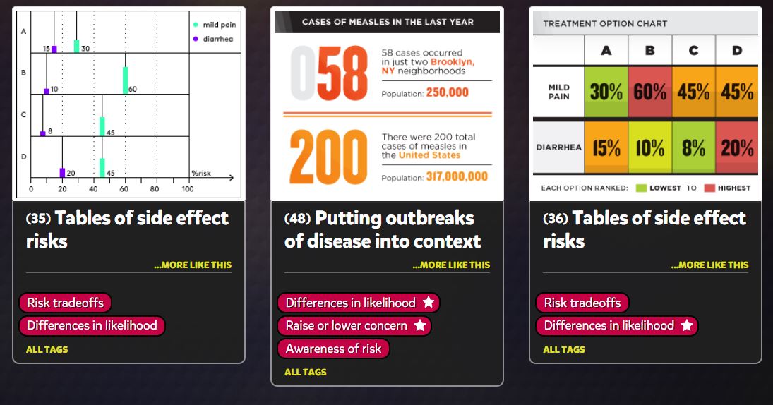
I think this website is a really cool time saver. Vizhealth created a gallery of easy and simple graphs, charts, and images that effectively communicate risk information. I think this is crucial for people because personal health is something that is usually very neglected in this country, especially during the pandemic. The “wizard” section of the website is the most important. It asks you your primary goal of what you are looking for, and if you need exact risk numbers or the basic idea. This narrows down the data and search criteria which will end up giving the user more accurate and useful information. Data visualizations should be quick, easy, and efficient. This website is the prime example of all of those words and is an incredible tool for data visualization and health. Everyone should be looking after their health and certain risks they may have and this website allows people to do that while saving lots of time. I cannot stress enough how useful this site really is. (6) Visualizing Health – YouTube
Recent Comments