PIE CHARTS
The Pie chart is one of the most recognizable charts that is used for visualization of all kinds of data. We have always seen them in newspapers and in textbooks, and now on the internet. Pie Charts are a great way to communication simple data or polls that have fewer legends to present that if it was graphed on a bar graph or line graph. And unlike these graphs the Pie chart is great to show 100% of something and present it in a set period. The title of the chart should have direct meaning to allow for quick understanding for what is shown in the chart. The use of making each piece as colorful as you need will help catch the attention of your viewer as well. Using the Pie Chart also helps in making sure that your data is correct in that if all the pieces do not equal 100% than the data is off, and corrections need to be made. It is not useful if your collective information or poll research has overlapping percentage for the legends and a Pie Chart is not the infographic for your data.
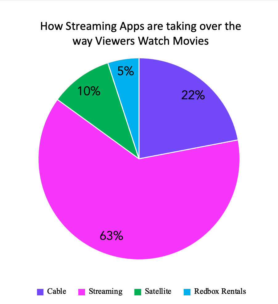
The Pie chart that I created with my fictitious poll data is on how people view movies today. I used bright colors to represent my legends and to make it fun and attractive to the follower of the blog. This is the best infographic to use for my poll because the total of my data equals 100%, the pieces of pie are large enough to have clear view of the numbers used. Also, there are no two pieces that are similar in size that would misrepresent the data percentage on any of the different tools that people use to match their movies.
URL: https://nces.ed.gov/nceskids/help/user_guide/graph/pie.asp
URL: https://www.shutterstock.com/image-vector/3d-pie-chart-infographic-used-presentation-387105985
Pie Chart
Pie charts are an effective way to show different parts of a whole. A simple comparison is data that adds up to 100. So if 100 students were surveyed about their favorite subject this data could be transferred into a visually appealing and easy. to understand pie chart.
I found data about the many different degrees people received in 2019. The 5 most popular were highlighted in the chart and to complete the whole survey I used “other” to represent the many degrees people had earned.

Pie Chart
The best time to use a pie chart is when you are comparing multiple categories that add up to 100. It is also important to not have too many categories because that can make the pie chart look cluttered and unappealing. This can also make it hard to read which completely defeats the purpose of having a chart to look at. It is also important to not have too many colors because this can be a distraction as well.
Perfect Pie Chart
There are many different types of charts that can be successful at portraying data. Today we will be looking at a pie chart and what kind of data would work with this kind of chart most successfully.
Pie charts are used when a presenter wants viewers to see the relationship between parts of their data and all of their data as a whole, because as we know pie charts are usually based out of 100% and all of our small slices add to that 100%. Pie charts are especially useful visually, the viewer can clearly compare the small fragments to the large. Like we can see below.
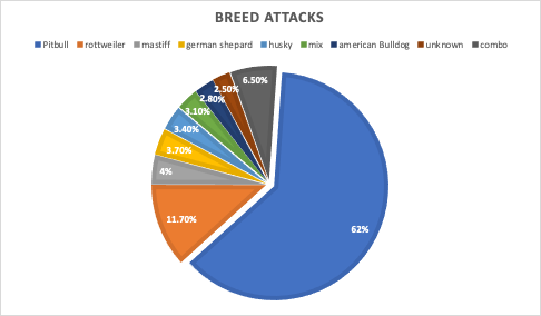
When looking at this pie chart we can see a clear winner on what dog breed is the most aggressive, Pit bulls are taking up more than half the chart at 62% in dog attacks. Then we can still clearly see Rottweilers have the second biggest slice putting them right under pit bulls in attacks. After these two statistic the viewer can further their part to whole understanding by seeing the rest of the data is almost all equal making no clear smallest slice. Data labels play such an important part of pie charts when the slices aren’t enough to convey the data just visually then we can read to find out more information. The data labels above reveal our unknown category is the smallest.
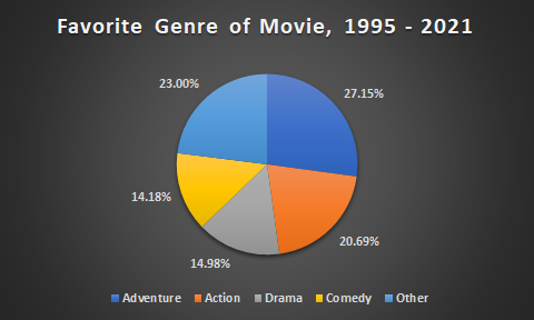
Pie Chart – Favorite Movie Genre
Ultimately, pie charts are used to show a slice of data in a complete circle, or a whole of nominal data. Having a variety of uses and are used arguably in business practices the most. They can show a percentage of subjects surrounding types of customer opinions, revenue, and categorization in an easily understandable way. Compared to other charts, keeping only five categories is wise, as you don’t want to overwhelm your audience with too much information and lose interest.
https://www.the-numbers.com/market/genres
This pie chart is a great example, showing popularized genre differences from 1995 to 2021. Each slice is distinguished through color and data, with the percentages shown on the outside to take up unnecessary “white-space.” If you’d like to go more in depth with this information, a bar graph would be preferred as you can display more genres and different groups of people who liked a specific genre.
Pie Charts
Pie charts are common visualizations that can be used to display parts of a whole as slices of a circle. They are very useful when trying to show relativity between pieces of data such as which slices are smaller or larger or to show a majority.
When pie charts should not be used
- If the data does not add up to a whole (100%)
- If there are too many data points
- If the data is spread across a time period
What makes a good pie chart
- Distinct slice colors
- Clear labeling that is not too large
- A reasonable amount of slices; no more than seven
- Accurate data; slices should add up to the whole (100%)
Example of a pie chart
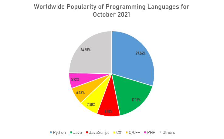
This is a good example of a pie chart that follows the basic rules and displays a clear message about the data to the viewer. Since the data about popularity of programming languages was collected as percentages, or parts of a whole, the pie chart was a great option to show what languages are most commonly used and how they compare against each other. It also does not have too many slices that overcrowd the whole chart and make it difficult to read. The labeling is also clear with a distinct set of colors to differentiate between each data point. An alternative chart that could be used to visualize the popularity of programming languages could be a bar graph to show how each language stacks up overall.
Pie Chart For Browser Usage
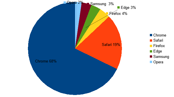
Pie charts are used to represent the proportional data or relative data in a single chart. The concept of pie slices is used to show the percentage of a particular data from the whole pie. Making them different colors can help the reader to differentiate each result. Pie charts show the proportion of the whole that is taken by various parts.
Pie Charts
A pie chart is a circular visual graphic which is divided into specific slices sized perfectly from percentages of categories to create sum up to 100%. This type of chart can be easily read and comprehend due to the association of part-to-whole and unity. However it can. be easily misinterpreted if one doesn’t us it in the proper ways. Here. are some rules you can follow to create a successful pie chart.
1. Don’t use more than five
Limit your slices to 5 or less, any more and it could hard to read.
2. No more than 1 pie chart
Never compare data between two charts, one is already a lot to. process, instead you should try and use stacked bar charts.
3. No 3-D charts
3-D effects may be eye catching and unique, however it can cause the data and labeling to be distorted. It’s best to keep thing simple and maybe use a fun and legible font to create a unique style
4. Use various colors
With any chart you should use a single color for each category, however it is very important in doing so with a pie chart , if you place two colors of the same hue the data can become manipulated. Also with two many categories limits your color choice allowing chaos and overcrowding.
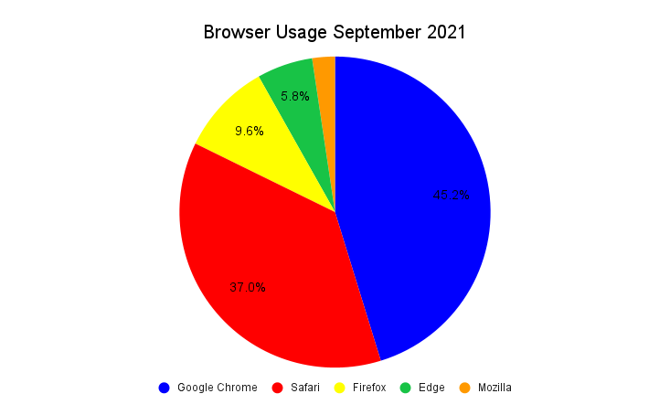
Here is a great example using simple data from statistics of browser usage of American citizens in the month of September. This graph shows all the the rules properly to create a simple but effective pie chart which is able. to be easily. comprehended to the audience. However, give if were to choose a different chart I would probably go with a horizontal bar graph to so an alternative of the size proportions between each category.
Pie Charts
Pie charts are used for many reasons, but for the most part they can determine parts to a whole. The sizes of the slices in the pie chart will determine what has more, and what has less. When using a pie chart to compare, determine, and visualize data, there are many different cases that pie charts are beneficial for determining what consumes more of the 100%. Some design ideas for pie charts are to make sure colors are not too similar, and the graphs are easy to determine what is the biggest or smallest part of the whole.
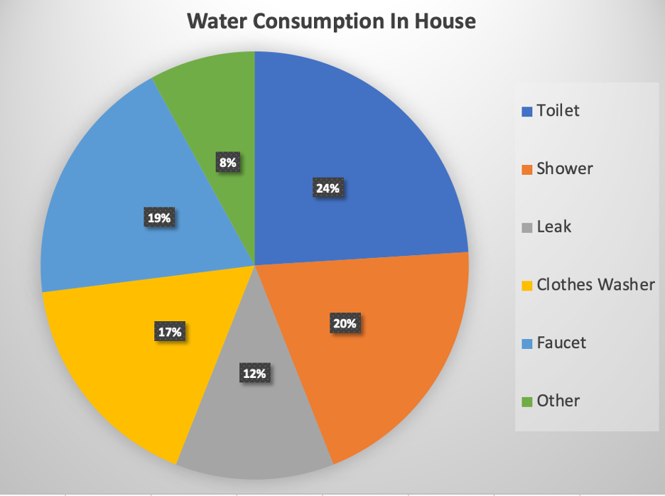
According to the United States Environmental Protection Agency, the use of water in a household in 2016, was best shown using a pie chart. In this case, the use of water in the toilet is the most. Representing this information as fractions of a whole, in a pie graph was the best way to visualize this data.
The perfect use of a pie chart.
Lollipop Graphs
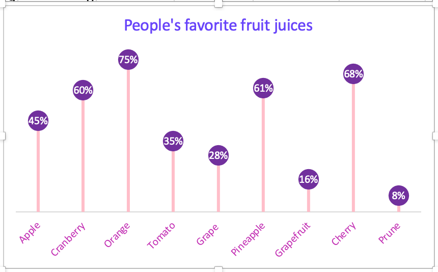
The lollipop graphs are fun way of making a visualization of lighthearted data. Although there was a lot of work put into creating this graph the out come is cute but affective. The graph starts out as a scatterplot graph with x-values and y-values and with a click of a buttons to the delete some lines, add a few extra percentages to sizes of markers and lines to form the lollipop like image. The changing of some numbers for names of the data and in no time ( but for me it took a little longer to make work) the shape and formation of lollipops magically appear.
The lollipop graph I created was a fictional poll of favorite fruit juice people drink. I chose colors that made it fun and “pop” with color. I used Microsoft Excel to log in my data and the graphs and tools to put the graph together. With guidance and direction of instructions I came up with a crafty and cheerful lollipop graph. This type of infographics would be great for blogs and websites that direct their information or product sales to their buyers and viewers who want the data displayed in an enjoyable setting.
Recent Comments