The Pie chart is one of the most recognizable charts that is used for visualization of all kinds of data. We have always seen them in newspapers and in textbooks, and now on the internet. Pie Charts are a great way to communication simple data or polls that have fewer legends to present that if it was graphed on a bar graph or line graph. And unlike these graphs the Pie chart is great to show 100% of something and present it in a set period. The title of the chart should have direct meaning to allow for quick understanding for what is shown in the chart. The use of making each piece as colorful as you need will help catch the attention of your viewer as well. Using the Pie Chart also helps in making sure that your data is correct in that if all the pieces do not equal 100% than the data is off, and corrections need to be made. It is not useful if your collective information or poll research has overlapping percentage for the legends and a Pie Chart is not the infographic for your data.
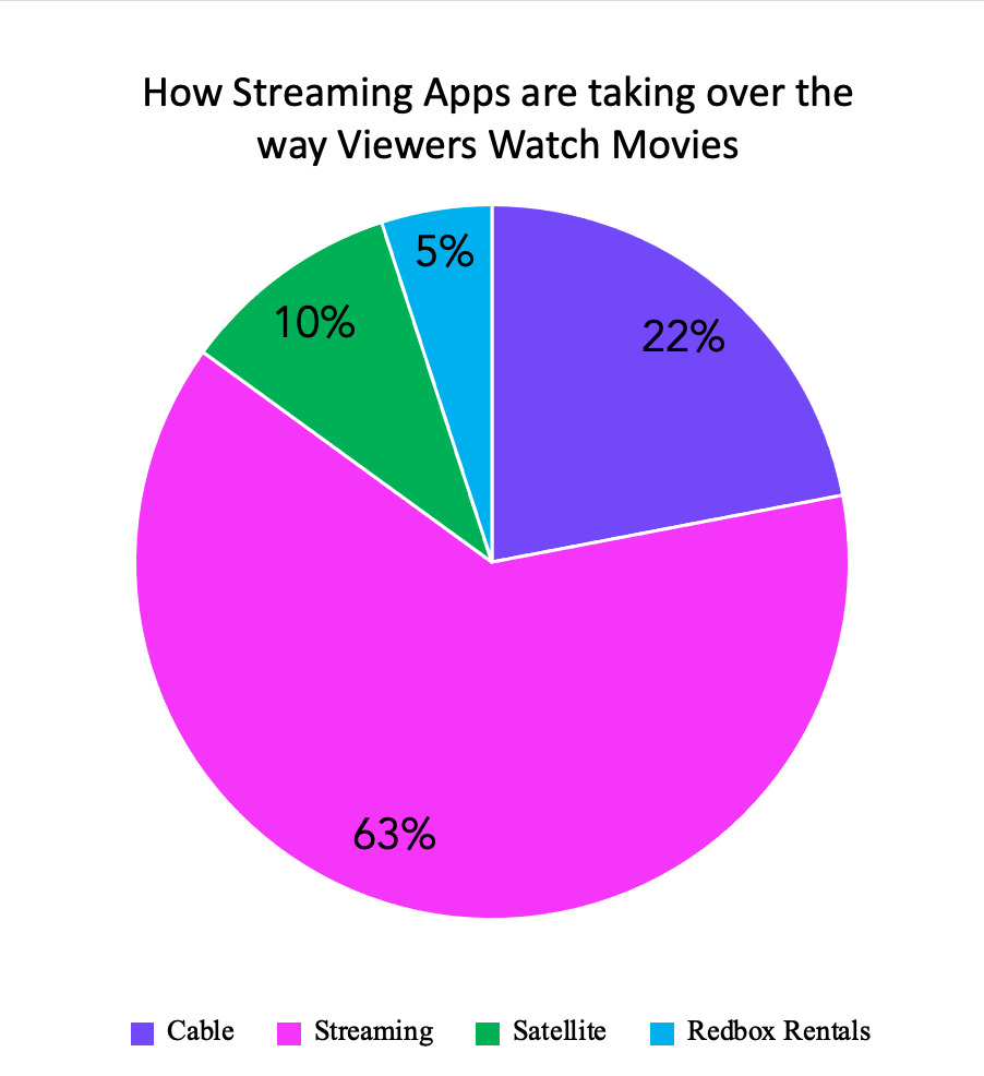
The Pie chart that I created with my fictitious poll data is on how people view movies today. I used bright colors to represent my legends and to make it fun and attractive to the follower of the blog. This is the best infographic to use for my poll because the total of my data equals 100%, the pieces of pie are large enough to have clear view of the numbers used. Also, there are no two pieces that are similar in size that would misrepresent the data percentage on any of the different tools that people use to match their movies.
URL: https://nces.ed.gov/nceskids/help/user_guide/graph/pie.asp
URL: https://www.shutterstock.com/image-vector/3d-pie-chart-infographic-used-presentation-387105985
Recent Comments