Home » Pie Charts
Category Archives: Pie Charts
Pie Chart
The best time to use a pie chart is when you are comparing multiple categories that add up to 100. It is also important to not have too many categories because that can make the pie chart look cluttered and unappealing. This can also make it hard to read which completely defeats the purpose of having a chart to look at. It is also important to not have too many colors because this can be a distraction as well.
Pie Charts
Pie charts are common visualizations that can be used to display parts of a whole as slices of a circle. They are very useful when trying to show relativity between pieces of data such as which slices are smaller or larger or to show a majority.
When pie charts should not be used
- If the data does not add up to a whole (100%)
- If there are too many data points
- If the data is spread across a time period
What makes a good pie chart
- Distinct slice colors
- Clear labeling that is not too large
- A reasonable amount of slices; no more than seven
- Accurate data; slices should add up to the whole (100%)
Example of a pie chart
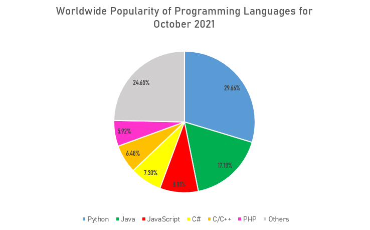
This is a good example of a pie chart that follows the basic rules and displays a clear message about the data to the viewer. Since the data about popularity of programming languages was collected as percentages, or parts of a whole, the pie chart was a great option to show what languages are most commonly used and how they compare against each other. It also does not have too many slices that overcrowd the whole chart and make it difficult to read. The labeling is also clear with a distinct set of colors to differentiate between each data point. An alternative chart that could be used to visualize the popularity of programming languages could be a bar graph to show how each language stacks up overall.
Pie Charts
Pie charts are another effective way of visualizing data for other viewers. There are two instances that constitute the utilization, they are when comparing to show the part-to-whole relationship or when trying to show that one segment is relatively large or small. Typically these types of visualizations are most effective with data that are roughly around either 75%, 50%, or 25%. This is due to the fact that it is easier for viewers to interpret and analyze the data since they can use their past knowledge on parts of a whole to clearly analyze and infer that the segments are represented correctly.
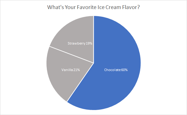
Favorite ice cream flavors are a perfect example of using a pie chart. In this case, we are showcasing the popularity of chocolate compared to vanilla and strawberry. Choosing an appropriate color scheme is important, too much color distracts the viewer and takes away from the message trying to be conveyed. So in this instance chocolate is the only segment with color because it is the section that we what the viewer’s attention to focus on to compare against the other two segments. By adding appropriate colors, data and labels make it easier for viewers to analyze and interpret, which in turn aids in the understanding of the message trying to be conveyed through the representation.
I think the pie chart is the perfect representation for this data because it effectively showcases the popularity of chocolate compared to the other popular flavors. If I had to pick another visualization to create I think a bar graph depicting the votes for each flavor would be another strong choice to represent the data and convey a similar message.
Pie Charts
A pie chart is best used when trying to work out the composition of something. If you have categorical data then using a pie chart would work really well as each slice can represent a different category that will all total up to 100%. A pie chart only works well when you have one set of data.
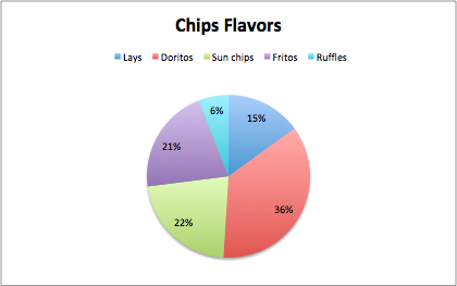
The data that I chose was different chips brand by category. The data is displayed in a pie chart and there are five categories. Each slice of the pie is a different color and is labeled the percentage of students on campus that prefer that chip brand. I think the best way to present this data would be a pie chart. An alternative can be a bar graph which would make sense and work, but a pie chart is the best visual choice for the data. Some design tips that i came across were the color choices and the format data labels which allowed me to add the percentages to each slice to help understand the data because sometimes the slices are close to size. This just gave my pie chart a better look for presenting.
Recent Comments