Pie charts are common visualizations that can be used to display parts of a whole as slices of a circle. They are very useful when trying to show relativity between pieces of data such as which slices are smaller or larger or to show a majority.
When pie charts should not be used
- If the data does not add up to a whole (100%)
- If there are too many data points
- If the data is spread across a time period
What makes a good pie chart
- Distinct slice colors
- Clear labeling that is not too large
- A reasonable amount of slices; no more than seven
- Accurate data; slices should add up to the whole (100%)
Example of a pie chart
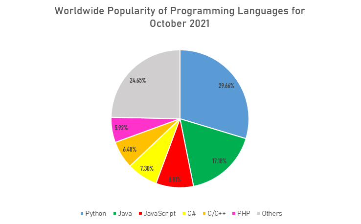
This is a good example of a pie chart that follows the basic rules and displays a clear message about the data to the viewer. Since the data about popularity of programming languages was collected as percentages, or parts of a whole, the pie chart was a great option to show what languages are most commonly used and how they compare against each other. It also does not have too many slices that overcrowd the whole chart and make it difficult to read. The labeling is also clear with a distinct set of colors to differentiate between each data point. An alternative chart that could be used to visualize the popularity of programming languages could be a bar graph to show how each language stacks up overall.
It’s weird seeing Python as the top programming language when Stockton and many other colleges specialize in Java and C++ more.