Pivot Tables
When dealing with large amounts of data, it is often times difficult to organize and visualize everything in a manner that effectively arranges the data to communicate a clear message to the viewer. However, a very useful tool that can help in this situation is the pivot table. Pivot tables are best used to aggregate various values from a larger subset of values into a compact yet versatile table. Typically, they are also interactive with the ability to add or remove different categories or values to fit the needs of any given situation.
Uses
Pivot tables are often used in businesses to organize and present sets of data such as sales and inventory reports where there are hundreds and sometimes thousands of values that fall under many different categories.
Example
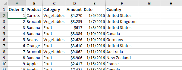
This data set consists of 213 records and 6 fields or categories. With the use of a pivot table, all of this data can be compressed into a more organized and readable format .
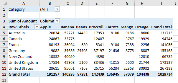
Now, all of the raw data is much easier to analyze through this pivot table that shows grand totals for each product, by location, as well as an overall total. While this is a very useful overview of the data, sometimes visualizing the entire data set can be excessive or simply unneeded. In this case, pivot tables really show their versatility with the option to filter the data to just the right specifications depending on what is needed.
Filters
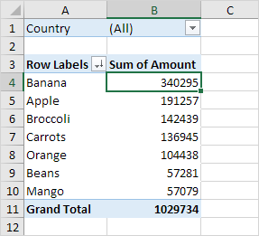
In this example, the data from above is sorted by all locations and the totals for each product.
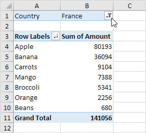
In this example, the data is filtered further to only present the totals for each product in the country of France.
Sankey Visualizations
In 1898, Matthew Henry Phineas Riall Sankey developed the Sankey Diagram when he wanted to visualize the energy efficiency of a steam engine. Since then, Sankey diagrams have been used in many different ways across various fields of study to show flow over time between stations. For example, in the webpage titled, “What You Need To Know About Energy” by The National Academies of Sciences Engineering and Medicine, the Sankey diagram is used multiple times to visualize the flow of energy sources throughout the United States and in specific states such as California.
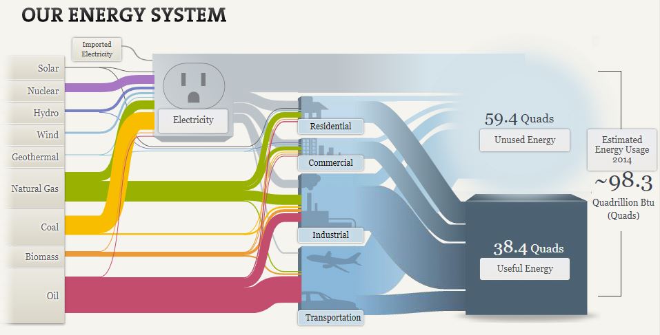
While this may seem very complex at first, it is really not too bad and it effectively visualizes the distribution of energy sources to their respective industries in 2014. It is very interesting to see how important the traditional oil, coal, and natural gas industries still are despite the large pushes towards renewable energies such as solar, wind, and hydro.
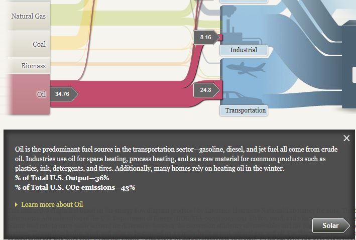
Another interesting thing I found on this site is the breakdown and visualization of CO2 emissions from each energy source. Of the nine energy sources, only three contribute to all of the U.S. CO2 emissions. They include, oil (43%), coal (29%), and natural gas (28%). This helps the viewer see and understand how the largest sources of energy are also the largest contributors of carbon dioxide emissions despite the “cleaner” alternatives that are available.
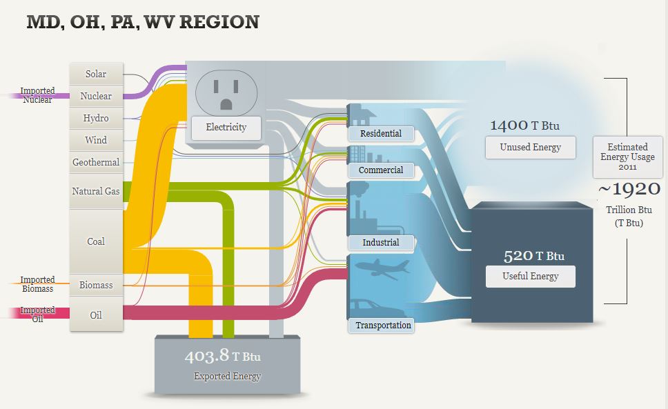
This Sankey diagram looks very similar to the first one but it is slightly different and covers the regional energy system of Maryland, Ohio, Pennsylvania, and West Virginia. In this diagram, it visualizes imports and exports as well as the general energy usage. You can see how the imported energy sources come in on the left and how they are distributed across the grid. It is also important to note how much energy is exported from this region through sources such as coal and natural gas. This is clearly shown from the divergence of these channels that contribute to almost 404 Trillion British Thermal Units of exported energy.
Overall, this is a very informative website that has great examples of effective uses of Sankey diagrams. There is a lot of good information about the energy systems of the United States but also more specific data on related topics such as energy efficiency and the pros and cons of different forms of lighting.
Pie Charts
Pie charts are common visualizations that can be used to display parts of a whole as slices of a circle. They are very useful when trying to show relativity between pieces of data such as which slices are smaller or larger or to show a majority.
When pie charts should not be used
- If the data does not add up to a whole (100%)
- If there are too many data points
- If the data is spread across a time period
What makes a good pie chart
- Distinct slice colors
- Clear labeling that is not too large
- A reasonable amount of slices; no more than seven
- Accurate data; slices should add up to the whole (100%)
Example of a pie chart
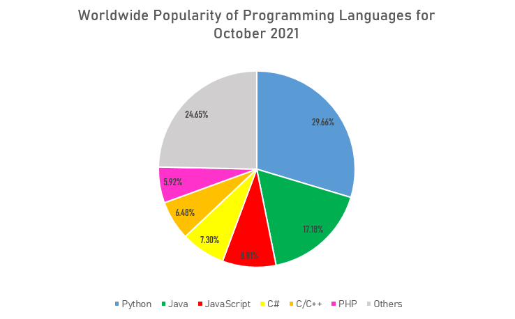
This is a good example of a pie chart that follows the basic rules and displays a clear message about the data to the viewer. Since the data about popularity of programming languages was collected as percentages, or parts of a whole, the pie chart was a great option to show what languages are most commonly used and how they compare against each other. It also does not have too many slices that overcrowd the whole chart and make it difficult to read. The labeling is also clear with a distinct set of colors to differentiate between each data point. An alternative chart that could be used to visualize the popularity of programming languages could be a bar graph to show how each language stacks up overall.
Lollipop Charts
Lollipop charts are very similar to bar charts and can be used to show how data behaves over time or to compare data sets. The design is rather self-explanatory where the chart has lines with circles at the end to represent data points which resemble lollipops.
An example of a lollipop chart is one I created after researching data on what the most popular car colors are in the United States.
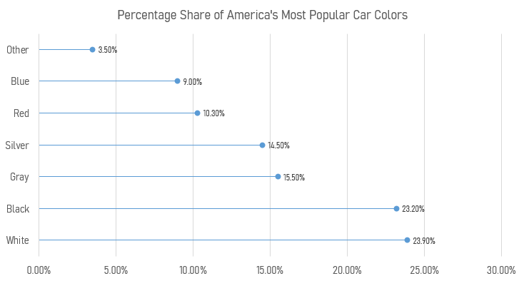
Using this chart creates a minimalistic and readable display of the data that clearly shows that white, black, and gray are the top three colors. Lollipop charts are very versatile and can be a very effective way of visualizing data.
Visual Benchmark Comparisons
Benchmark comparisons are some of the most important visualizations used in everyday applications. Some of these applications include business sales performance, educational performance, and investment analyses. Regardless of the situation, all benchmarks are used to show a comparison that allows the viewer to make a conclusion such as under or over performing.

Investing Applications
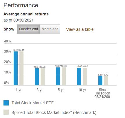
One real world example of a benchmark comparison is in investment analyses or stock performance graphs. As available from Vanguard.com, they have a performance graph that compares the average annual returns of their Total Stock Market ETF (VTI) with a benchmark Spliced Total Stock Market Index across multiple chunks of time. In this case, they used a bar graph to visualize the difference where the data of interest is highlighted in a vibrant blue color and the benchmark is in a less distracting grey shade.
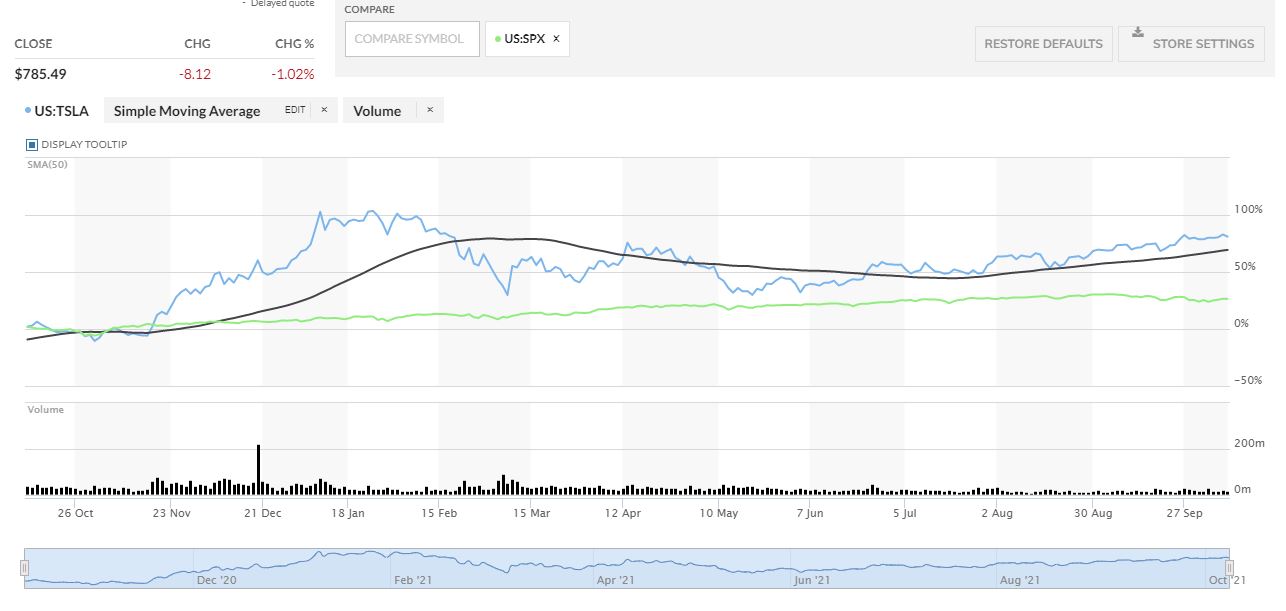
Another investment application is in the performance comparison graph between Tesla (TSLA) and the S&P 500 (SPX) from MarketWatch.com This graph is more complicated but it has a greater difference between the two that gives the viewer a better visualization of which one had a greater performance.
In this case, MarketWatch outlines Tesla’s stock price performance in blue while the price performance of the S&P 500 is in a vibrant green color. As seen in the graph, Tesla clearly outperformed the S&P 500 by a wide margin in the past year but it was much more volatile throughout the year.
Other Applications
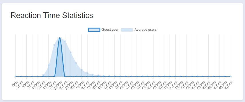
Another application of benchmark comparisons is with performance of bodily functions such as reaction time. There are various websites that have reaction time tests and will provide statistics based on a user’s results. The website I used is HumanBenchmark.com where I scored an average reaction time of 203 ms. The graph that is generated shows your score highlighted in a dark blue with the average of all other users in a lighter blue. Based on the graph, my score was almost directly in the middle of the bell curve that seems to be skewed to the right. I can conclude that my reaction time is right around average compared to other users.
Data Visualizations that Compare Numbers
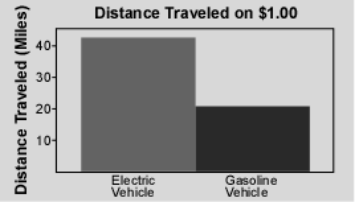
When presenting raw data in a document, it can be overwhelming for the reader and the message may not be communicated effectively. This is where data visualizations come in to make it easier to understand the relationship and meaning of a data set. To demonstrate, the analysis of electric vehicles can be used when compared to internal combustion engine (ICE) vehicles.
Electric Vehicles vs. ICE Vehicles
According to a study done by the Idaho National Laboratory, “… the distance that can be traveled for a fuel cost of $1.00 is more than twice as far with an electric vehicle” (INL). To visualize this comparison, they created a graphic that easily communicates this idea;
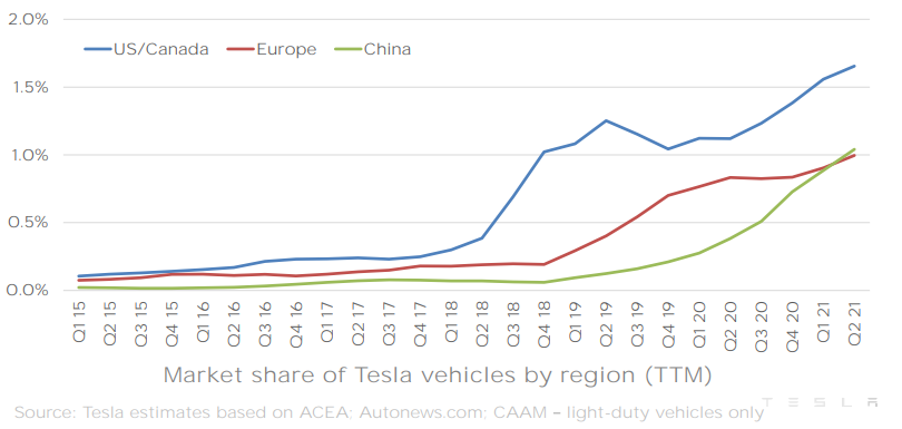
As electric vehicles have improved over the years, the market share for such vehicles has grown along with them. In a quarterly report by electric car manufacturer Tesla, they created a great infographic for their market share growth in different countries;
Comparing numbers can be difficult, but as seen in this example with electric vehicles vs. internal combustion vehicles, data visualizations can help bridge the gap and quickly relay a valuable message.
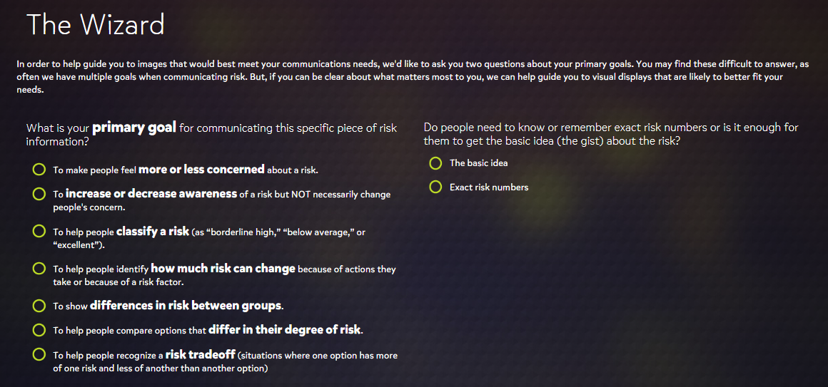
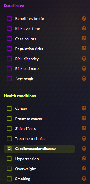
Visualizing Health
The Visualizing Health website offers a very professional feel to its wide variety of visualizations that assess health risks based on available data. It guides users through a wizard to gather information about what their goal is for communicating risk.
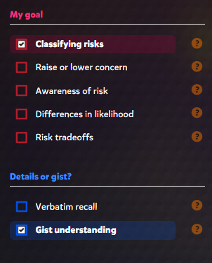
Upon completing the wizard guide, the website brings you to a great page that offers various criteria on the left side with corresponding graphics to the right. The criteria include goals and details that were prompted in the wizard guide that can be easily changed if a different result is desired.
Some of the other specifications include available data and the health conditions of interest. Depending on what boxes are checked, the website will display a bunch of colorful, informative, and effective graphics. The graphics range from pie charts, to histograms, and even to simple statistics that are offered in an efficient visual presentation.
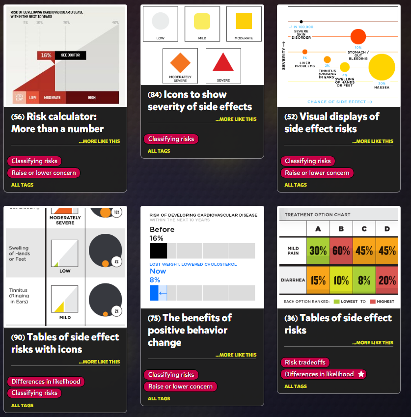
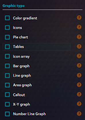
Another great feature that the website offers is the ability to change what graphic type you prefer. This is useful for narrowing down how you want to present your data for certain health risks. For example, a bar graph would be preferred for showing risk of certain diseases over time and this tool lets you filter for exactly that.
Overall, I think this is a great website not only for visually communicating health risks but also for learning how to use visualizations effectively. I was very impressed by the amount of features offered as well as the general design. The colors of the text, lines, and shapes are high in contrast with the dark background which makes the presentation visually pleasing. Everything is also organized neatly which makes this a great tool for all users.
Infographics
Examples of Insightful Data Visualizations
- Insightful data visualizations should present data in a concise and readable format that efficiently communicates a message to the viewer. Visualizations that present too much information, are too large or small, or present false information are not useful.
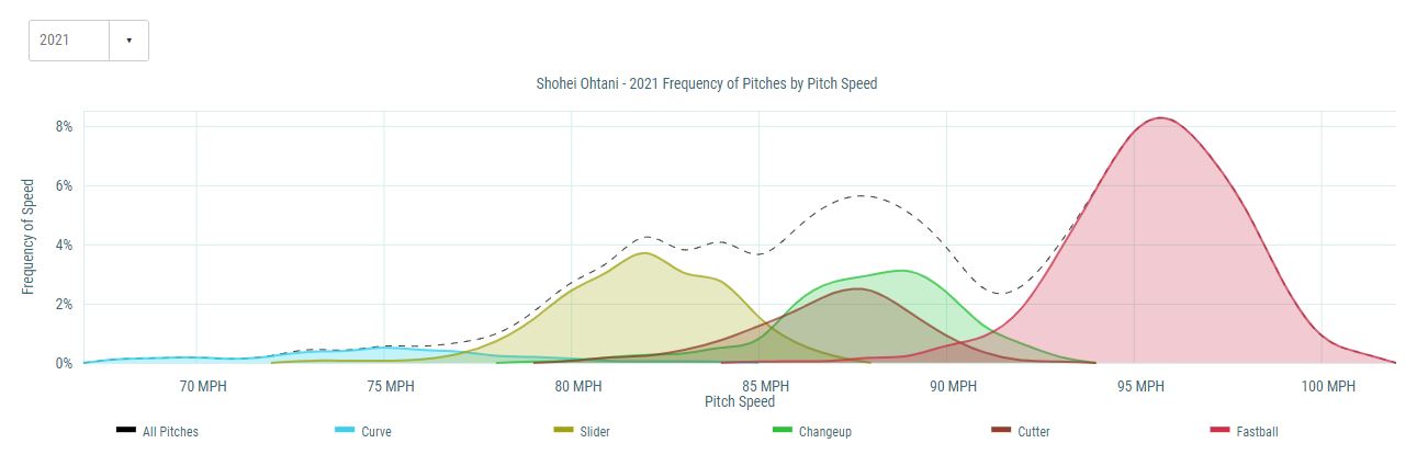
An example of an effective infographic that is used in the real world is the chart shown below displaying the frequency of pitches by pitch speed from the 2021 Major League Baseball season for the Angels pitcher, Shohei Ohtani.
Recent Comments