When presenting raw data in a document, it can be overwhelming for the reader and the message may not be communicated effectively. This is where data visualizations come in to make it easier to understand the relationship and meaning of a data set. To demonstrate, the analysis of electric vehicles can be used when compared to internal combustion engine (ICE) vehicles.
Electric Vehicles vs. ICE Vehicles
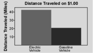
According to a study done by the Idaho National Laboratory, “… the distance that can be traveled for a fuel cost of $1.00 is more than twice as far with an electric vehicle” (INL). To visualize this comparison, they created a graphic that easily communicates this idea;
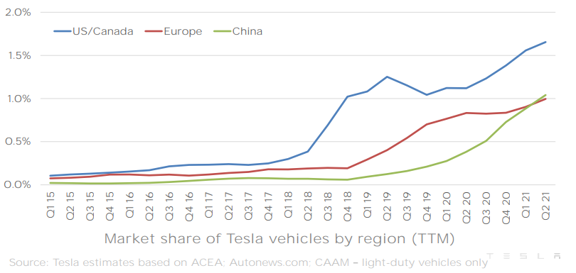
As electric vehicles have improved over the years, the market share for such vehicles has grown along with them. In a quarterly report by electric car manufacturer Tesla, they created a great infographic for their market share growth in different countries;
Comparing numbers can be difficult, but as seen in this example with electric vehicles vs. internal combustion vehicles, data visualizations can help bridge the gap and quickly relay a valuable message.
Recent Comments