What is Data Visualization?
Presenting data in visual graphics such as charts, maps, graphs, etc. to create both an appealing display and to allow the audience to easily understand the information presented
Two Ways To Present Data Visualization
Static: Printouts or web data that limit the viewer to only see and explore the data that is presented at the initial sight.

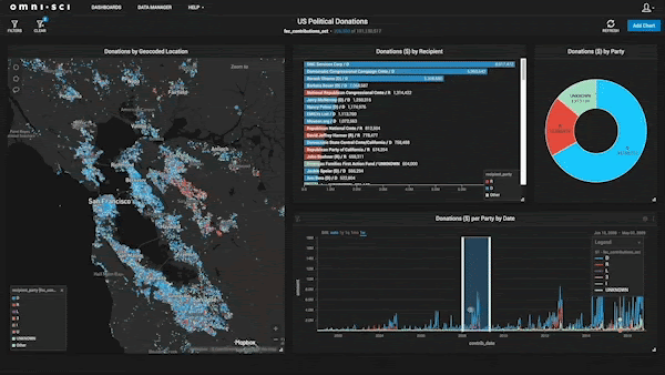
Interactive: Web data and multiple printouts that allows the viewer to engage in the information by providing various categories and hyperlinks to expand the information for better understanding
Finding The Best Fit
The first step in using data visualization is choosing the right one that will display your data in the appropriate manner. If you choose the wrong one can lead to misinterpretation of your data. These examples and breakdowns of known visualization will help you choose the best one for your data.
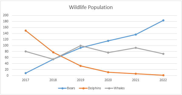
Line Chart(Display Trends)
They demonstrate an overall trend precisely that is hard to misinterpret. Good for showing trends in different categories over an extended period of time to support comparison
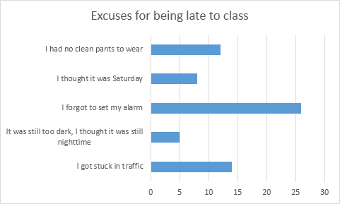
Bar Chart(Simple Break Down)
Great for displaying various values using color coded categories in a horizontal direction. Compared to a line graph you are able to add a specific category to break down the difference in better detail when you have a broader ray of data.
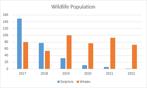
Column Chart(Compare multiple)
This is similar to a bar chart but is used bars in a vertical direction. This easily allows you to compare various data over time.
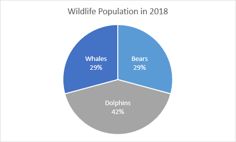
Pie Chart(Proportional Data)
This is a great choice when displaying percentages or specific numbers in an overall comparison of each other. Each part of the chart must come together to sum up and overall total. In order to create organization and understanding you should only use six categories or less.
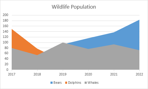
Area Chart(Comparison)
Very similar to a line chart, however the areas are completely filled with a color to represent each category. This way each area I stacked on top of each other to better show the comparison. This visualization can be best used to show relative values over a time period.
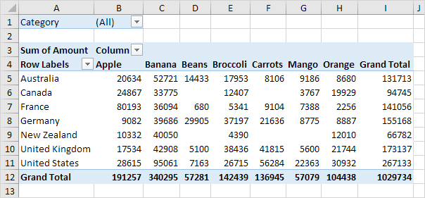
Pivot Table(Quick Summary)
This is a very popular yet simple ways to show data using visualization. Allows you to quickly summarize, assess, and organize large amounts of data while allowing you to customize your colors, fonts, and focus points of the data as needed to appeal to your audience.
There are many various data visualizations to choose from, however it is important to remember the purpose of the chart to show the best way to display your data in an effective and appealing way to the audience. There are also many free and subscribed softwares you can use based on your skill level that will allow you to create these charts, add your own data, and customize it appropriately such as.
Recent Comments