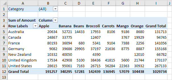
Pivot Tables
What is a pivot table?
A pivot table is somewhat like a report, however it gives you an interactive view of the data. It allows use to specifically categorize small portions of data into separate units.
Importance of a Pivot Table?
A pivot table is very useful in excel, it allows an individual too easy and effectively create and organize a wide variety of data. I can be used to create reports and analysis within a large data set.
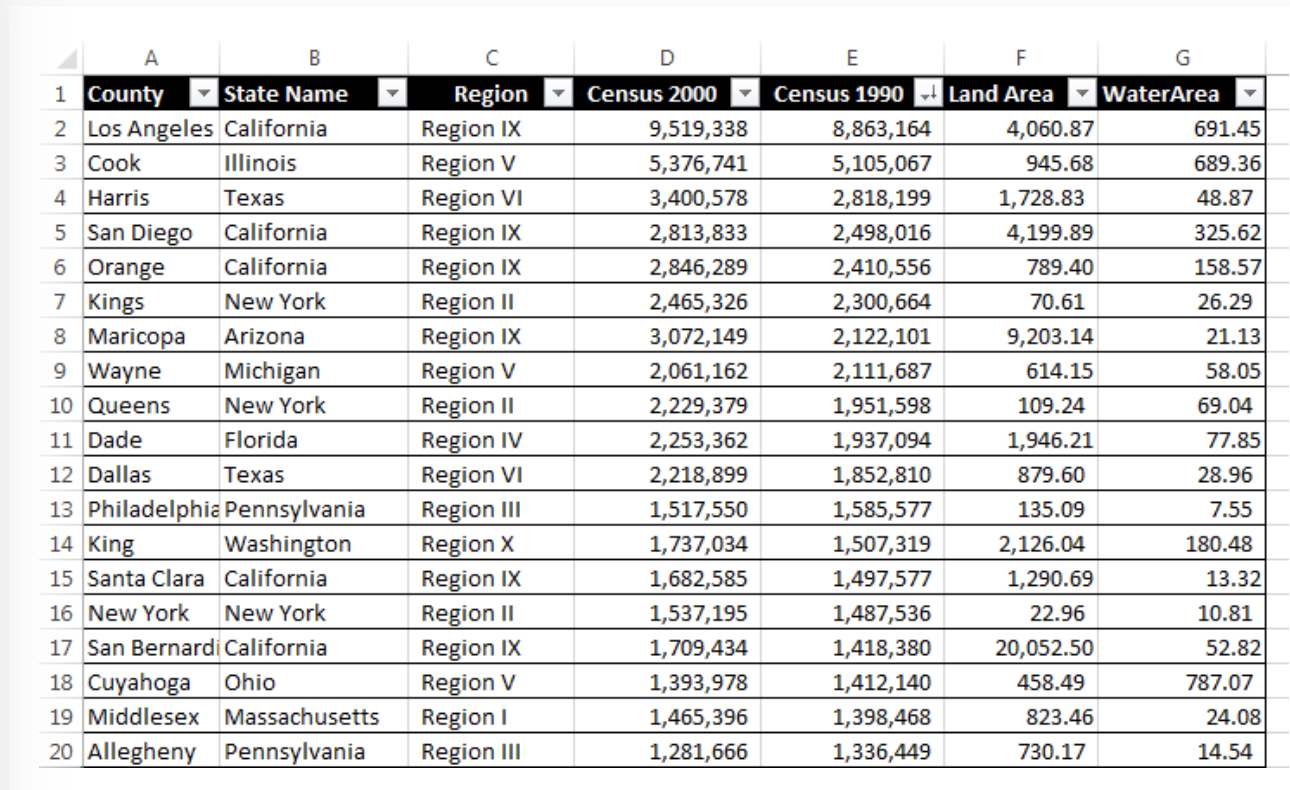
This example pivot table shows various categories of the state and county as a focal point, and then shows the population as well as the square miles of both land and water. This example is a good explanation of how. you can organize and create specific categories to compare side by side while still keeping it in relation to a specific topic in this case it’s the state. As you can see the comparison between census(population) in the 2000’s compared to the. 1990’s.
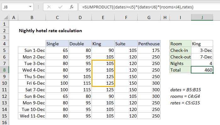
This pivot table is a great example of cost comparison as well as defining them through specific dates within a month. As you can see there are 5 categories defining the specific room type for each date and as the room size gets bigger the price increases. This is a great data set used by hotels, or any company that has packages within their business.
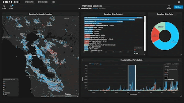
Link to create your own pivot table:
Takeaways of Energy System Website

My first interaction as I started the flow chart is I like the overall theme and organization of the chart, they created different sections based on the appropriate energy source as well as the envier rental areas it has because all these parts can cause a increase or decrease of the amount of energy being made and consumed.
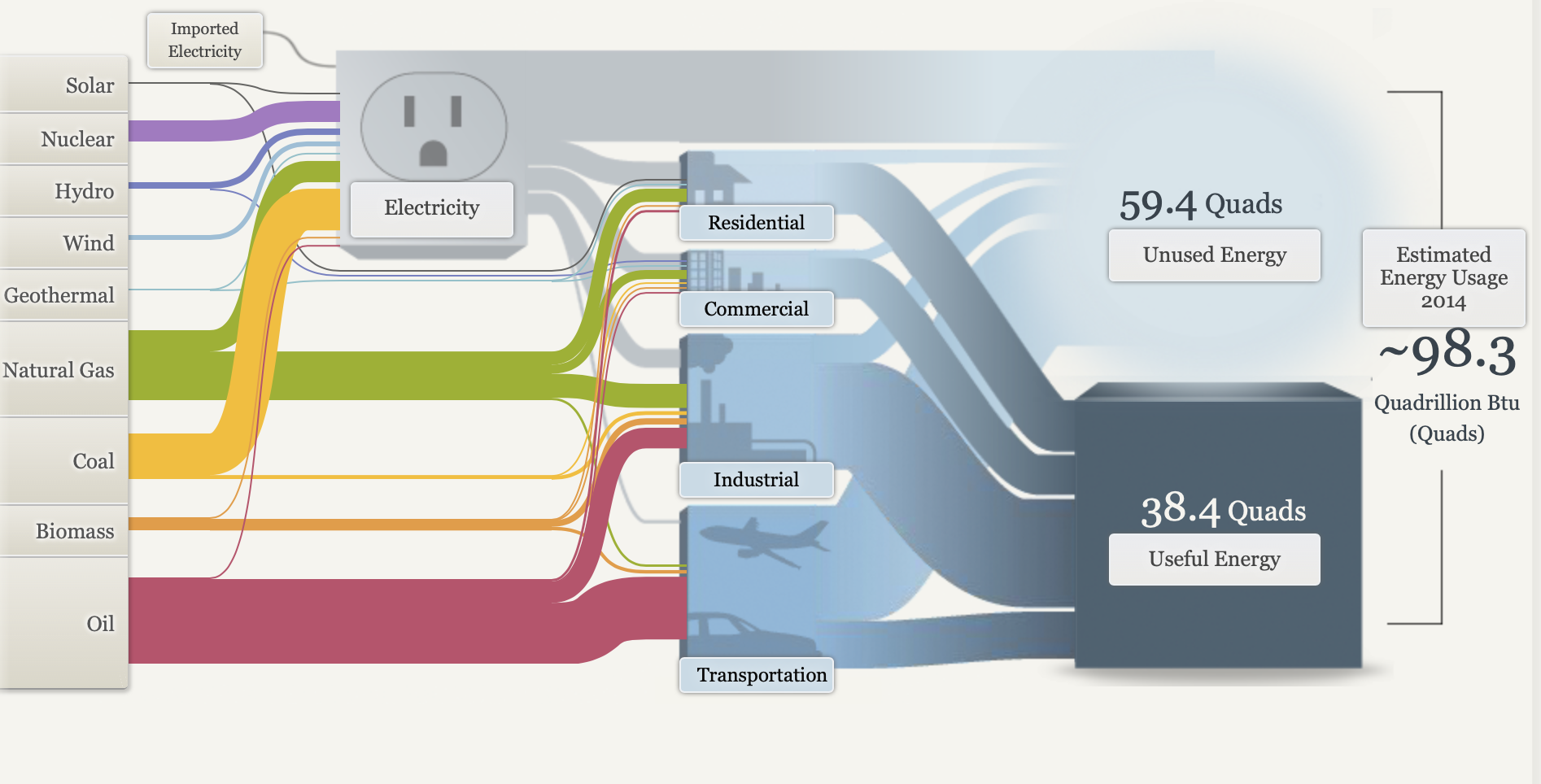
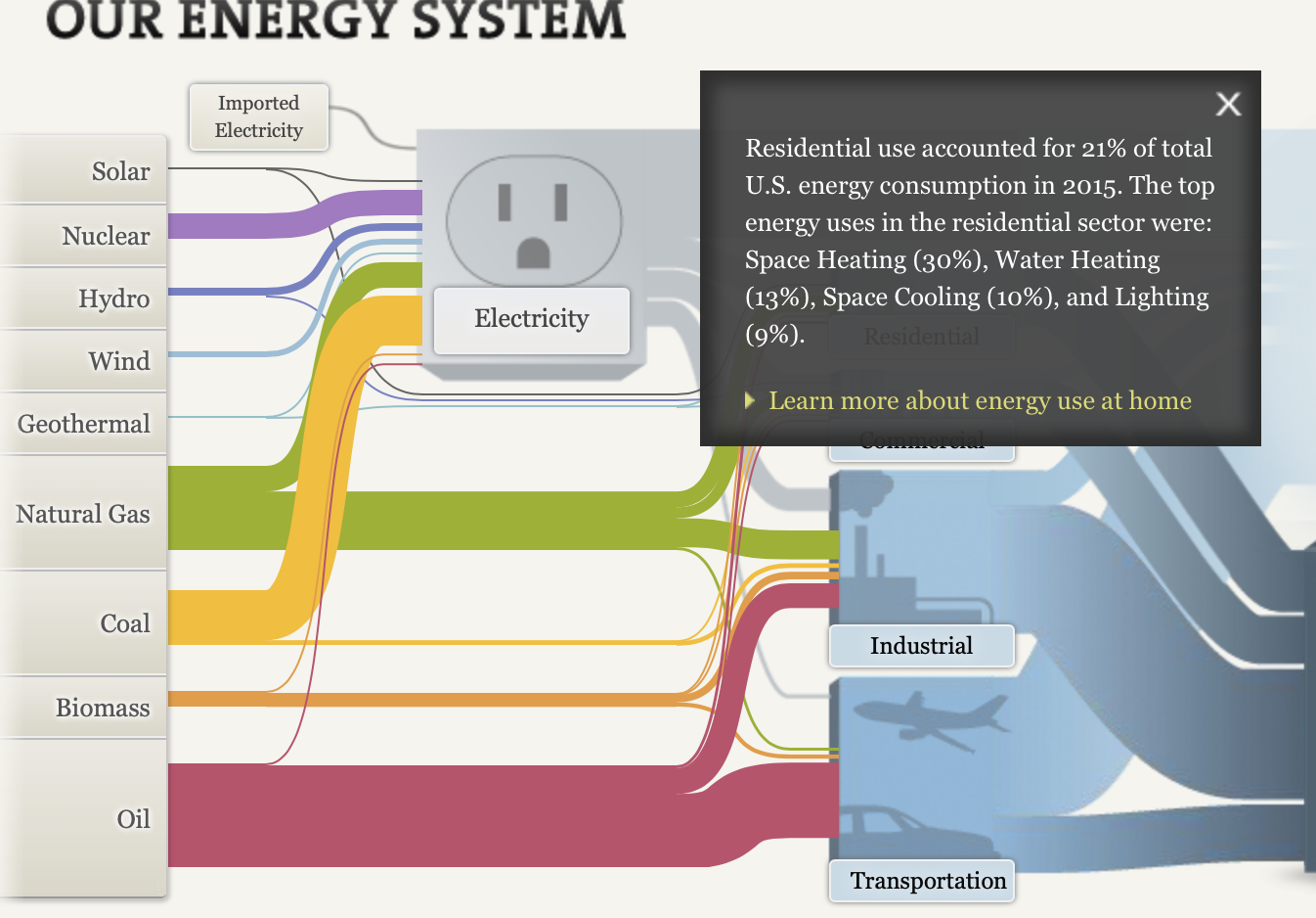
I also love how they give you a quick summary of the specific uses in the residential, commercial, Industrial, ad Transportation areas. Many people don’t know specifically how much energy it takes to power the specific 7. appliances in their house let alone all the other individuals and businesses in their communities.
I also like how they broke down the the different sections between national, regional, and state(CA) because there is a major differentiations between each section and it is appropriate to show at least one state to show how much energy is consumed at a smaller population of individuals at still a high rate.
Overall I feel like they used a lot of visuals and simple explorational designs to help the viewer easily comprehend the extensive background behind energy, how it is obtain, maintained, and consumed by people to supply power.
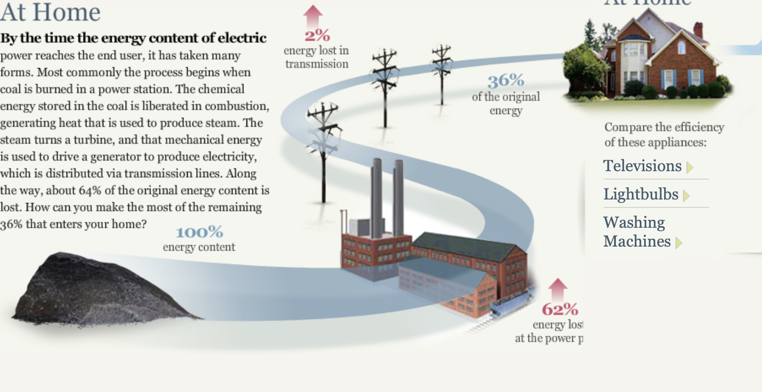
I also was interested in how they expressed alternatives to decrease the use of energy for the future through innovative and efficient technology. They provided simple visuals to separate each section and provide a visual representation of the overall information.
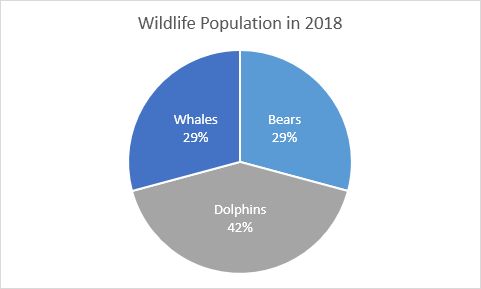
Pie Charts
A pie chart is a circular visual graphic which is divided into specific slices sized perfectly from percentages of categories to create sum up to 100%. This type of chart can be easily read and comprehend due to the association of part-to-whole and unity. However it can. be easily misinterpreted if one doesn’t us it in the proper ways. Here. are some rules you can follow to create a successful pie chart.
1. Don’t use more than five
Limit your slices to 5 or less, any more and it could hard to read.
2. No more than 1 pie chart
Never compare data between two charts, one is already a lot to. process, instead you should try and use stacked bar charts.
3. No 3-D charts
3-D effects may be eye catching and unique, however it can cause the data and labeling to be distorted. It’s best to keep thing simple and maybe use a fun and legible font to create a unique style
4. Use various colors
With any chart you should use a single color for each category, however it is very important in doing so with a pie chart , if you place two colors of the same hue the data can become manipulated. Also with two many categories limits your color choice allowing chaos and overcrowding.
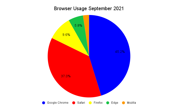
Here is a great example using simple data from statistics of browser usage of American citizens in the month of September. This graph shows all the the rules properly to create a simple but effective pie chart which is able. to be easily. comprehended to the audience. However, give if were to choose a different chart I would probably go with a horizontal bar graph to so an alternative of the size proportions between each category.
Where and When to Use Lollipop Charts
Lollipop Plot
This type of chart is very similar to a column or bar chart, however it consist of a line running from the x-axis and a dot at the top to pin point the value of each category. The visual replicates as a lollipop hence the name due to its long line as the stick and the point at the top to form a circle.
Common Uses:
- Visual alternative to side by side bars
- Comparison between categories
- When displaying more than 10 categories making it more legible.
Easy and Effective
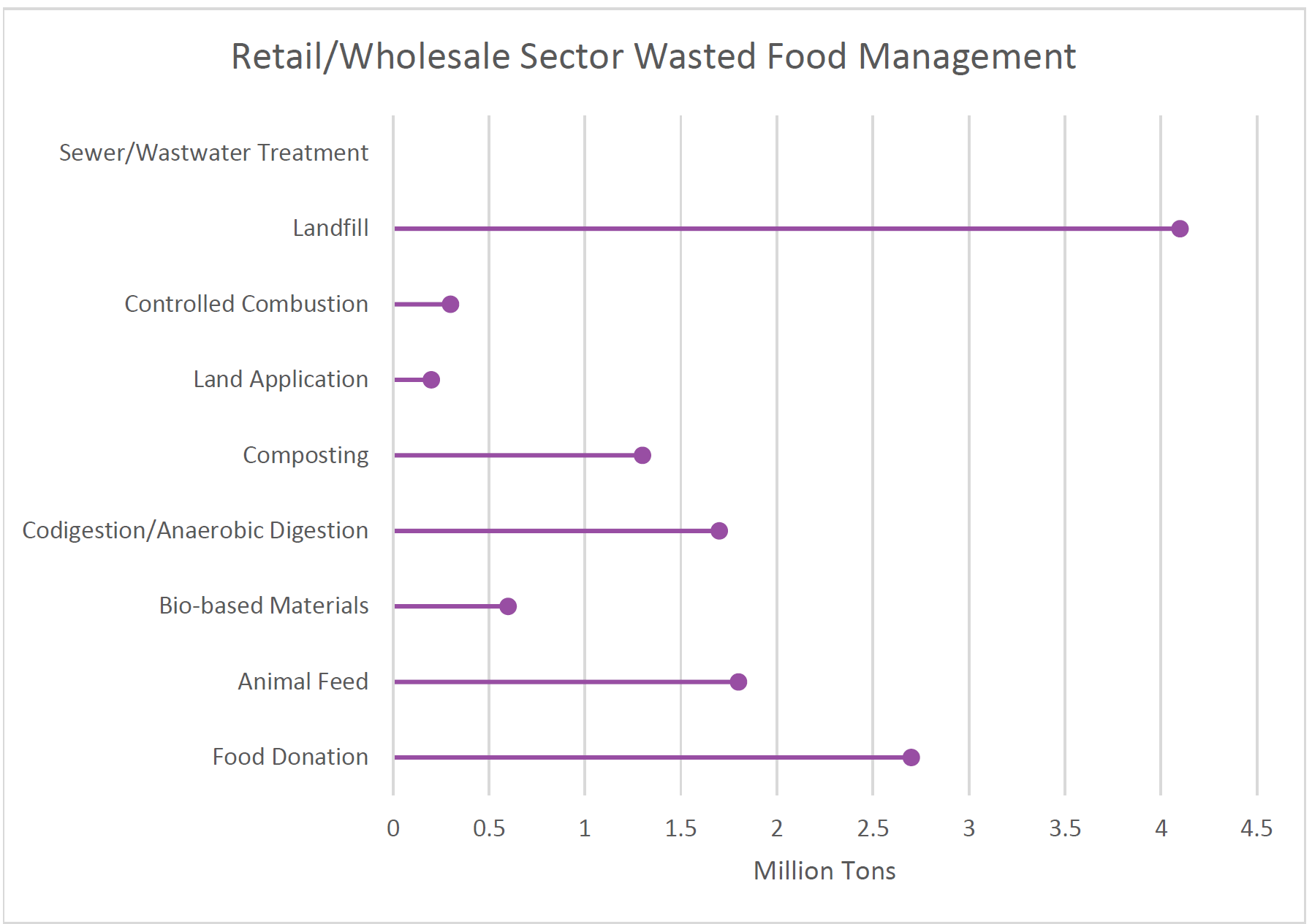
The example below of a Lollipop data chart displays data of how much retail and wholesale organizations manage and dispose of their waste in 2018. This chart is easy to manage and create way to effectively arrange your specific data. that allows the presenter to create unique designs and templates while allowing it to be used for various data forms.
Benchmark Graph Data Comparisons
Benchmark graphs are a great data visual to allow companies to compare their own performance with their competitors or even their own set goals to reference points to improve new insides and improve their processes.
Investment Comparison
In this benchmark graph shows the data between US(Ford, General Motors) and Japanese(Toyota and Honda) and their manufacturing production rates of vehicles within Canada. This chart’s main focus is to show the increased production within Japanese that evaluates the growing performance, sales, and attention their vehicles have been in Canada. In showing this data they want to make an attempt in increasing the amount of investments Canada should make compared to the amount they make for the US.
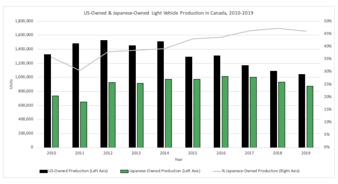
The graph shows an effective comparison between the two countries and their production rates. I like how they used a span of almost 10 years which shows the increasing rate Japan has developed compared to the US who has ben decreasing. I also like how the also included their percentage of owned products within Canada that is combined with all manufactures which is also larger than that compared to the US and is increasing through the years. This shows that they have a positive and effective rate of change in their products and are very popular in Canada.
Video Streaming Data Comparison
In this graph represents the total, revenue, gross profit and net income with Netflix they have been increasing in all categories with the last 3 years. This graph is used to show in the article that even though many competitors are coming up with unique and reliable resources for popular video streaming apps they can still be on top and have a high popularity rate of users and are still continuing to rise to the top
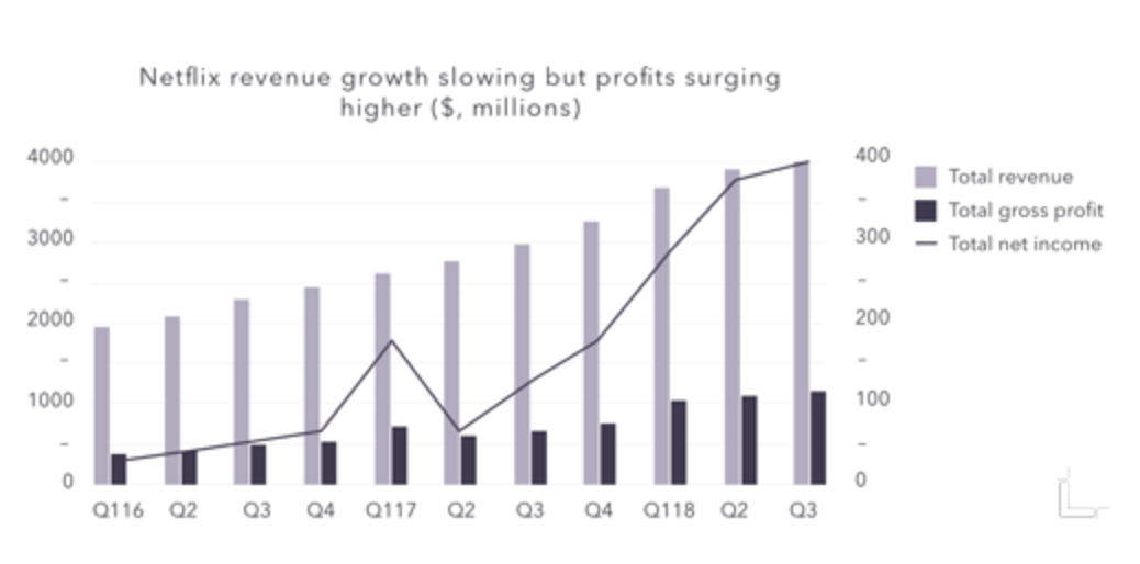
I like how they break down each category and make it simple to comprehend using labels on each side because the amounts between revenue and gross profit are large in comparison and would be hard to comprehend if only one y axis. I also like how they use the years but also break down each section into the quarters where their finances are calculated to show a precise estimate of the money they have made. This chart shows a great representation of how well Netflix has done in a small span of time and they are still continue to increase their sales.
Data Visualization Techniques To Help Compare Numbers
What is Data Visualization?
Presenting data in visual graphics such as charts, maps, graphs, etc. to create both an appealing display and to allow the audience to easily understand the information presented
Two Ways To Present Data Visualization
Static: Printouts or web data that limit the viewer to only see and explore the data that is presented at the initial sight.

Interactive: Web data and multiple printouts that allows the viewer to engage in the information by providing various categories and hyperlinks to expand the information for better understanding
Finding The Best Fit
The first step in using data visualization is choosing the right one that will display your data in the appropriate manner. If you choose the wrong one can lead to misinterpretation of your data. These examples and breakdowns of known visualization will help you choose the best one for your data.
Line Chart(Display Trends)
They demonstrate an overall trend precisely that is hard to misinterpret. Good for showing trends in different categories over an extended period of time to support comparison
Bar Chart(Simple Break Down)
Great for displaying various values using color coded categories in a horizontal direction. Compared to a line graph you are able to add a specific category to break down the difference in better detail when you have a broader ray of data.
Column Chart(Compare multiple)
This is similar to a bar chart but is used bars in a vertical direction. This easily allows you to compare various data over time.
Pie Chart(Proportional Data)
This is a great choice when displaying percentages or specific numbers in an overall comparison of each other. Each part of the chart must come together to sum up and overall total. In order to create organization and understanding you should only use six categories or less.
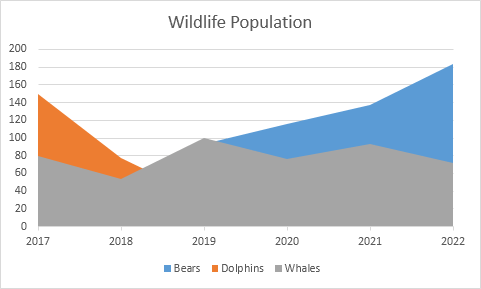
Area Chart(Comparison)
Very similar to a line chart, however the areas are completely filled with a color to represent each category. This way each area I stacked on top of each other to better show the comparison. This visualization can be best used to show relative values over a time period.
Pivot Table(Quick Summary)
This is a very popular yet simple ways to show data using visualization. Allows you to quickly summarize, assess, and organize large amounts of data while allowing you to customize your colors, fonts, and focus points of the data as needed to appeal to your audience.
There are many various data visualizations to choose from, however it is important to remember the purpose of the chart to show the best way to display your data in an effective and appealing way to the audience. There are also many free and subscribed softwares you can use based on your skill level that will allow you to create these charts, add your own data, and customize it appropriately such as.
Google Sheets, PowerPoint, Canva, Microsoft excel, etc.
First Look at Visualizing Health Website
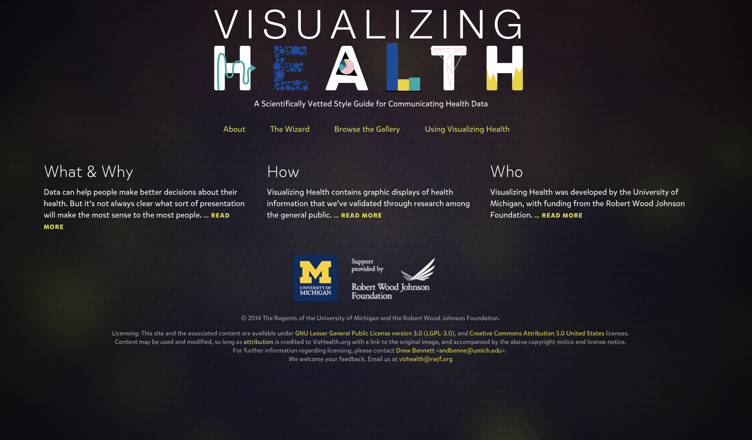
From my initial experience with the website called Visualizing Health which is a developed project founded by the Robert Wood Johnson Foundation and University Michigan center for health communications research. They created various examples of tested visualizations of health information that effectively present audiences with detailed and complex data, however they display it to be easily comprehended when using the appropriate resources. In doing so they also allowed other individuals to use various graphics, tables, and charts to present data and successfully meet the needs of the presenter and
One very major asset that allows this website to work so well is a formula called the wizard that ask you through multiple choice questions designed to match the type of graphic you want and the specific needs you have for the data. Wow meeting in this test the questions seen complex and we’re hard to visualize however they are examples and break down oh the specific type of “risk” you were trying to communicate allowed me to better understand the specific need I was looking for. After the two questions they bring you to a filters which allows you to choose various categories that narrow down your search more distinctively to find the best fit for your data. I like it it’s taking your data and matching it to the correct graphic that will display the data you were trying to present. Once you choose a specific graphic that you wish to use it also gives you a detailed summary of the design and how you can appropriately use this example in your own form of visual data. I like this I because it gives you more information and awareness of the specific data you are using and working down it’s benefits and accuracy in communication risk when properly formulated.
Overall I think this website could be useful for many individuals with the various topics such as health, education, politics, mathematics etc. to effectively show their audiences visual data that supports the information they are presenting. I would recommend this app to anyone who want to present complex yet simple visual graphics and data to easily allow their audiences to understand the information.
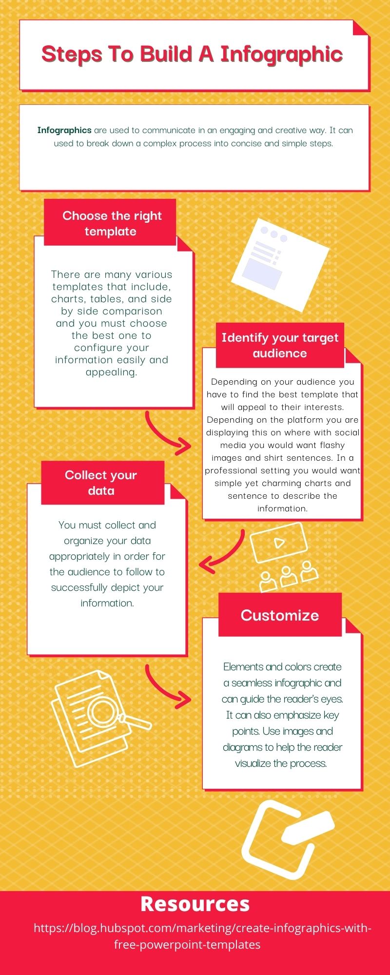
Tools to easily construct a Infographic
Why Infographics
Infographics allow the present/writer to present information in an interactive way to their audience. In doing so this helps the audience to quickly depict the information more easily as well as retain the information for a longer period of time.
Top 3 useful Infographic sites

#1 Canva
A personal favorite of mine, which is a free and subscription based website as well as app that allows you to create personal infographics, flyers, and many other social media uses. It includes templates for beginners to copy & paste their information easily. It also offers free pictures & even
gifs to appeal to the audience

#2 Infogram
Also an online infographic maker which allows you to easily access templates and tools to create your own personal design. With various charts, graphics, and animations it helps you gain appeal to your information to engage with the audience.

#3 Snappa
Not as much variety as Canva however is alot free and contains various graphics. It is very beginner friendly allowing drag and drop access to manipulate templates into your own.
Why Using Apps is Easier
- Photo shop is too time consuming
- Graphic Designers are too expensive
- Web-based tools too complicated
All theses apps are easy to manage, edit, and share at a click of a button to allow users to use for personal, business, or educational uses.
Recent Comments