A pie chart is a circular visual graphic which is divided into specific slices sized perfectly from percentages of categories to create sum up to 100%. This type of chart can be easily read and comprehend due to the association of part-to-whole and unity. However it can. be easily misinterpreted if one doesn’t us it in the proper ways. Here. are some rules you can follow to create a successful pie chart.
1. Don’t use more than five
Limit your slices to 5 or less, any more and it could hard to read.
2. No more than 1 pie chart
Never compare data between two charts, one is already a lot to. process, instead you should try and use stacked bar charts.
3. No 3-D charts
3-D effects may be eye catching and unique, however it can cause the data and labeling to be distorted. It’s best to keep thing simple and maybe use a fun and legible font to create a unique style
4. Use various colors
With any chart you should use a single color for each category, however it is very important in doing so with a pie chart , if you place two colors of the same hue the data can become manipulated. Also with two many categories limits your color choice allowing chaos and overcrowding.
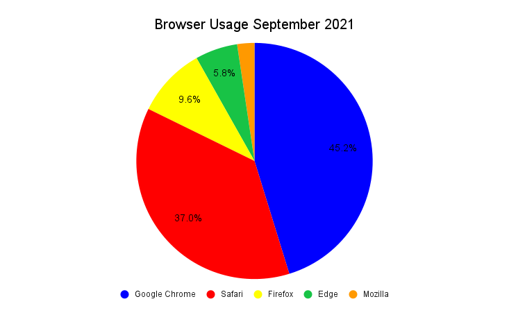
Here is a great example using simple data from statistics of browser usage of American citizens in the month of September. This graph shows all the the rules properly to create a simple but effective pie chart which is able. to be easily. comprehended to the audience. However, give if were to choose a different chart I would probably go with a horizontal bar graph to so an alternative of the size proportions between each category.
Recent Comments