Pie charts are used for many reasons, but for the most part they can determine parts to a whole. The sizes of the slices in the pie chart will determine what has more, and what has less. When using a pie chart to compare, determine, and visualize data, there are many different cases that pie charts are beneficial for determining what consumes more of the 100%. Some design ideas for pie charts are to make sure colors are not too similar, and the graphs are easy to determine what is the biggest or smallest part of the whole.
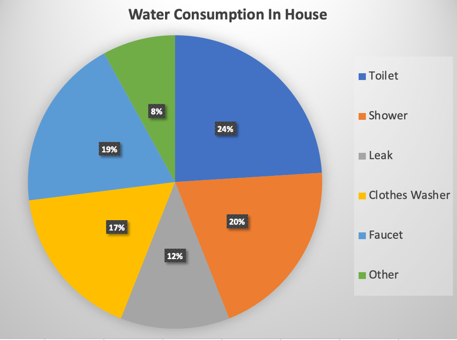
According to the United States Environmental Protection Agency, the use of water in a household in 2016, was best shown using a pie chart. In this case, the use of water in the toilet is the most. Representing this information as fractions of a whole, in a pie graph was the best way to visualize this data.
The perfect use of a pie chart.
Recent Comments