The lollipop graphs are fun way of making a visualization of lighthearted data. Although there was a lot of work put into creating this graph the out come is cute but affective. The graph starts out as a scatterplot graph with x-values and y-values and with a click of a buttons to the delete some lines, add a few extra percentages to sizes of markers and lines to form the lollipop like image. The changing of some numbers for names of the data and in no time ( but for me it took a little longer to make work) the shape and formation of lollipops magically appear.
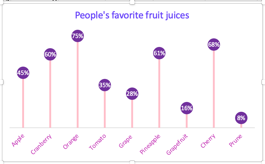
The lollipop graph I created was a fictional poll of favorite fruit juice people drink. I chose colors that made it fun and “pop” with color. I used Microsoft Excel to log in my data and the graphs and tools to put the graph together. With guidance and direction of instructions I came up with a crafty and cheerful lollipop graph. This type of infographics would be great for blogs and websites that direct their information or product sales to their buyers and viewers who want the data displayed in an enjoyable setting.
Recent Comments