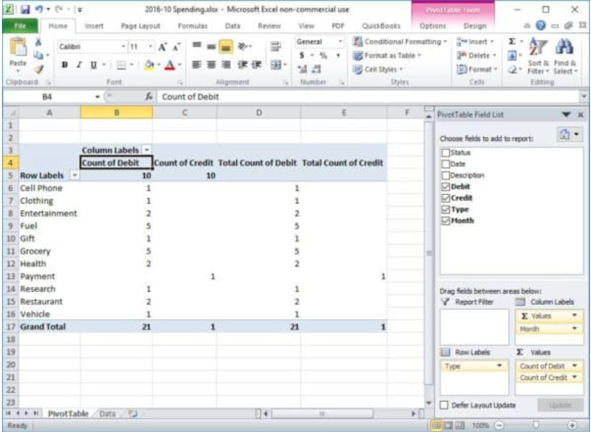
Pivot Tables
The pivot tablet is a value tool for any one who wants to present their data findings in different formats. Data that has many different components can be manipulated and shown to represent the information in any heading the user wants to highlight. For example, if the user has data that has several high points to represent say, sales of kitchen applicants. A pivot table can manipulate the header of the data by leading sales manufacture, must or least purchased applicants, or in any variant the user wants their data represented. This type of table can be a very useful tool when doing a presentation for a company that needs to know how sales for their company are doing, or to check on the competition’s sales on their different products. The pivot table can also be used for personal finances. A household budget can be entered and they can see the many ways their money can be saved or spent to keep them in healthy financial structure.
Family Budget
Business Sales Presentation

PIE CHARTS
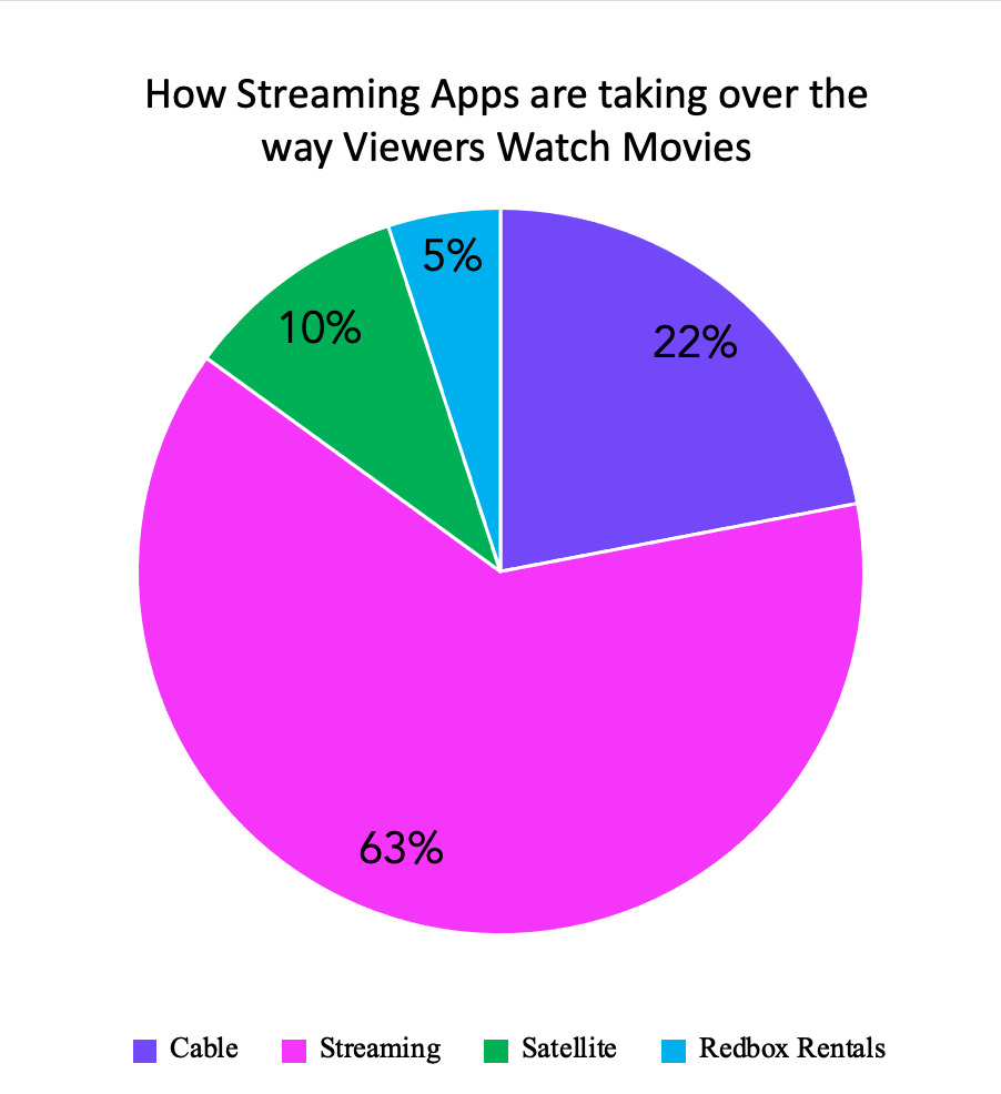
The Pie chart is one of the most recognizable charts that is used for visualization of all kinds of data. We have always seen them in newspapers and in textbooks, and now on the internet. Pie Charts are a great way to communication simple data or polls that have fewer legends to present that if it was graphed on a bar graph or line graph. And unlike these graphs the Pie chart is great to show 100% of something and present it in a set period. The title of the chart should have direct meaning to allow for quick understanding for what is shown in the chart. The use of making each piece as colorful as you need will help catch the attention of your viewer as well. Using the Pie Chart also helps in making sure that your data is correct in that if all the pieces do not equal 100% than the data is off, and corrections need to be made. It is not useful if your collective information or poll research has overlapping percentage for the legends and a Pie Chart is not the infographic for your data.
The Pie chart that I created with my fictitious poll data is on how people view movies today. I used bright colors to represent my legends and to make it fun and attractive to the follower of the blog. This is the best infographic to use for my poll because the total of my data equals 100%, the pieces of pie are large enough to have clear view of the numbers used. Also, there are no two pieces that are similar in size that would misrepresent the data percentage on any of the different tools that people use to match their movies.
URL: https://nces.ed.gov/nceskids/help/user_guide/graph/pie.asp
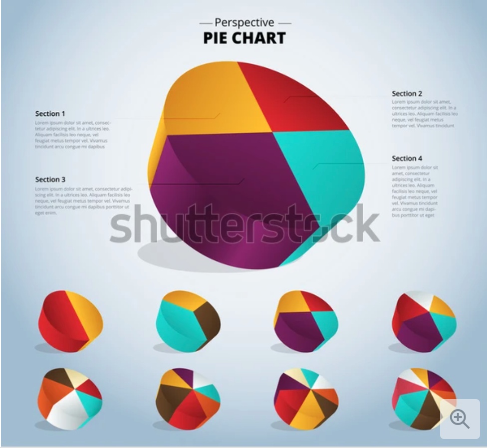
URL: https://www.shutterstock.com/image-vector/3d-pie-chart-infographic-used-presentation-387105985
Lollipop Graphs
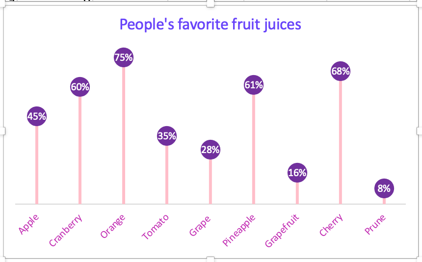
The lollipop graphs are fun way of making a visualization of lighthearted data. Although there was a lot of work put into creating this graph the out come is cute but affective. The graph starts out as a scatterplot graph with x-values and y-values and with a click of a buttons to the delete some lines, add a few extra percentages to sizes of markers and lines to form the lollipop like image. The changing of some numbers for names of the data and in no time ( but for me it took a little longer to make work) the shape and formation of lollipops magically appear.
The lollipop graph I created was a fictional poll of favorite fruit juice people drink. I chose colors that made it fun and “pop” with color. I used Microsoft Excel to log in my data and the graphs and tools to put the graph together. With guidance and direction of instructions I came up with a crafty and cheerful lollipop graph. This type of infographics would be great for blogs and websites that direct their information or product sales to their buyers and viewers who want the data displayed in an enjoyable setting.
Benchmark Graphics
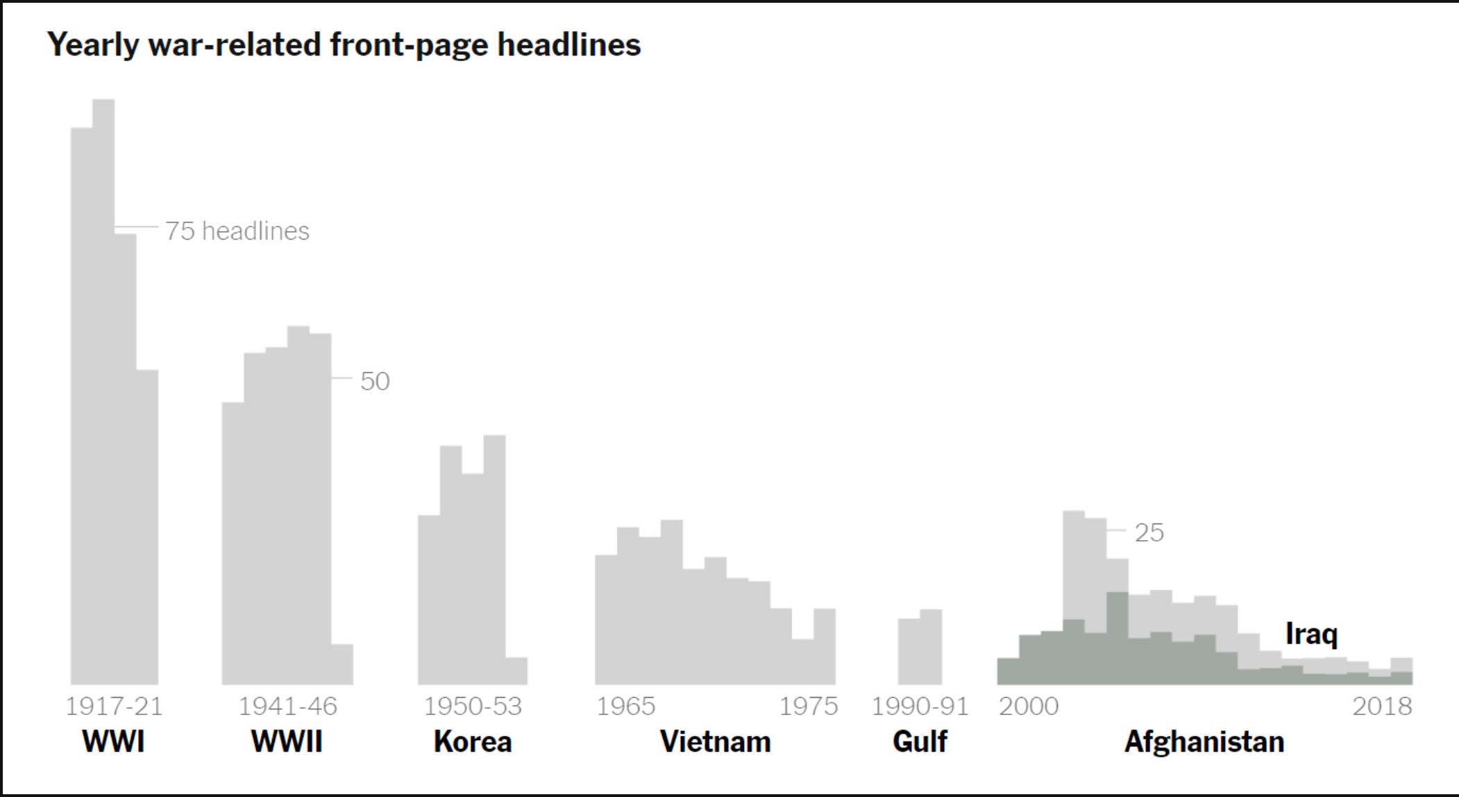
This benchmark graph measures the number of yearly war time headlines for major wars of our time. The benchmark depicted for this data is represented as a small line with the benchmark number to show possibly the number of what the papers wanted to report on the wars to the actual number of headlines made from the wars. This graph, although very informative, needs to have more color with stronger font to catch the viewers eye. It needs to make a faster and impressive impact or it will get looked over and not seen.
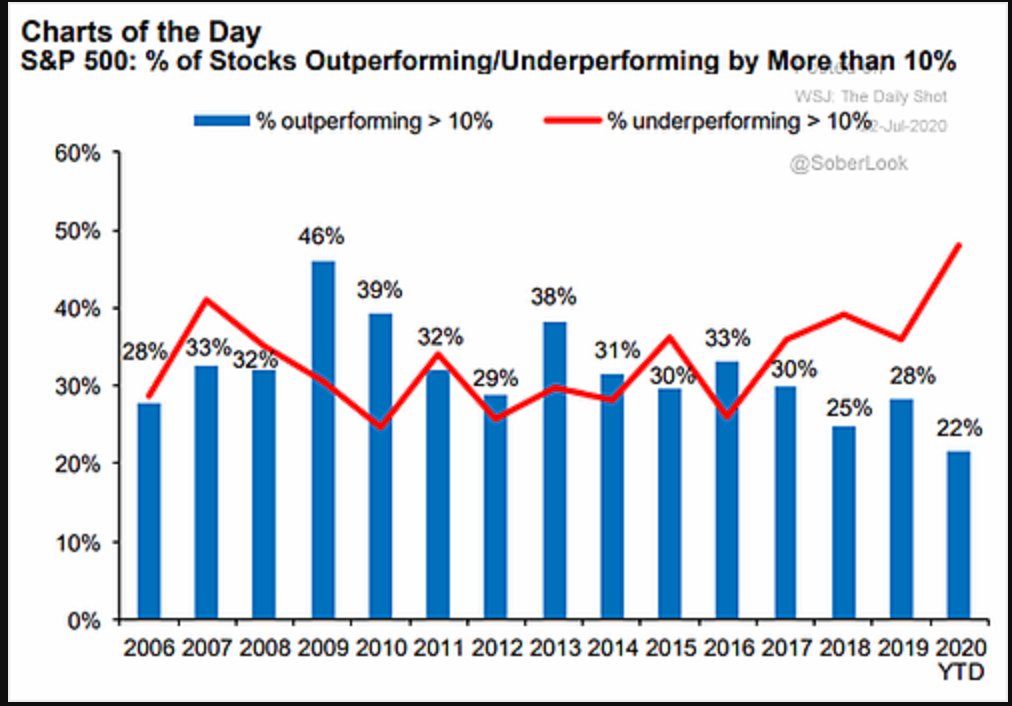
In this benchmark graph the data is given to show how the S&P 500 performed. The red curved line is to represent where the underperforming percentage margin. The blue bars on the graph represent the outperforming percentage margin. The strong red color stands out to catch the attention of the viewer with visual infographics.
URL: https://blog.commonwealth.com/independent-market-observer/a-look-under-the-sp-500-hood
Comparison Chart Builders
Piktochart
URL: https://piktochart.com/features/comparison-chart-maker/
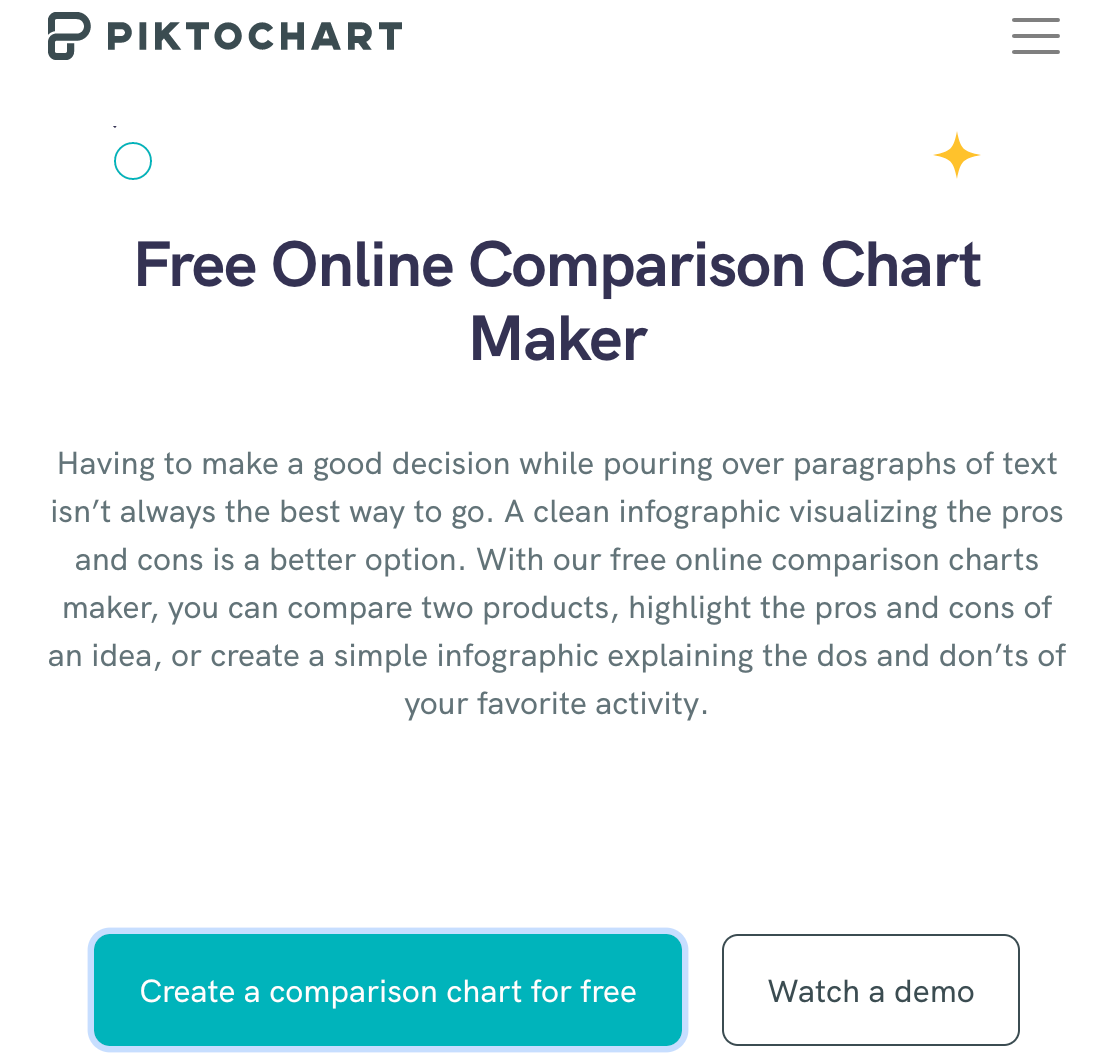
Piktochart is a free comparison chart making website for the basic user. In order to access their templates, the user must already have an account through Google or by simply signing up for free. By creating an account, the user is given a folder to store their creations which is useful for later editing and storage. The website offers demos to the user to help format their data to their benefit for a more efficient comparison.
Adobe
URL: https://www.adobe.com/express/create/chart/comparative
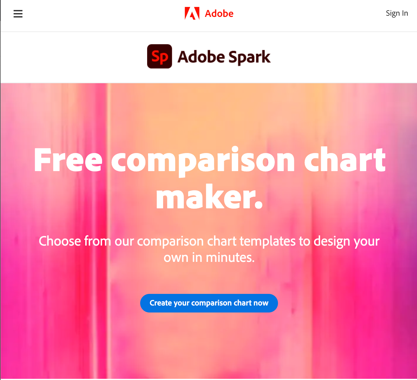
Adobe Spark is another free comparison chart making website. Adobe is a trustworthy computer design company that has put out many other editing programs i.e. photoshop, acrobat, and animator. The user can sign up through Google, Facebook, or any email. It also allows schools to set up student accounts for school assignments and projects. Adobe offers a more customizable and free range interface as it requires more creativity from the user and how they want to present their data to the viewer.
Helpful Infographic Tools
In order to create an efficient display of information to the reader, one has to make a chart that has the right format. Here is a list of tools that can help create useful graphics from given data that will be needed to be shown to the viewer.
Google Sheets
Google sheets is a free-to-use service from Google that is able to create tables and graphs. This service offers a variety of simple graphs for the user’s disposal, but some functions will require prior experience of similar interfaces. In order to use Google Sheets, you must already have a Google account.
Canva

Canva is another free infographic creator and has a variety of pre-designed charts that are ready to edit that only need the data to be put in and minor adjustments.
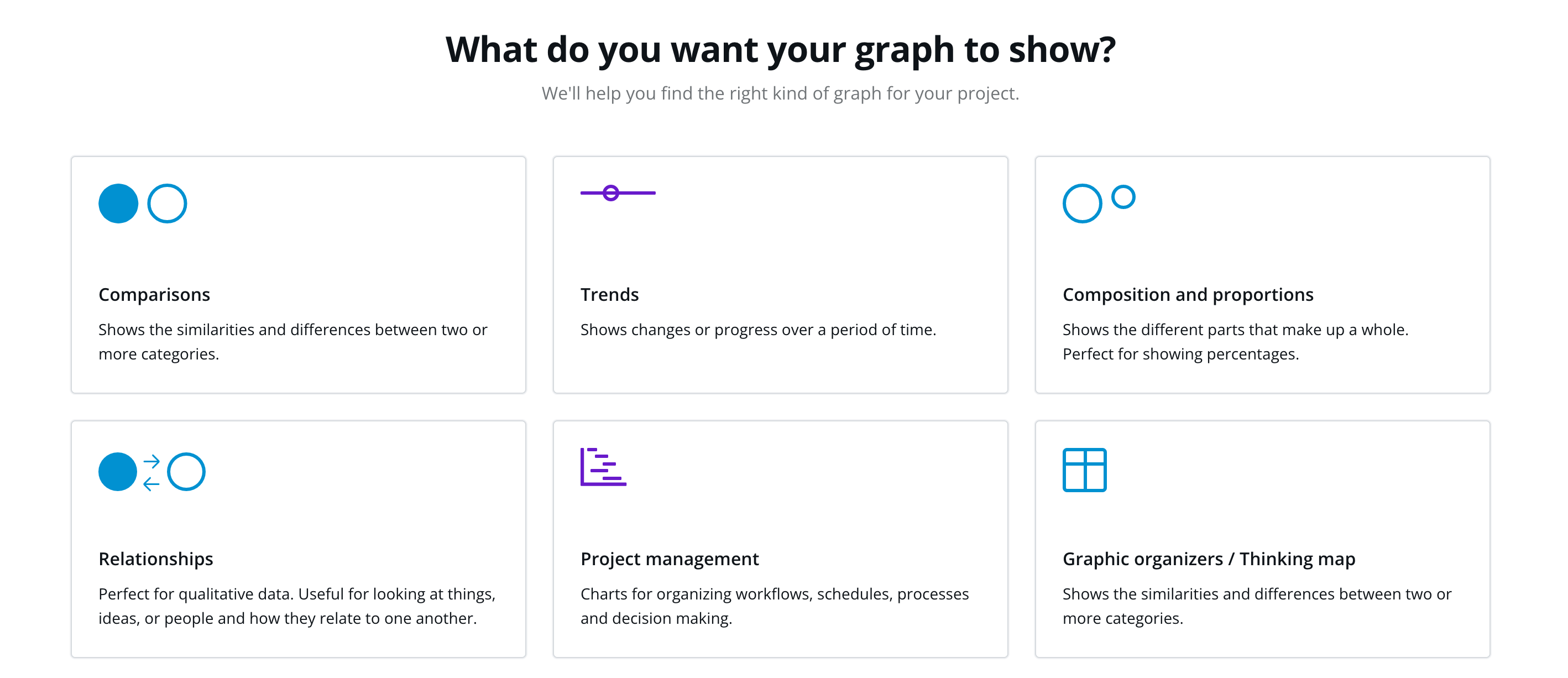
By clicking on “create my graph now” on its table page, the website will give you a questionnaire that will guide the user to creating a chart best fit for their needs.
This website is more beginner-friendly and is useful for many other topics like social media, cards, and designs.
URL: https://www.canva.com/graphs/
Visme
Visme is another website like Canva and has a variety of charts and graphs to choose from. The only drawback of this website is an account needs to be created before accessing the templates and some can only be used with a paid membership. After making an account, the user is able to edit a template, input their data, and save it for their use.
My Wizard Experience

The wizard is a simple, easy-to-understand presentation that offers a demonstration to the user on what and how they should display any statistics on a graph.
The questions that are asked in the setup of the graphic design allows the user to construction their information. This will direct them on how they want to deliver data to their viewer in the best format (graph), color scheme, and direct point to interest and attract the reader.
Customizing the graphs give the user creative power to put forth their best graphic design to captivate their audience. The title has to be precise in what it wants the viewer to know and the information has to come fast to draw their attention to make them aware of what is needed to inform the reader.

Recent Comments