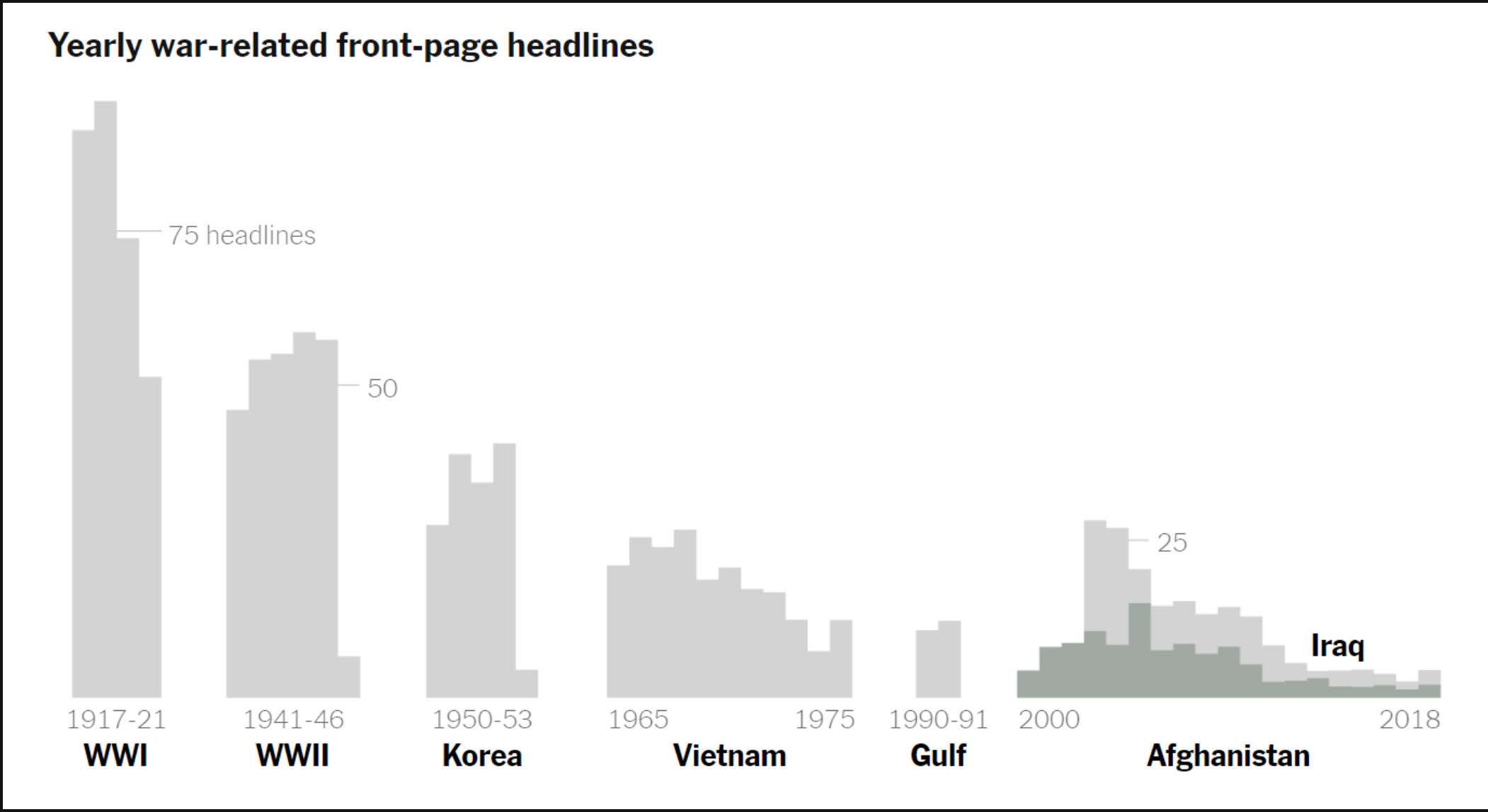
This benchmark graph measures the number of yearly war time headlines for major wars of our time. The benchmark depicted for this data is represented as a small line with the benchmark number to show possibly the number of what the papers wanted to report on the wars to the actual number of headlines made from the wars. This graph, although very informative, needs to have more color with stronger font to catch the viewers eye. It needs to make a faster and impressive impact or it will get looked over and not seen.
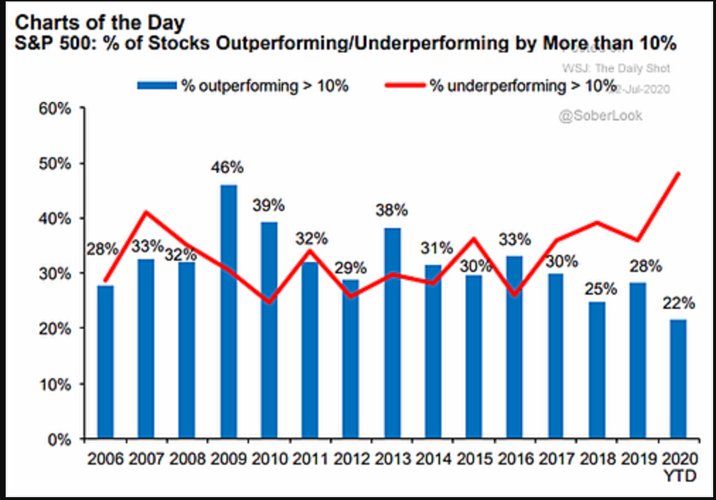
In this benchmark graph the data is given to show how the S&P 500 performed. The red curved line is to represent where the underperforming percentage margin. The blue bars on the graph represent the outperforming percentage margin. The strong red color stands out to catch the attention of the viewer with visual infographics.
URL: https://blog.commonwealth.com/independent-market-observer/a-look-under-the-sp-500-hood
Recent Comments