Pivot Tables
After reviewing the link on www.contextures.com,
I found useful information to assist me in trying to format a organized pivot table. In excel, pivot tables are known to be the most powerful, useful, and beneficial for large data sets. They summarize, sort, and organize information in tables that are easily adjustable. They allow you to interact and explore data in different ways and look at the same data with different perspectives.
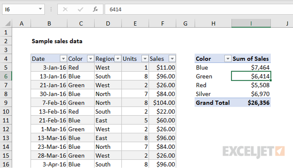
An example of a sales data set, from ExcelJet includes a pivot table that is easy for adjustments because in this case data changes frequently. There are many other benefits to using Pivot Tables, they are easily changeable or flexible. They are accurate, take less time, and you can create pivot charts from the pivot table.
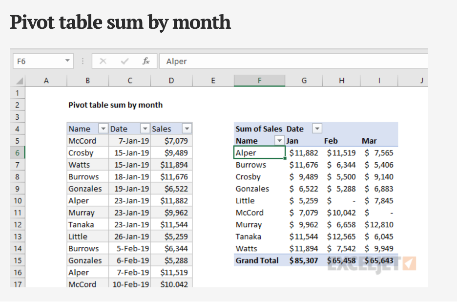
With pivot tables there are many ways to summarize and group data, for example the pivot table sum by the month using the data grouping feature on excel.
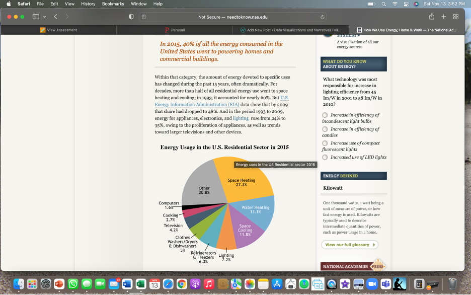
Sankey Visualizations
After exploring the following data visualizations about Our energy System, on the following link:
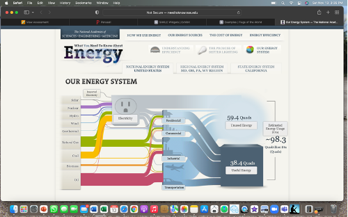
Sankey visualizations are discussed in the text to be a bit complicated but, overall I believe they are a great way to display information. After exploring this information about the energy system in the US, it is a very accurate and clear way to visualize multiple sources and forms of important data. Providing different percentages and estimated energy usage per year after pressing start the flow, was very informative and easily to understand complex data.
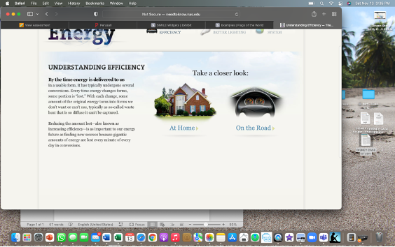
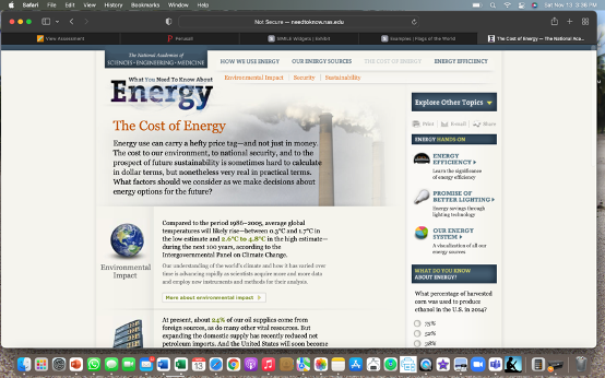
Further into the website, there is more information on energy and understanding the efficiency. They also give options to take a look at how energy is used at home and on the road. Offering very important and useful information about how we use energy at work, and at home.
The most interesting aspect of the website was the cost of energy, and the information provided about the environmental impacts. Increasing the importance of climate change for the future, and the visualization and information on energy, the costs, and the environmental impact is displayed efficient, and easily accessible.
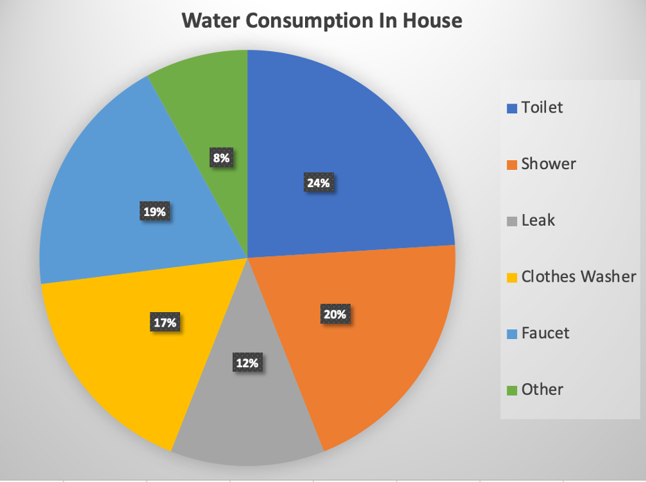
Pie Charts
Pie charts are used for many reasons, but for the most part they can determine parts to a whole. The sizes of the slices in the pie chart will determine what has more, and what has less. When using a pie chart to compare, determine, and visualize data, there are many different cases that pie charts are beneficial for determining what consumes more of the 100%. Some design ideas for pie charts are to make sure colors are not too similar, and the graphs are easy to determine what is the biggest or smallest part of the whole.
According to the United States Environmental Protection Agency, the use of water in a household in 2016, was best shown using a pie chart. In this case, the use of water in the toilet is the most. Representing this information as fractions of a whole, in a pie graph was the best way to visualize this data.
The perfect use of a pie chart.
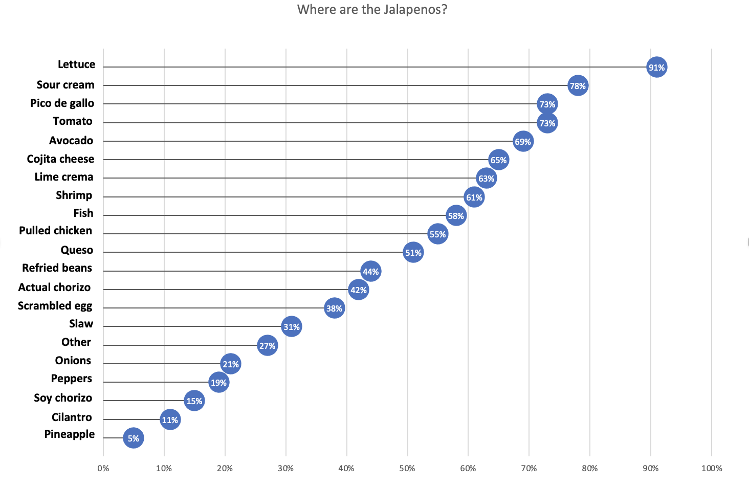
LOLLIPOP CHART
Lollipop charts are very important and useful when comparing items, or for example in the example below, deciding what is liked best. These charts are used for ranking items, or showing items in a more visual way. Having many categories and large numbers, using this Lollipop chart visually displays this set of information better for the viewer. Using lines and circles at the end, it is easily understandable which has the highest values.
Visualizing Benchmark
Identifying areas of improvement and understand the performance of the company is also done when showing comparison benchmarks using data visualization. Using comparisons benchmark helps with determining the best possible strategies and take advantage of where to gain competitive advantage.
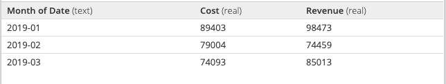
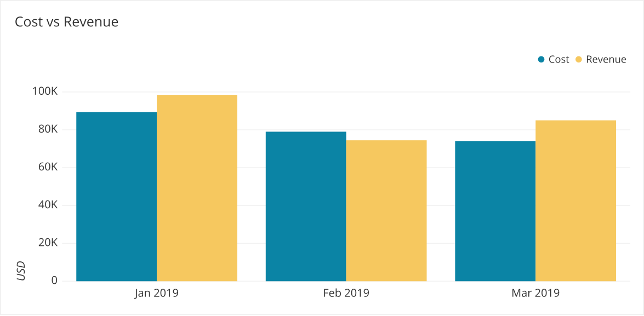
As discussed on The Data School.com, there are ways to find the best the visualizations for your metrics, and showing comparison effectively. With a bar graph, assisting in determining when revenue is greater than cost or how much revenue differs across months. It is easier to compare with Data Visualizations, than just numbers. Understanding the data is easier after being placed in a visual context.

Which is easier to understand?
1 OR 2
1.
2.
The Data School discusses the best way to visualize your numbers, and how creating these data visualizations for the decision makers to determine future operations is very beneficial for companies. When there are different goals or benchmarks for each category, you can use a combo chart or the many different combinations to represent the information best.
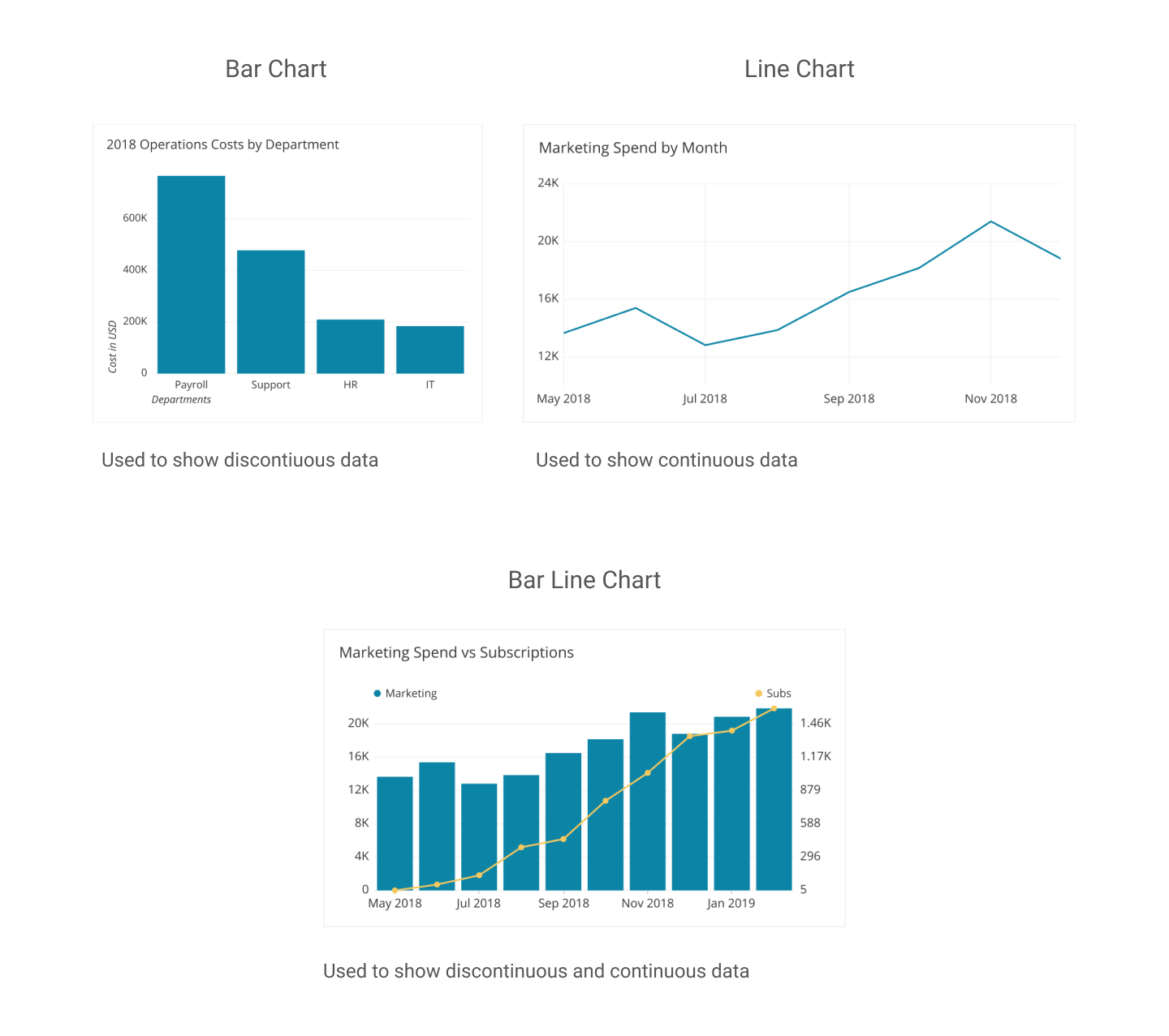
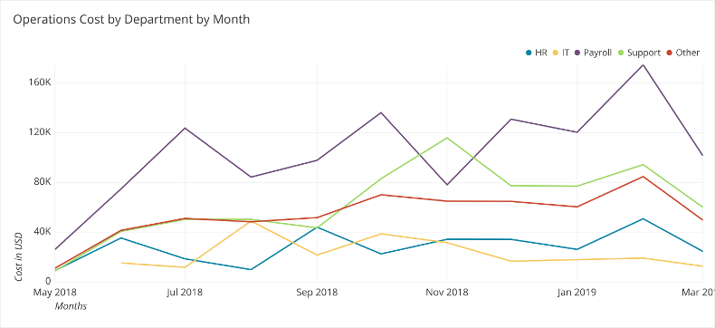
Showing comparison to meet expectations for future, the most direct method for adding comparison on your graph is using a line. This works especially well when all the data share the same comparison point or goal. For example, operation cost by departments in the following data visualization. Including different colors and comparison give the audience a better insight on performance, and this specific charts shows operations costs per month by departments assisting in decisions in future operation costs in multiple departments.
THE DATA SCHOOL : FIND THE BEST VISUALIZATION FOR YOUR METRICS
Tools to Compare Numbers
When comparing values, showing differences, similarities, making visualizations to change minds, persuade people, it is important to understanding the readers expectations. Providing the best method to distinguish and compare values, by displaying the numbers in the most effective way. Comparing numbers, and visually representing them correctly comes with research and reconstruction. Including different aspects, seeing many numbers side by side it can lead to confusion and misinterpretations. It is very important to know your audience and determining the best graph and visualization when comparing numbers. There are many tools and software’s available online to help construct visualizations when comparing numbers and finding the best method to represent the data and story.
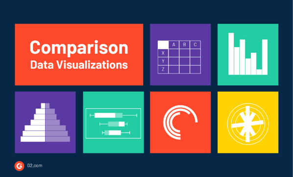
According to G2’s Learn Hub, which is used for marketing, sales, management, HR, technology, software, and all business topics, some charts that are known for effective methods of comparing numbers are:
Bar & Column Charts
Table Charts,
Histograms
Population Pyramids
Box and Whisker Plots
Radial Bar Charts
Radial Column Charts
Tally Charts
There are many different types of data visualization and G2’s Learning hub discusses the “67 Types of Data Visualizations” and how to determine if you are using the right one. In addition to the information provided on G2’s learning hub, the following links provides more options of different charts and tools to use for comparing numbers.
G2’s Learning Hub
Tools for comparing numbers!
https://learn.g2.com/types-of-data-visualizations
TABLEAU
TOOL FOR DATA VISUALIZATION:
TABLEAU
Tableau is another platform and tool that is used to communicate information, present it accurately, and understands the importance of data visualization. Tableau platform was founded in Jan 2003, where data meets design. This website helps view business data in a visual way, and the innovation was focused on visual analysis. Tableau helps people and business see and understand data, and their visual analytics for businesses is helping solve problems and compare numbers. Using these software’s available as tools to help give better understand and using the technology available to generate visualizations of data combined with design to help businesses and reaching target numbers or goals. Attached is a video of how simple and easy comparing profit values, or numbers using Tableau.
Visualizing Health
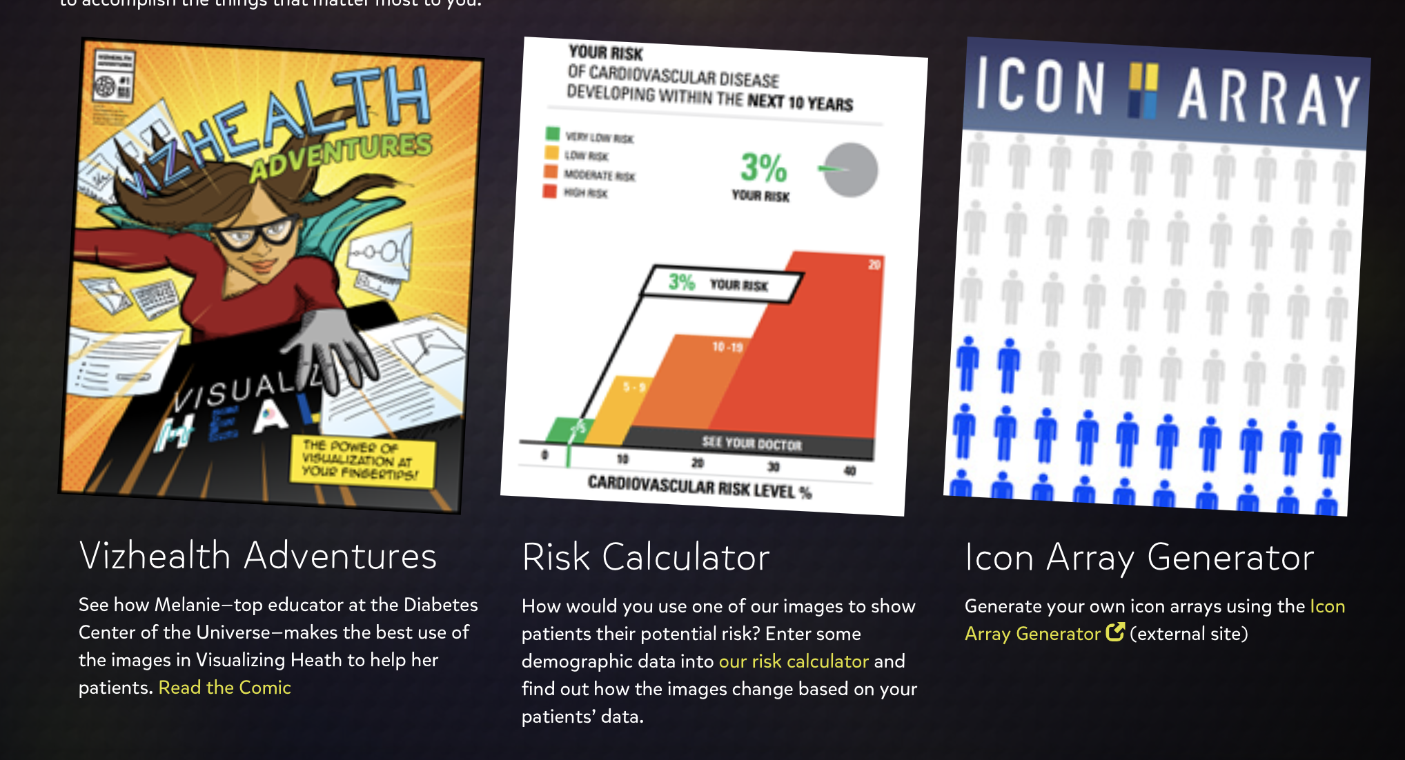
My experience on Vizhealth.org developed a better understand of how beneficial visualization can be. This website was very clear, informative, and very user friendly. The website generates visualization designs for patients to understand in a quick and effective way, for doctors who are trying to communicate some complicated information. The primary goal is communication, and the “wizard” is available to explain the giving data with the best design options. Visualizations help lead to decisions and when facing health issues these visualizations below very helpful. The following video was published on their site, and explains how many different health concerns can be confusing. With this easily accessible visualization of health designed by Robert Wood Johnson Foundation and the University of Michigan Center for Health Communications Research , is to give them a better understanding on the goal and the purpose.
I had no issues with the user-friendly navigation of the site and gained a lot of insight from the many ways of presenting data. This site explained to me that different goals or communication needs requires different designs and graphics for the reader to understand and grasp the concept.
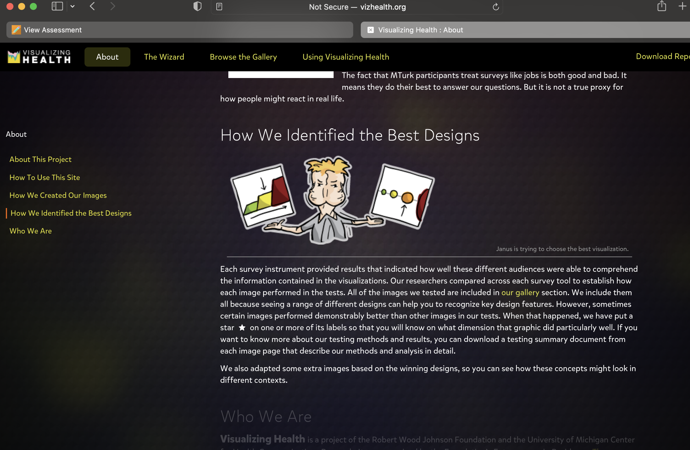
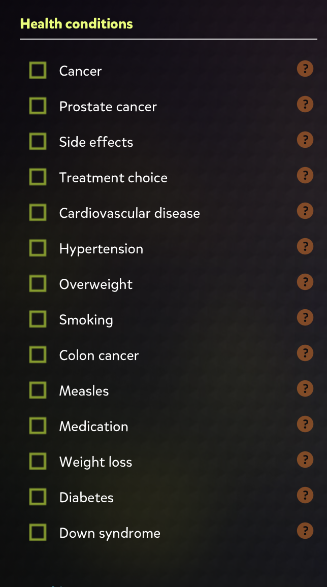
The “wizard” is an assistant in meeting communication needs, and meeting the goal when it involved risk information. It gives multiple ways to design the data, what is best and most comprehendible. With options to input data and edit for example, specific health conditions, different forms of cancer, and if you smoke or are overweight.
Allowing the doctor to input these different aspects and generate the basic idea with options. The ability to edit data and choose the best visualization, including the most relevant information will help assist in explanations. The patient understanding the data in the most effective way is the goal, and there are many options to choose from. The gallery is available to see the best designs and displays a wide range of designs assisting in the determination of what visualization is best.
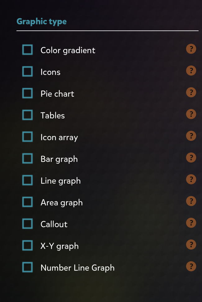
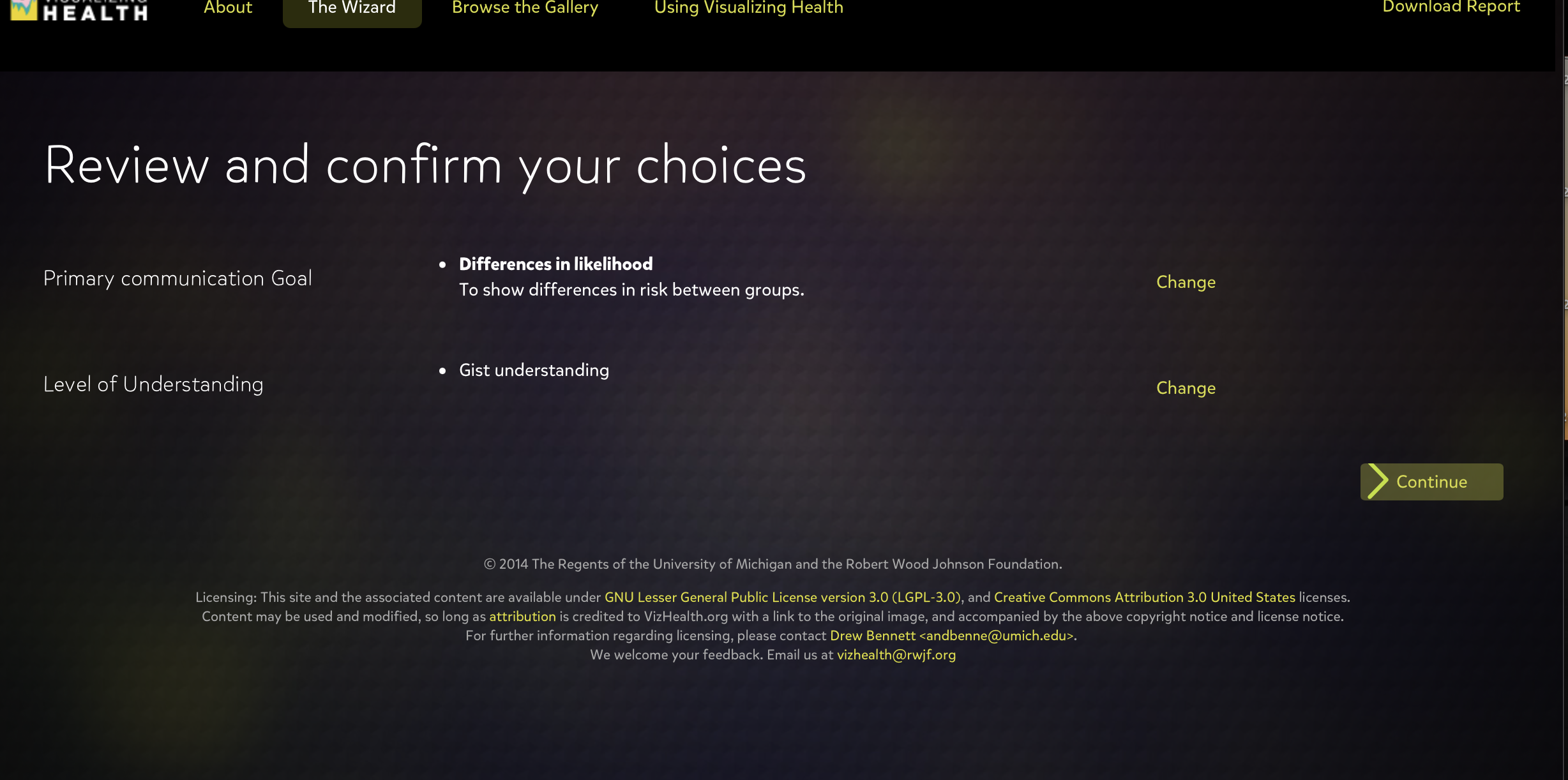
This tool rapidly generates results to choose from to assist in visualizing health issues. Making the patient have a better understand of the risks of their issues and what is the best approach to medications, treatments, and other medical decisions. Visualizing Health gives options for the primary communication goal, and the level of understand whether you want to give basic information or exact numbers.
This site is beneficial to both doctors and patients when communicating life threatening sicknesses, medications, raise or lower concerns, and inform about the risks. The wide variety of helpful visualizations, and my overall experience with this scientifically vetted style guide for communicating health data was simple yet very informative. I grasped the concept of visualization in a more effective way, understanding the many possible ways to present data and how someone will interpret it based on the design.
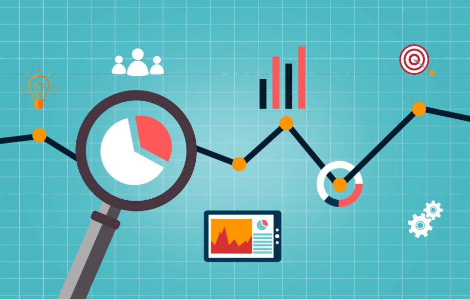
INFOGRAPHICS & TOOLS
INFOGRAPHIC ARE COLLECTIONS OF IMAGERY, CHARTS, AND TEXT REPRESENTING RESEARCHED AND SIMPLIFIED DATA. DATA VISUALIZATIONS AND INFOGRAPHICS SUPPORT MAIN POINTS BY USING ICONS AND COLORS TO CATCH ATTENTION OF THE AUDIENCE. AIMING TO SHOW, RATHER THAN TELL BY USING VISUALIZATIONS, THE DISPLAYS SHOULD BE CONCISE, EASY TO FOLLOW, AND THE SIZE AND SHAPE OF THE INFOGRAPHICS CAN ASSIST IN STORYTELLING. KNOWING WHAT INFORMATION TO INCLUDE, HOW TO INCLUDE IT, AND HOW TO CREATE THE MOST EYE CATCHING INFOGRAPHIC IS DISCUSSED IN THE FOLLOWING VIDEO.

Recent Comments