After exploring the following data visualizations about Our energy System, on the following link:
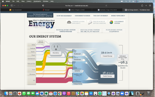
Sankey visualizations are discussed in the text to be a bit complicated but, overall I believe they are a great way to display information. After exploring this information about the energy system in the US, it is a very accurate and clear way to visualize multiple sources and forms of important data. Providing different percentages and estimated energy usage per year after pressing start the flow, was very informative and easily to understand complex data.
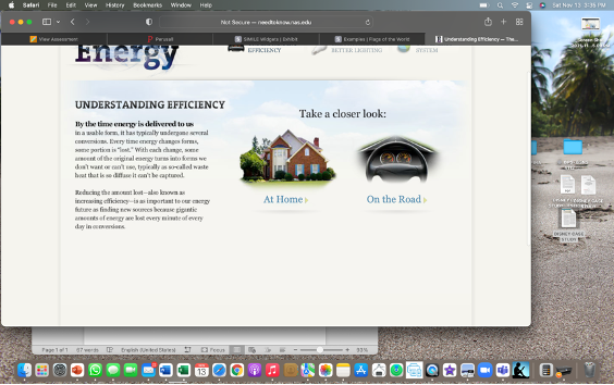
Further into the website, there is more information on energy and understanding the efficiency. They also give options to take a look at how energy is used at home and on the road. Offering very important and useful information about how we use energy at work, and at home.
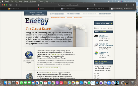
The most interesting aspect of the website was the cost of energy, and the information provided about the environmental impacts. Increasing the importance of climate change for the future, and the visualization and information on energy, the costs, and the environmental impact is displayed efficient, and easily accessible.
Recent Comments