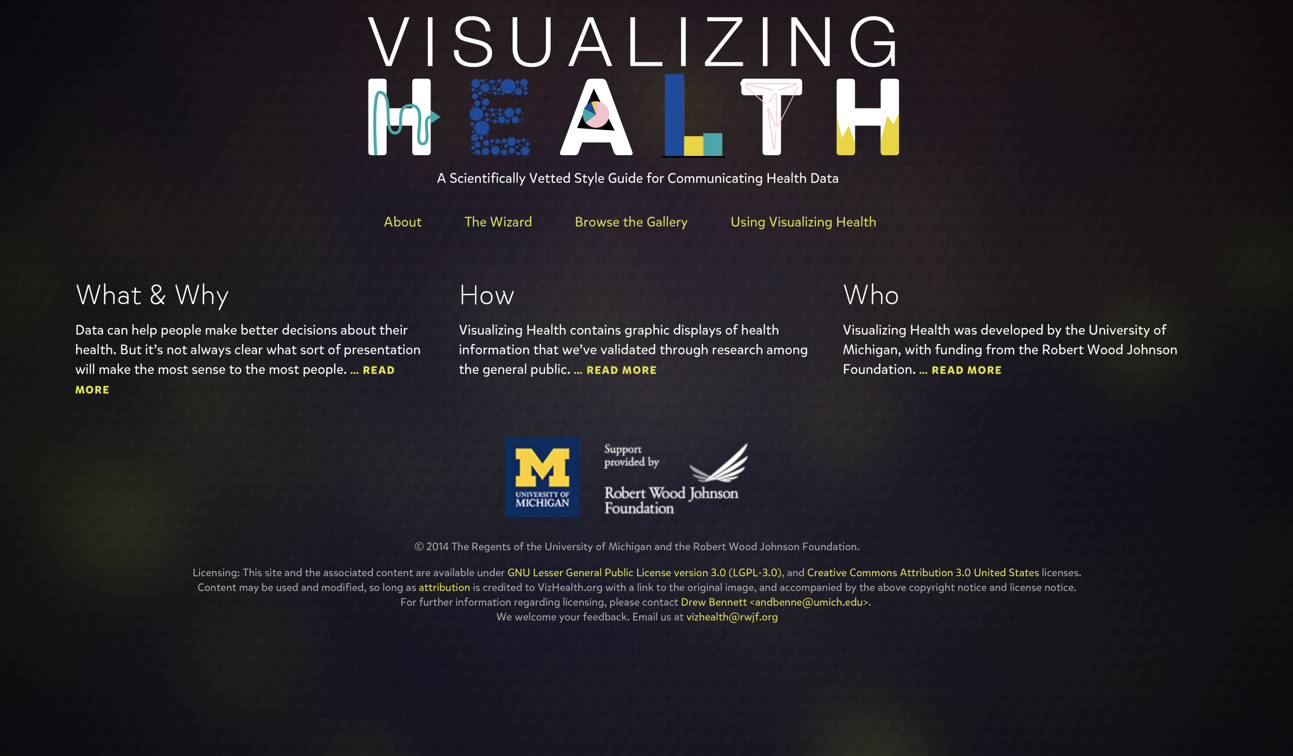
From my initial experience with the website called Visualizing Health which is a developed project founded by the Robert Wood Johnson Foundation and University Michigan center for health communications research. They created various examples of tested visualizations of health information that effectively present audiences with detailed and complex data, however they display it to be easily comprehended when using the appropriate resources. In doing so they also allowed other individuals to use various graphics, tables, and charts to present data and successfully meet the needs of the presenter and
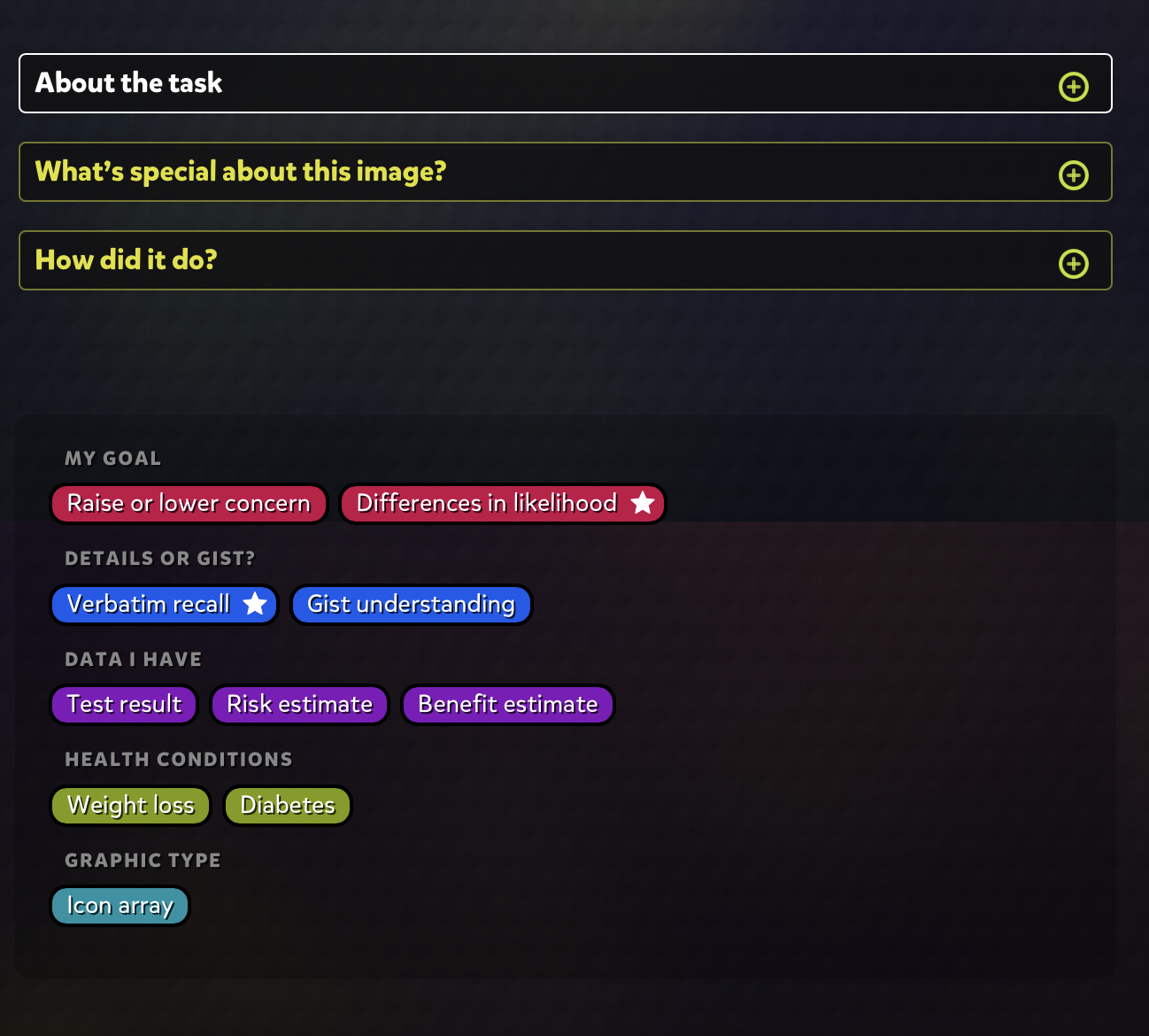
One very major asset that allows this website to work so well is a formula called the wizard that ask you through multiple choice questions designed to match the type of graphic you want and the specific needs you have for the data. Wow meeting in this test the questions seen complex and we’re hard to visualize however they are examples and break down oh the specific type of “risk” you were trying to communicate allowed me to better understand the specific need I was looking for. After the two questions they bring you to a filters which allows you to choose various categories that narrow down your search more distinctively to find the best fit for your data. I like it it’s taking your data and matching it to the correct graphic that will display the data you were trying to present. Once you choose a specific graphic that you wish to use it also gives you a detailed summary of the design and how you can appropriately use this example in your own form of visual data. I like this I because it gives you more information and awareness of the specific data you are using and working down it’s benefits and accuracy in communication risk when properly formulated.
Overall I think this website could be useful for many individuals with the various topics such as health, education, politics, mathematics etc. to effectively show their audiences visual data that supports the information they are presenting. I would recommend this app to anyone who want to present complex yet simple visual graphics and data to easily allow their audiences to understand the information.
Recent Comments