Lollipop charts are very similar to bar charts and can be used to show how data behaves over time or to compare data sets. The design is rather self-explanatory where the chart has lines with circles at the end to represent data points which resemble lollipops.
An example of a lollipop chart is one I created after researching data on what the most popular car colors are in the United States.
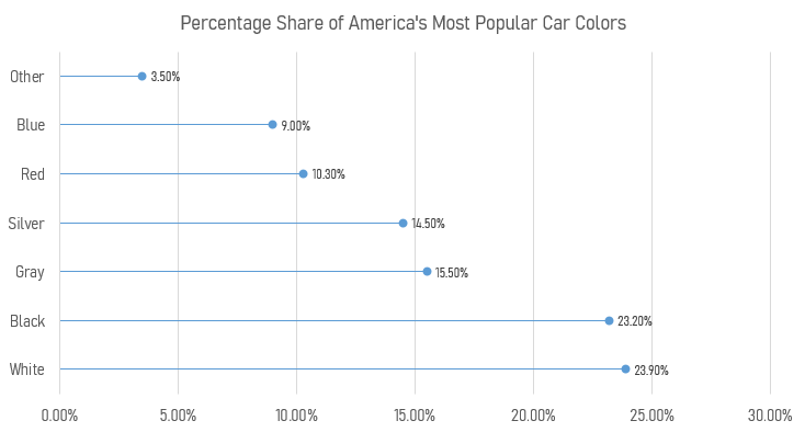
Using this chart creates a minimalistic and readable display of the data that clearly shows that white, black, and gray are the top three colors. Lollipop charts are very versatile and can be a very effective way of visualizing data.
Recent Comments