Benchmark comparisons are some of the most important visualizations used in everyday applications. Some of these applications include business sales performance, educational performance, and investment analyses. Regardless of the situation, all benchmarks are used to show a comparison that allows the viewer to make a conclusion such as under or over performing.

Investing Applications
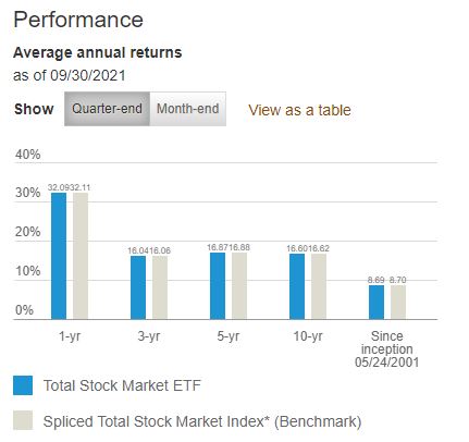
One real world example of a benchmark comparison is in investment analyses or stock performance graphs. As available from Vanguard.com, they have a performance graph that compares the average annual returns of their Total Stock Market ETF (VTI) with a benchmark Spliced Total Stock Market Index across multiple chunks of time. In this case, they used a bar graph to visualize the difference where the data of interest is highlighted in a vibrant blue color and the benchmark is in a less distracting grey shade.
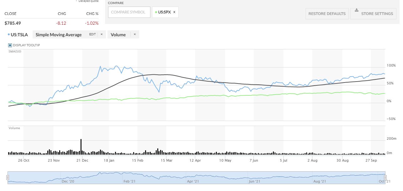
Another investment application is in the performance comparison graph between Tesla (TSLA) and the S&P 500 (SPX) from MarketWatch.com This graph is more complicated but it has a greater difference between the two that gives the viewer a better visualization of which one had a greater performance.
In this case, MarketWatch outlines Tesla’s stock price performance in blue while the price performance of the S&P 500 is in a vibrant green color. As seen in the graph, Tesla clearly outperformed the S&P 500 by a wide margin in the past year but it was much more volatile throughout the year.
Other Applications
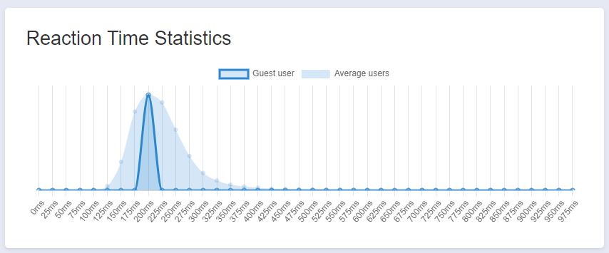
Another application of benchmark comparisons is with performance of bodily functions such as reaction time. There are various websites that have reaction time tests and will provide statistics based on a user’s results. The website I used is HumanBenchmark.com where I scored an average reaction time of 203 ms. The graph that is generated shows your score highlighted in a dark blue with the average of all other users in a lighter blue. Based on the graph, my score was almost directly in the middle of the bell curve that seems to be skewed to the right. I can conclude that my reaction time is right around average compared to other users.
Recent Comments