![The Wall Street Journal on Twitter: "Heard on the Street: China's rate cut isn't the deepest, writes @alexfrangos http://t.co/wRlENxOe8Q http://t.co/kAYootdACU"](https://pbs.twimg.com/media/CEtTEUNWMAAQsy3.jpg)
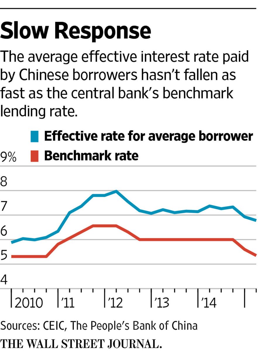
This is a graph from the wall street journal showing the effective rate vs the benchmark rate. We can clearly see that the effective rate is not meeting the benchmark rate.
![Former Harvard Money Whiz Jack Meyer Tries to Regain His Edge - WSJ](https://si.wsj.net/public/resources/images/BF-AP675_CONVEX_16U_20170418161505.jpg)
I also feel like this is another good example because it shows the benchmark as the x axis
Recent Comments