Pivot Tables

I chose this pivot table because it highlights some of the information, and is a good example. The higher percentage of email sign ups (18% and above) are shaded yellow, while the lower percentages are shaded blue. Pivot tables are primarily used to point out data. In this instance a good take away would be that email sign-ups in 2013 and 2014 are generally higher on wednesdays.
Word Cloud
To me, this word cloud is pretty good. At first it is confusing because the words are all positive words about education and best practices. Then the question becomes why is the word cloud called dog vomit. It could be for many reasons. I agree with them that the word cloud shows no context and is a bad word cloud.
Perfect Use Case Pie Chart
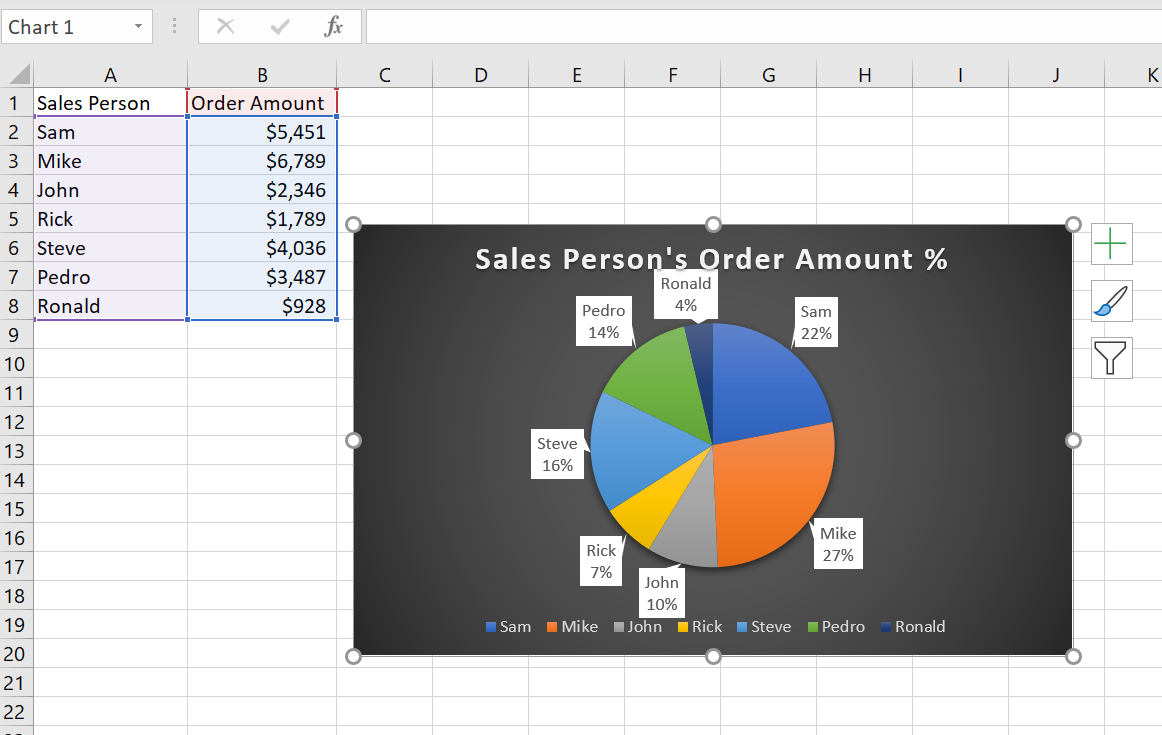
I believe that this is a perfect Use case for a pie chart because you can easily identify the percentages for each salesperson. The more information your pie chart can say the better. In this case its not enough to only know the order amount in dollars. By including the percentages for each salesperson, it makes for a more appealing pie chart.
I am not sure if there is a better way to display percentages than a pie chart. Written form can be useful for showing percentages but a pie chart looks much better.
Loli Pop Chart
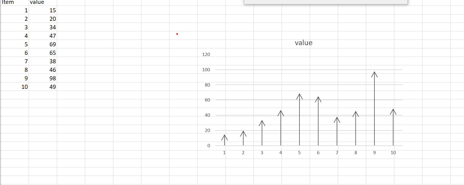
This is my loli pop chart and I got it from a regular bar chart by playing with the borders and adding arrows. This type of graph is similar to a bar chart so its best used whenever a bar chart is best used. Usually for looking at linear data
Benchmark
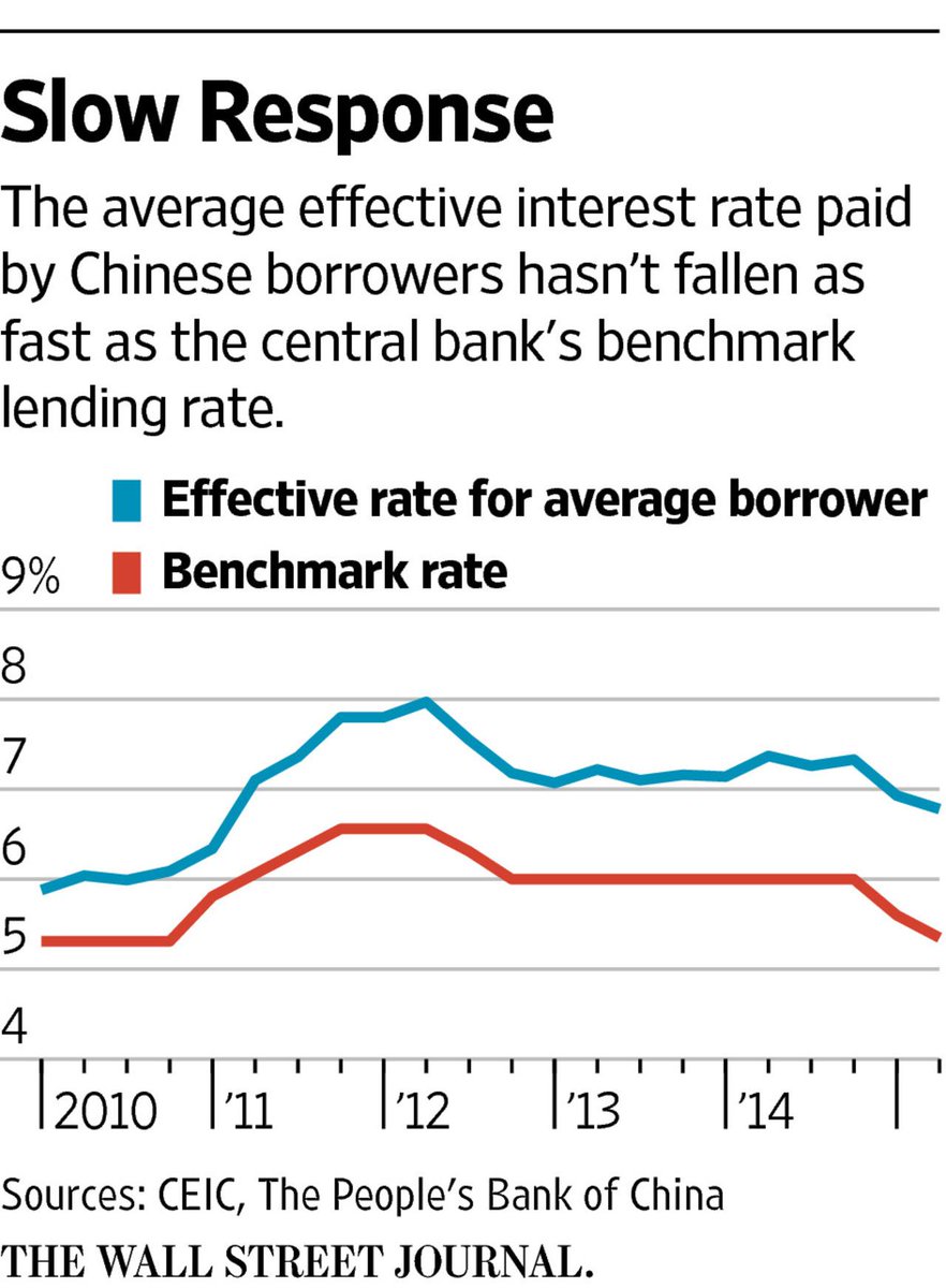
This is a graph from the wall street journal showing the effective rate vs the benchmark rate. We can clearly see that the effective rate is not meeting the benchmark rate.

I also feel like this is another good example because it shows the benchmark as the x axis
Comparing Numbers
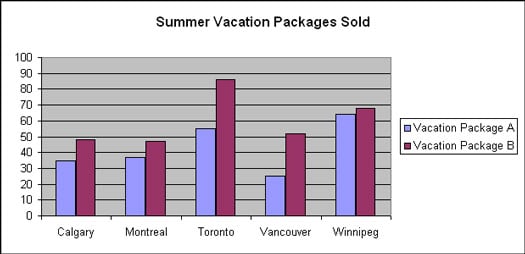
www.dummies.com/education/math/basic-math/compare-numbers-using-a-bar-graph/
This graph does a good job of comparing two different vacation packages from the same company. Here we can compare the companies sales from their different Canada offices. Something like this would be used as a way for a company to improve itself, and the bar graph is good for visualizing the data.
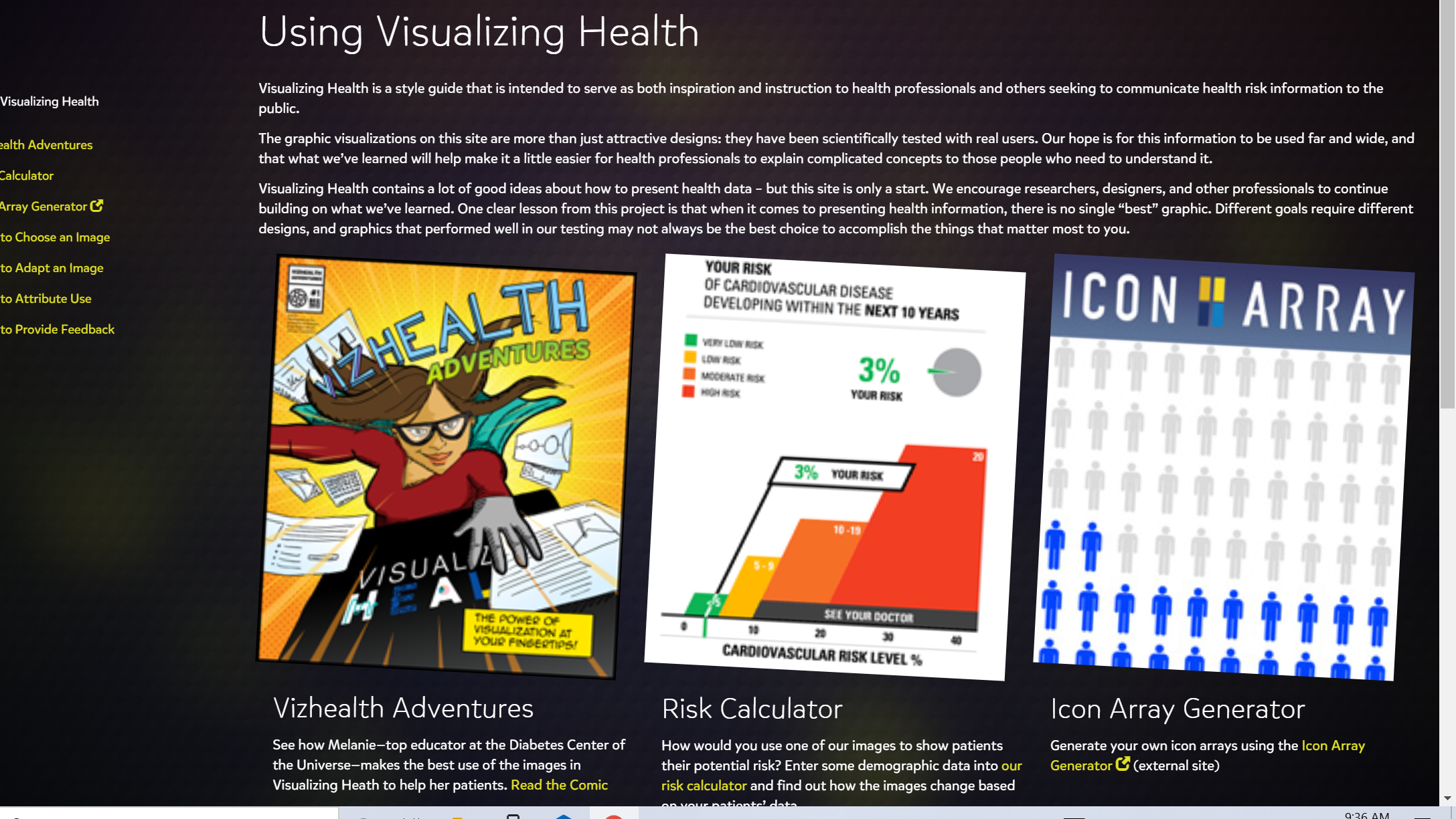
Visualizing Health

Chances of a hole in one
pinterest.com/pin/47921183521791727/?d=t&mt=login
I have been golfing for many years now and still have yet to hit a hole in one. I know it sounds really hard, but its not impossible. Some people get lucky for example a person who’s ball hits the tree and somehow goes in the cup. It still counts. As the fall approaches I think to myself if I’m ever gonna hit that hole in one. I might have a better chance of hitting one after I turn 50. I bet it is a great feeling, but that day has not come yet. Until then I will continue trying to hit a hole in one.
Recent Comments