Pie charts are another effective way of visualizing data for other viewers. There are two instances that constitute the utilization, they are when comparing to show the part-to-whole relationship or when trying to show that one segment is relatively large or small. Typically these types of visualizations are most effective with data that are roughly around either 75%, 50%, or 25%. This is due to the fact that it is easier for viewers to interpret and analyze the data since they can use their past knowledge on parts of a whole to clearly analyze and infer that the segments are represented correctly.
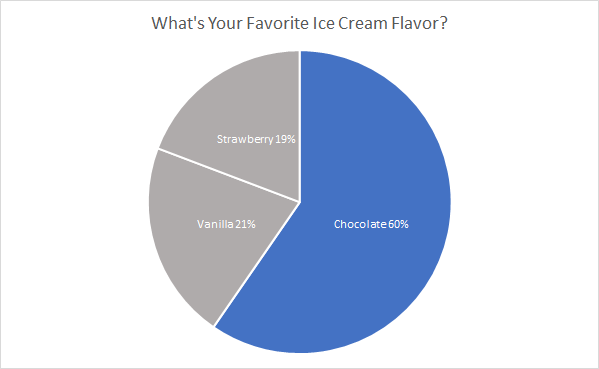
Favorite ice cream flavors are a perfect example of using a pie chart. In this case, we are showcasing the popularity of chocolate compared to vanilla and strawberry. Choosing an appropriate color scheme is important, too much color distracts the viewer and takes away from the message trying to be conveyed. So in this instance chocolate is the only segment with color because it is the section that we what the viewer’s attention to focus on to compare against the other two segments. By adding appropriate colors, data and labels make it easier for viewers to analyze and interpret, which in turn aids in the understanding of the message trying to be conveyed through the representation.
I think the pie chart is the perfect representation for this data because it effectively showcases the popularity of chocolate compared to the other popular flavors. If I had to pick another visualization to create I think a bar graph depicting the votes for each flavor would be another strong choice to represent the data and convey a similar message.
Recent Comments