When it comes to data visualization, pie charts seem almost quintessential. Along with bar graphs, they are one of the earliest exposures a child might have to see numbers graphically. As such, it might be easy to underestimate the power pie charts can have. This power, however, is delicate and there are plenty of ways it can be hindered.
In a post to Storytelling with Data, Elizabeth Ricks highlights key considerations one should make when constructing pie charts. Hardly a trivial task, Ricks insists that along with being “one of the most common types of data visualizations,” they are also one of the most misused.
The key, as she goes on to explain, to be able to identify which kind of data is applicable for pie charts is to look for signal phrases such as “percent of” or “part of”. As it turns out, however, this alone is not sufficient. Ricks continues by mentioning the primary uses for pie charts:
If you want your audience to have a general sense of the part-to-whole relationship in your data and comparing the precise sizes of the slices is less important.
To convey that one segment of the total is relatively small or large.
Elizabeth Ricks (2020), retrieved from : storytellingwithdata.com.
As an example, in an October 22nd news report through NPR, Scott Hensley shared that the Pfizer-BioNTech COVID-19 vaccine is “90% effective against symptomatic COVID-19” in kids aged five to eleven. Following Ricks’ advice, the percent figure might make it tempting to use a pie chart to represent this statistic.
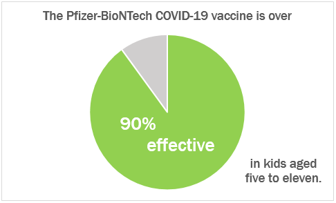
On its own, this chart is a fine visualization; it conveys the stark difference between the two segments. Nevertheless, given the context of the data, Vaccine effectiveness rates are common compared to others. In this regard, using pie charts falls short. Both Ricks and Stephanie DH. Evergreen concede that people are not good at being able to distinguish areas and angles. This may not be an issue when there are a small number of greatly varying segments, such as the example above. However, if a number of similar areas are at play, this can become a problem.
With regards to vaccine effectiveness rates, Caitlyn Stulpin offers a better visual in her article for Healio. In it, the use of angles is eliminated and the areas are more simple, consisting of bars rather than wedges of a circle.

A better use of a pie chart would see stand-alone employment of a part-to-whole relationship. While comparisons can be made, the primary one ought to be between its components. With regards to vaccinations, consider the percent of people in the state of New Jersey that have received at least one dose of a COVID-19 vaccine.
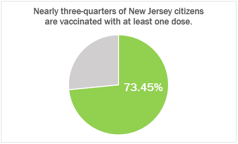
While both pie charts visualize a percentage, it is important to take into consideration how that percentage might be used. In this regard, the second example is a better fit for the primary abilities of a pie chart. By showing the part-to-whole relationship with a focus on the size differential between the two, it employs the fundamental strengths of pie charts while avoiding their shortcomings.
Recent Comments