Pivot Tables
Spreadsheets can be intimidating. Although simple data sets may be more common, sometimes, there’s no way to prevent them from becoming complex as more columns and rows are added to accommodate additional information. To combat this, spreadsheet applications offer the option to include “Pivot Tables”.
A PivotTable is a powerful tool to calculate, summarize, and analyze data that lets you see comparisons, patterns, and trends in your data.
Retrieved from : support.microsoft.com.
In addition to providing basic instructions for a number of different spreadsheet applications, Lumeer mentions several uses for Pivot Tables. Throughout each example, however, it is evident how well the tool works at making otherwise convoluted data more intelligible.
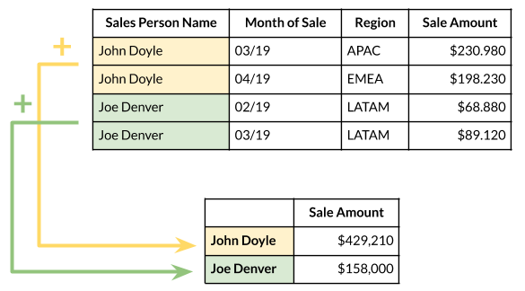
In this example, the original data set is altered to show the total sale amount of each salesperson across the timespan the data was collected from. This is only one possible adaptation of the data, however. If the sales amount by month is preferred, a different Pivot Table would fit the bill.
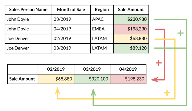
Depending on what factors a Pivot Table takes into consideration, the same data set can yield a multitude of different stories. While it may be a cliché to suggest that the possibilities are endless, that is exactly the appeal and purpose of Pivot Tables. With their help, any element can be added to a data set and be presented concisely.

In this spreadsheet, data spread across 135 cells take factors such as transaction type, method, status, method, and date into consideration. With earlier examples in mind, it is easy to imagine how any number of Pivot Tables can represent the data. By isolating desired information, they are an invaluable tool for displaying and sharing data in ways that are more effective than the original table on its own.
Sankey Diagrams
The production of energy is an incredibly complex topic. With so many factors at play (including sources, consumers, and amount used), it can be difficult to effectively visualize the data in one graphic. The National Academies of Sciences, Engineering, and Medicine maintain a collection of Sankey diagrams that attempts to depicts the energy system across the United States and more localized areas. Although not perfect, and at the cost of cohesion, they accomplish this goal.
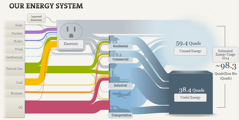
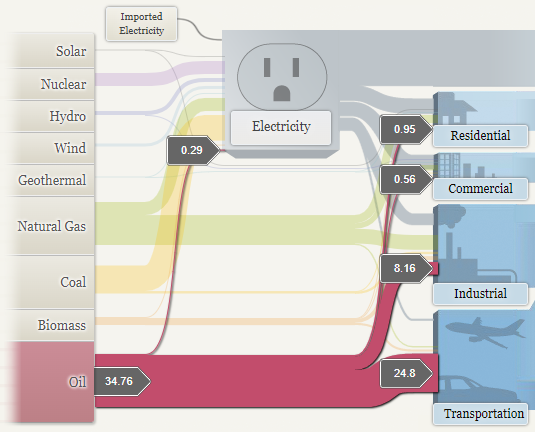
At first glance, the diagram appears overwhelmingly convoluted. It is important to realize, however, that this particular Sankey diagram combines three into one: the first shows the distribution of energy from its sources (in color), the second shows the distribution of electricity (in gray), and the third shows what portions are considered useful versus those that go unused (in blue).
To increase intelligibility, the diagrams let the viewer make particular selections. This highlights the one part and provides numerical data, both crucial for conciseness.
In addition, the number of separate diagrams introduces the possibility for even more information to be depicted, even going beyond what the diagrams show.
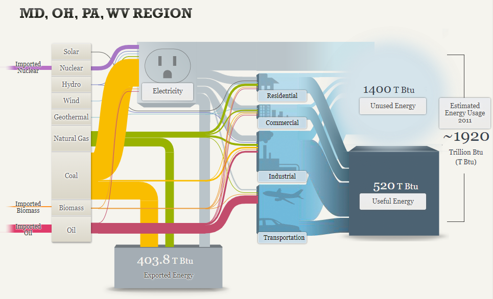
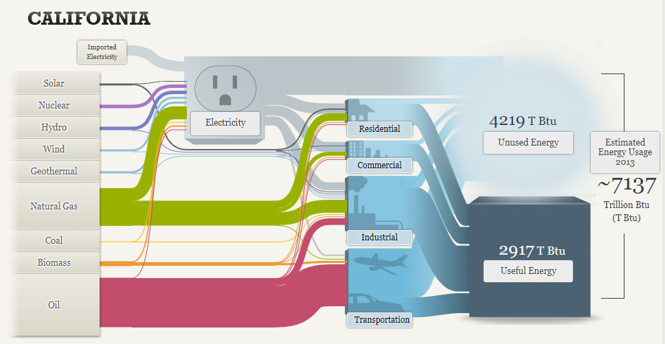
Immediately, one feature proves to be advantageous: it is easy to determine what the primary sources of energy are in each area. Further, this can be important in determining how reliant particular areas are on certain sources. For instance, California relies heavily on oil (most of which is used for transportation) whereas the other region relies more on coal (most of which goes into the production of electricity). In turn, these can go on to provide insight into the context of each area; coal use is more prevalent in an area where it is mined just as oil is used more in an area that is heavily populated and on the move.
Nevertheless, these Sankey diagrams could be improved. Consider, for instance, the percent of useful energy compared to the total amount produced. Although not provided, the values can be calculated as 39.1% nationally, 27.1% across the specified region, and 40.9% in California. These are all represented by dark-blue cubes of the same side, regardless of the varying percentages. Therefore, without doing the calculations and relying on the diagrams alone, one might be led to believe the ratios are consistent across the nation, regardless of scale.
That being said, these Sankey diagrams in particular highlight the issue that more energy is wasted as opposed to put to use. While this may be concerning, it is important to mind physical limitations of energy production. The diagram points out the following:
There are many opportunities to improve our nation’s energy efficiency, but it’s impossible to avoid losing some energy as heat when converting energy from one form to another. The principles of physics place upper limits on how efficient a heat engine, power plant, or oil refinery can be.
Retrieved from : needtoknow.nas.edu.
Pie Charts : Hardly a Piece of Cake
When it comes to data visualization, pie charts seem almost quintessential. Along with bar graphs, they are one of the earliest exposures a child might have to see numbers graphically. As such, it might be easy to underestimate the power pie charts can have. This power, however, is delicate and there are plenty of ways it can be hindered.
In a post to Storytelling with Data, Elizabeth Ricks highlights key considerations one should make when constructing pie charts. Hardly a trivial task, Ricks insists that along with being “one of the most common types of data visualizations,” they are also one of the most misused.
The key, as she goes on to explain, to be able to identify which kind of data is applicable for pie charts is to look for signal phrases such as “percent of” or “part of”. As it turns out, however, this alone is not sufficient. Ricks continues by mentioning the primary uses for pie charts:
If you want your audience to have a general sense of the part-to-whole relationship in your data and comparing the precise sizes of the slices is less important.
To convey that one segment of the total is relatively small or large.
Elizabeth Ricks (2020), retrieved from : storytellingwithdata.com.
As an example, in an October 22nd news report through NPR, Scott Hensley shared that the Pfizer-BioNTech COVID-19 vaccine is “90% effective against symptomatic COVID-19” in kids aged five to eleven. Following Ricks’ advice, the percent figure might make it tempting to use a pie chart to represent this statistic.
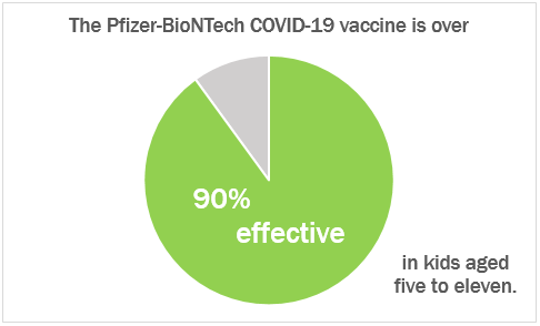
On its own, this chart is a fine visualization; it conveys the stark difference between the two segments. Nevertheless, given the context of the data, Vaccine effectiveness rates are common compared to others. In this regard, using pie charts falls short. Both Ricks and Stephanie DH. Evergreen concede that people are not good at being able to distinguish areas and angles. This may not be an issue when there are a small number of greatly varying segments, such as the example above. However, if a number of similar areas are at play, this can become a problem.
With regards to vaccine effectiveness rates, Caitlyn Stulpin offers a better visual in her article for Healio. In it, the use of angles is eliminated and the areas are more simple, consisting of bars rather than wedges of a circle.

A better use of a pie chart would see stand-alone employment of a part-to-whole relationship. While comparisons can be made, the primary one ought to be between its components. With regards to vaccinations, consider the percent of people in the state of New Jersey that have received at least one dose of a COVID-19 vaccine.
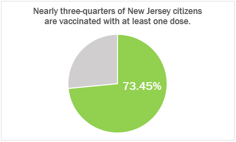
While both pie charts visualize a percentage, it is important to take into consideration how that percentage might be used. In this regard, the second example is a better fit for the primary abilities of a pie chart. By showing the part-to-whole relationship with a focus on the size differential between the two, it employs the fundamental strengths of pie charts while avoiding their shortcomings.
Lollipop Charts : A Sweet Take on Data Visualization
At first glance, lollipop charts might seem like a frivolous adaptation of a bar or column graph. Fundamentally, these types are identical; they show any number of categories’ values with respective figures. However, it is through that “any number” where one loses favor over the other. Stephanie DH. Evergreen notes in Effective Data Visualization that lollipop charts are “especially helpful when [a standard bar or column chart] is overpowering due to its massive ink,” (page 156), a consequence of trying to show too many categories.
For example, consider “Travels’ Choice Best of the Best”: Tripadvisor’s collection of “iconic, can’t-miss destinations”. For 2021, the most popular destinations across the world include twenty-five locations, each with a specific number of “things to do”. These numbers can vary greatly, however, and do not influence a location’s position on the list. With extremes being Playa del Carmen, Mexico at just over one-thousand, and Bali, Indonesia at nearly ten-thousand, it’s clear to see that there is no rhyme or reason when it comes to how much a destination might have to offer.
Graphically seeing this data would help, but with twenty-five points to consider, something like a conventional bar graph could easily become overwhelming. The solution, as Evergreen puts it, is to “remove even more ink,” (page 149). Since the endpoint of each bar is what quantifies the data, that’s all one would need to show. Nevertheless, just having these points can just as easily be confusing; having to trace x-many points back to their labels requires more diligence by the viewer than should be expected. The best of both worlds combines points that indicate value with stems that lead back to the label. Enter: the Lollipop Chart.
Returning to Tripadvisor’s “Best of the Best”, a lollipop chart would compare each location to its number of things to do.
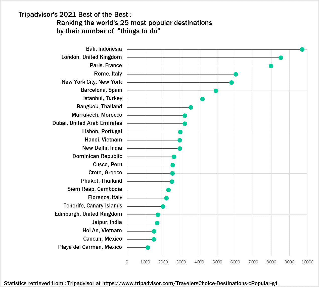
Although specific numbers can only be estimated, a general overview is easy to see with this visual. The viewer can tell how each destination compares to any other and where it falls relative to the entire list. They can also see how the trend differs between the first ten destinations and the rest. If a traveler is looking for a quick reference to see just how much their desired location has to offer (or to see if other locations have even more), then this visual works wonders.
Benchmark Comparisons in News and Other Media
Displaying performance through a benchmark gives context to data and shows how well they meet expectations. Often displayed as simple graphs, it is no wonder that they accompany news articles, a place where ease of comprehension is paramount.
In an article from 2018, Drew DeSilver from the Pew Research Center examined the purchasing power of the average wage throughout the past five decades. DeSilver used text to describe the statistics and their implications. Additionally, he included a graph that compares the dollar amount to its equivalence in 2018.
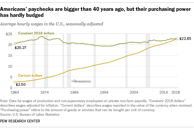
… today’s real average wage (that is, the wage after accounting for inflation) has about the same purchasing power it did 40 years ago. And what wage gains there have been have mostly flowed to the highest-paid tier of workers.
Drew DeSilver, Pew Research Center, August 7. 2018
Though incidental, this graph sees the line for “Constant 2018 dollars” acting as an average or standard, both potential facets of focus Stephanie DH. Evergreen describes in Effective Data Visualization. Through it, the audience can see how the two values compare and their trends: whereas “Constant 2018 dollars” has, indeed, remained relatively constant since 1964, “Current dollars” has continuously grown, narrowing the gap to a point.
Other examples can be more cut-and-dry. Isaiah Mitchell reported on end-of-year exam results for Texan public schools in a 2021 article. The report included several graphs, most of which compared grade averages in Texas to their national counterparts.

The data is self-explanatory, a testament to how well it is suited to the graphic. It is clear to see the progression of both averages and the overall decline in Texas’ marks.
Comparisons to a benchmark are not exclusive to news articles, however. An example that might be more familiar to students, in particular, might be their results of standardized tests.

Here, the comparison is more obvious. The graphic takes the liberty of even labeling the benchmark for both areas that were tested. This makes it even easier for the viewer to determine how well they fared relative to what is deemed “on track for college readiness”. In Effective Data Visualization, this style best reflects a “bullet graph” (page 105). There are distinct acceptable and unacceptable areas, a target line (seen here as the transition from yellow to green), and the actual value depicted as a dot.
Though their forms may vary greatly, the purpose benchmarks serve is the same. As evergreen put it, their stories “… help a reader to determine whether performance was good, bad, or close to the mark,” (page 91). They offer necessary information for an audience and gives a data set an easy-to-understand meaning. As previous examples showed, complex, sometimes convoluted information can be well displayed through a benchmark.
Population Pyramids : Comparing Numbers Across Time
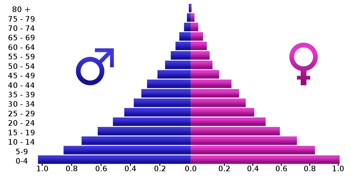
Particular attention of this week’s assignments (and Chapter 3 of Effective Data Visualization) was paid to back-to-back graphs. Although Evergreen’s exercises explored one potential use of back-to-back graphs, perhaps the most common example are population pyramids.
Otherwise known as age-sex pyramids, these graphs aptly measure the distribution of a population based on a sex’s share of age groups. With each graph a snapshot of a particular timeframe (usually for a given year), population pyramids are particularly good at displaying changes over time.
PopulationPyramid.net lets the user explore the age-sex distribution of the world and individual countries. With data from 1950, one can see how populations have changed over time and have been influenced by historic events – for better or worse. One of the most relevant types of statistical data, the site also affords population projections unto the year 2100. With these, organizations and governments can plan ahead in anticipation of what future populations will need; areas with a sizeable young population might consider investing in infrastructure to meet impending housing demands, whereas areas with an aging population might focus on eldercare.
As the video highlights, within a single image, scientists and policymakers are able to gain a “rich and complex understanding of populations and the factors affecting them,” (04:40). Although they might appear as aesthetically plain graphics, population pyramids can be incredibly dense in historical context and implications of what’s to come. An integral part in being able to understand the past and prepare for the future, it is all the more valuable to be able to appreciate the power of population pyramids and properly interpret and utilize them.
A Commentary on “Visualizing Health”

Visualizing Health is a program that hopes to alleviate the burden put on healthcare professionals when they need to communicate information about a person’s data-rich bodies. Likewise, for individuals, it hopes to clear up what the numbers presented to them mean. Graphics can be a great way of visualizing this data, making it easier for both parties. However, not all visualizations are created equal.
The program beings with “The Wizard”. It only needs to know two things: what the graphic’s primary goal will be and whether or not exact statistics will be used in achieving that goal. From the selections made, the program sifts through its collection of 54 tested visualizations. It then returns the ones best suited to achieve one’s specific goal.
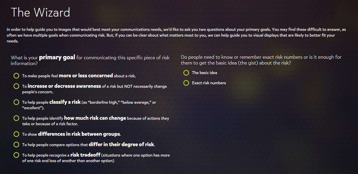
After the initial results, one can make further refinements through the selection of tags that take other factors into consideration. These include the type of data that is available, which specific health conditions are being looked at, and which type of graphic is desired. The selection of more tags yields recommendations better suited for one’s topic and purpose.

Each graphic appears to adhere well to the principles of good chart design that have been explored so far through class assignments. The data is well presented with appropriate, attractive graphs and color schemes, and there is no “chart junk”. Rather, every element has its specific purpose. As these graphics were designed with the medical field in mind, this would be expected.
When it is a matter of a person’s health, there is no benefit in making information ambiguous or hard to follow. The health conditions that Visualizing Health focuses on – cancers, diseases, genetic disorders – are grave topics. Often matters of life or death, the more effective one can be in communicating data about these conditions, the better. Visualizing Health, therefore, provides an immense service to healthcare professionals and patients alike.
However, its utility does not end there. Its expertise in data visualization can extend beyond the field of medicine. As mentioned, many of the principles used in the graphics were introduced before Visualizing Health. They are universal, in a sense, and can apply to any discipline. Every graphic can benefit from the ideals of conciseness, eye appeal, and a “less is more” mindset. What’s more, there is the matter of finding the right visual. Through practice with this program, and with help from “The Wizard”, these tasks become less taxing, making one’s visuals all the more effective.
“With great power …” : Tools for Building Infographics

It’s no secret that the modern world is saturated in data.
While the potential of data has always been known, exactly how versatile it is continues to grow as more novel ways of gathering, utilizing, and sharing information arise. Stephanie DH. Evergreen alludes to this progression in her book, Effective Data Visualization (Second Edition, 2020, page 2).
… we have so much data we are suffocating in it. So now smart organizations are asking me how to cut through all the data they have and make it useful again.
The great power data affords is followed by the need to make use of it. However, it’s not just companies who have the responsibility to be able to share data in ways that are visually appealing, convincing, and concise. These skills are increasingly becoming an asset for use in the office and in the classroom; so much so, it seem inevitable that they will soon be a requirement.
To meet this rising demand for infographics and other data visualizations, programmes appealing to audiences with varying levels of skillsets and expertise (as well as the even greater variability of the audience the visuals are for) have been created. Offering the ability to start from a template or from scratch with drag-and-drop ease, sites such as Piktochart and Easelly have been hallmarks in the industry for nearly a decade. Others, such as Canva, are seeing a new surge of enthusiasm as the company expands beyond infographics and into other graphic media such as business cards, posters, and even social media posts.
While there is more to effective data visualization than these user-friendly platforms might lead on to, they offer an invaluable resource to those heeding the call to be more responsible with the data they share. With the ability of constructing attractive infographics taken care of, creators can turn their attention towards the more subtle (but, perhaps, the more crucial) traits of being to the point and truthful. A testament to their credibility, what they do with the data – and, indeed, the power – they have at their disposal speaks volumes. After all, with great power …
Recent Comments