Displaying performance through a benchmark gives context to data and shows how well they meet expectations. Often displayed as simple graphs, it is no wonder that they accompany news articles, a place where ease of comprehension is paramount.
In an article from 2018, Drew DeSilver from the Pew Research Center examined the purchasing power of the average wage throughout the past five decades. DeSilver used text to describe the statistics and their implications. Additionally, he included a graph that compares the dollar amount to its equivalence in 2018.
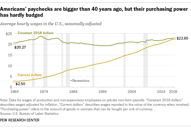
… today’s real average wage (that is, the wage after accounting for inflation) has about the same purchasing power it did 40 years ago. And what wage gains there have been have mostly flowed to the highest-paid tier of workers.
Drew DeSilver, Pew Research Center, August 7. 2018
Though incidental, this graph sees the line for “Constant 2018 dollars” acting as an average or standard, both potential facets of focus Stephanie DH. Evergreen describes in Effective Data Visualization. Through it, the audience can see how the two values compare and their trends: whereas “Constant 2018 dollars” has, indeed, remained relatively constant since 1964, “Current dollars” has continuously grown, narrowing the gap to a point.
Other examples can be more cut-and-dry. Isaiah Mitchell reported on end-of-year exam results for Texan public schools in a 2021 article. The report included several graphs, most of which compared grade averages in Texas to their national counterparts.

The data is self-explanatory, a testament to how well it is suited to the graphic. It is clear to see the progression of both averages and the overall decline in Texas’ marks.
Comparisons to a benchmark are not exclusive to news articles, however. An example that might be more familiar to students, in particular, might be their results of standardized tests.
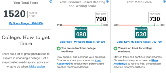
Here, the comparison is more obvious. The graphic takes the liberty of even labeling the benchmark for both areas that were tested. This makes it even easier for the viewer to determine how well they fared relative to what is deemed “on track for college readiness”. In Effective Data Visualization, this style best reflects a “bullet graph” (page 105). There are distinct acceptable and unacceptable areas, a target line (seen here as the transition from yellow to green), and the actual value depicted as a dot.
Though their forms may vary greatly, the purpose benchmarks serve is the same. As evergreen put it, their stories “… help a reader to determine whether performance was good, bad, or close to the mark,” (page 91). They offer necessary information for an audience and gives a data set an easy-to-understand meaning. As previous examples showed, complex, sometimes convoluted information can be well displayed through a benchmark.
Hello,
I love how you explained the purpose and benefits for benchmark charts and why they are used in these specific articles. I also like how you references other sources like the book to support your explanation of the effectiveness of the chart. The charts you chose are very effective and easy to comprehend in understanding what a benchmark is and the various topics and comparisons you can have In using this type of chart. Great Work!
I like this article because of all the information on it and that it has multiple graphs. I don’t have any suggestions its a good article on benchmarking. Have you ever set a benchmark for yourself