There are many different ways to make benchmark comparisons in data visualizations, its really all about the creators preference. The most common and easiest from what I’ve seen is using a consistent color for all the data points except for the one that the main focal point of the comparison. This is to ensure that that stands out to the viewers compared to the other data in the visualization. The better a data entry stands out in relation to the rest of the data set makes it easier for the view to distinguish what is trying to be compared a long with the message that is trying to be conveyed to them.
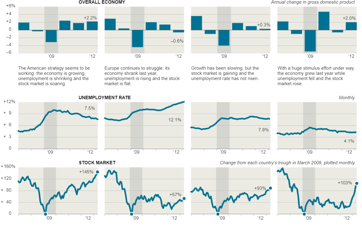
For example, take the visualizations that were displayed in the New York Times article, Three Measures of Central Banks’ Effectiveness. Here they were showing the effects of the financial and economic crisis of 2008 and 2009. In their visualization they placed a light grey highlight around the 2009 column to create a greater contrast to the other bars in the visualizations to let the viewers know this is the year that we are focusing on in relation to the others. This is effective because open viewing the visualization my eyes were immediately drawn to it.
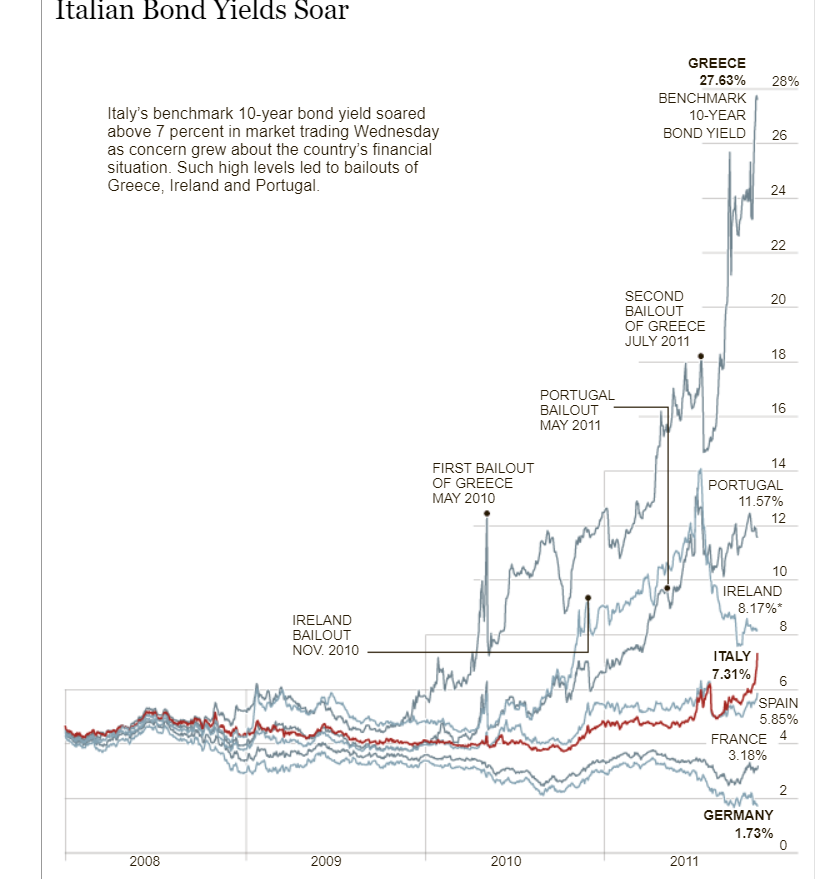
Furthermore, the Italian Bond Yields Soar visualization in the New York Times uses the same technique of changing colors in their crowded line graph in order to make the line they want to compare the data to stand out. The visualization keeps every line a consistent shade while using a darker red color on the Italian Bond line to make it stand out against all of the light grey lines allowing the viewers to easily follow and compare the Italian Bond to the others when comparing the growth rates.
Recent Comments