Pivot Tables
Pivot Tables are an easy and extremely useful feature in Excel that allows for the extraction of significant information from large detailed data sets. It allows for the users to quickly convert data into smaller easier to understand sets to help them complete their work.
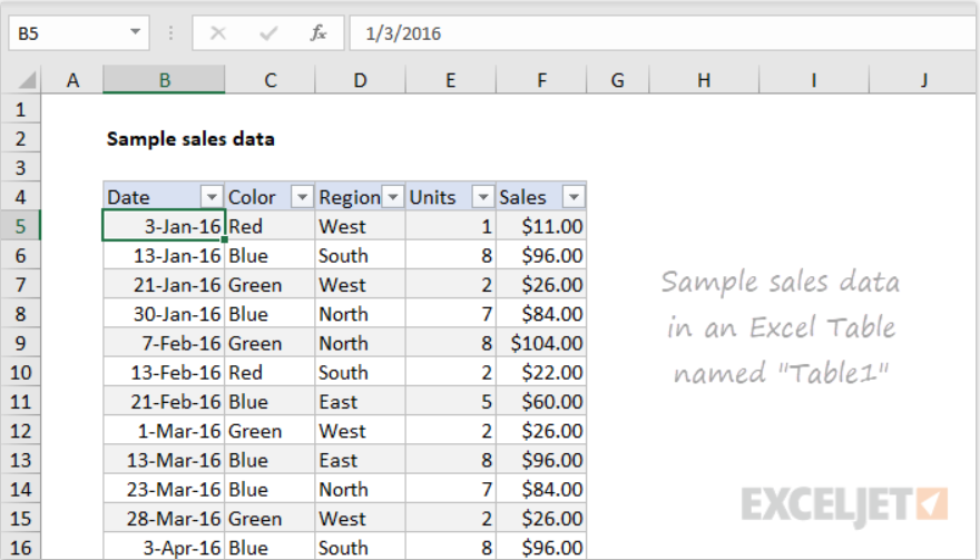
In this example, you can see the different entries in regards to color, region, units, and sales. This is a great example of pivot tables because it shows how to organize the data clearly in the main table to aid the viewers in their understanding. This allows for easy comparison between the respective categories to identify trends.
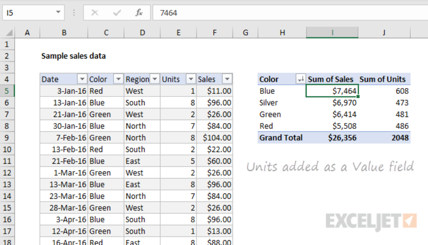
The other pivot charts allow the viewers to sort and manipulate the data in order to make them easier to understand. As you can see the cart identifies the color, sales, and units allowing the viewer to spot trends and compare the overall sales. This is a great tool for any company looking to review its sales.
Sankey
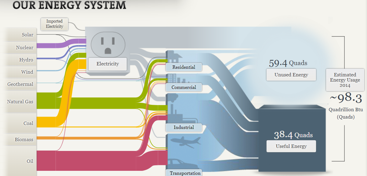
I liked the interactive aspects of Sankey’s visualizations, but or the visualization that you see above of the U.S energy system is a bit confusing. The reason that I find it confusing is all the lines that stem from the energy sources to other destinations are hard to follow due to the sheer amount of other lines and sizes that are present. This in turn makes it harder for viewers to follow the flow of energy from one source to another, which does hinder their understanding. To combat this issue the small thin lines should have been made bigger so they are easier to follow and when intersecting the bigger and fatter lines they should run over the top of them so they can still be followed easily. This does not only apply to the U.S. energy system visualization, it can be applied to the regional energy systems visualization and the California state energy system.

Continuing on, I feel that there were too many interactive visualizations. Take this for example under the understanding efficiency tab there are multiple tabs to click on for television, lightbulb, washing machines, and car usages. In each section there is also a dial with other options to click on that changes the visualization. What seemed cool originally turned into an annoying process for me when viewing the visualizations. It elongated the process of analyzing the visualizations when they could have just displayed all the visualizations for that tab on the page with titles indicating what it was presented instead of adding extra steps to see all of them. I did like the way that they chose to represent that data. I thought it was easy to read and compare the different models.
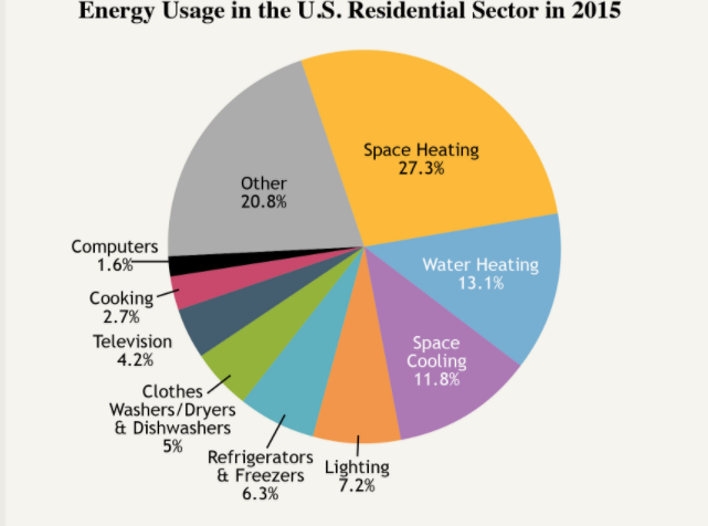
The pie chart above is very cluttered which serves as a distraction to the viewer sincethere are too many slices. If its possible they should combne slices that are related in order to reduce the number of slices making the visualization more appealing. I think this visualization would be better suited as a bar graph rather than a pie chart. I feel this is the right choice since they could represent and compare all the points better in that form rather than this cluttered part of a whole depiction.
Pie Charts
Pie charts are another effective way of visualizing data for other viewers. There are two instances that constitute the utilization, they are when comparing to show the part-to-whole relationship or when trying to show that one segment is relatively large or small. Typically these types of visualizations are most effective with data that are roughly around either 75%, 50%, or 25%. This is due to the fact that it is easier for viewers to interpret and analyze the data since they can use their past knowledge on parts of a whole to clearly analyze and infer that the segments are represented correctly.
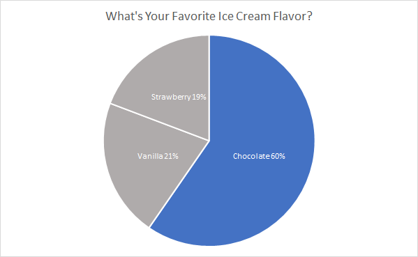
Favorite ice cream flavors are a perfect example of using a pie chart. In this case, we are showcasing the popularity of chocolate compared to vanilla and strawberry. Choosing an appropriate color scheme is important, too much color distracts the viewer and takes away from the message trying to be conveyed. So in this instance chocolate is the only segment with color because it is the section that we what the viewer’s attention to focus on to compare against the other two segments. By adding appropriate colors, data and labels make it easier for viewers to analyze and interpret, which in turn aids in the understanding of the message trying to be conveyed through the representation.
I think the pie chart is the perfect representation for this data because it effectively showcases the popularity of chocolate compared to the other popular flavors. If I had to pick another visualization to create I think a bar graph depicting the votes for each flavor would be another strong choice to represent the data and convey a similar message.
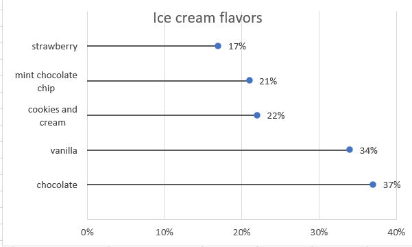
Lollipop Charts
Lollipop charts are minimalistic graphs the are based on line, scatter, and bar graphs. The lollipop chart is easily identified by its long stick with a dot at the top which usually has a percent either inside of the dot or above or in front of the dot depending upon the orientation. Lollipop chart orientations could either be vertical or horzontal. This type of chart is best used for displaying survey data since it shows the percent of responses from a survey group based on the questions asked. They can also be used to make any comparison between two different items or categories. Additionally. they can be used to rank or show trends over time.
In my lollipop chart, I chose to depict survey results for people’s favorite ice cream flavors. The survey posed the question of which flavor people liked the most out of the most popular answers that people have, which are, chocolate, vanilla, cookies and cream, mint chocolate chip, and strawberry.
Benchmark Comparison
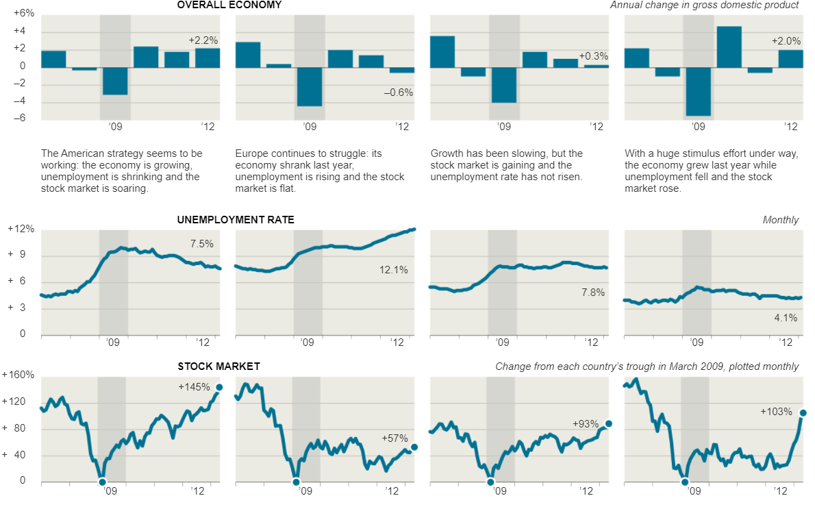
There are many different ways to make benchmark comparisons in data visualizations, its really all about the creators preference. The most common and easiest from what I’ve seen is using a consistent color for all the data points except for the one that the main focal point of the comparison. This is to ensure that that stands out to the viewers compared to the other data in the visualization. The better a data entry stands out in relation to the rest of the data set makes it easier for the view to distinguish what is trying to be compared a long with the message that is trying to be conveyed to them.
For example, take the visualizations that were displayed in the New York Times article, Three Measures of Central Banks’ Effectiveness. Here they were showing the effects of the financial and economic crisis of 2008 and 2009. In their visualization they placed a light grey highlight around the 2009 column to create a greater contrast to the other bars in the visualizations to let the viewers know this is the year that we are focusing on in relation to the others. This is effective because open viewing the visualization my eyes were immediately drawn to it.
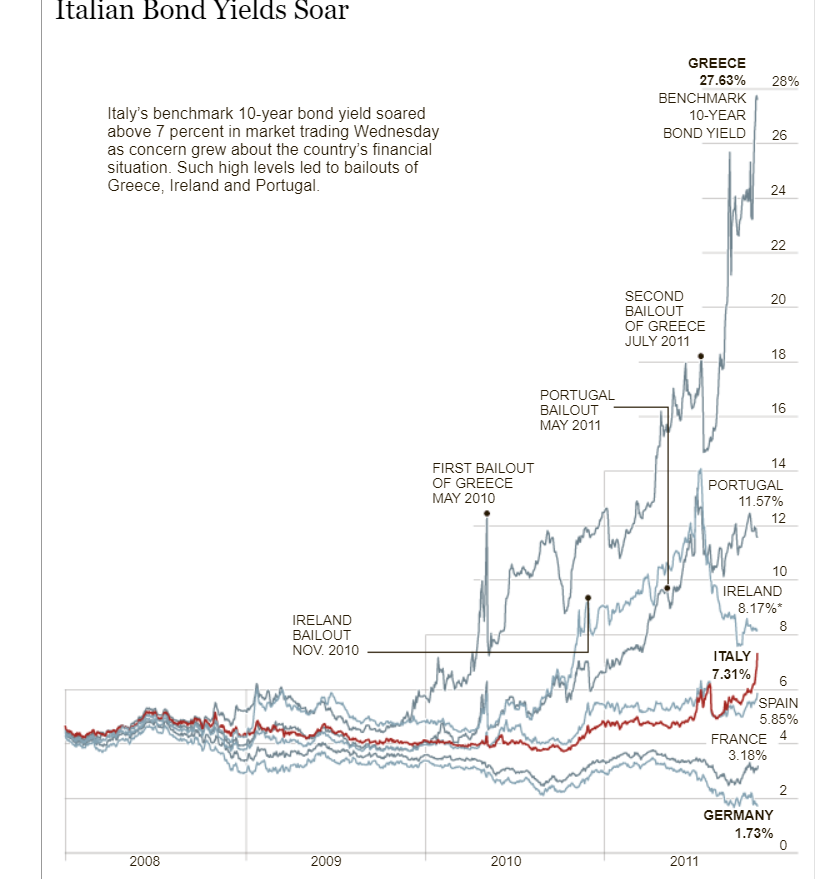
Furthermore, the Italian Bond Yields Soar visualization in the New York Times uses the same technique of changing colors in their crowded line graph in order to make the line they want to compare the data to stand out. The visualization keeps every line a consistent shade while using a darker red color on the Italian Bond line to make it stand out against all of the light grey lines allowing the viewers to easily follow and compare the Italian Bond to the others when comparing the growth rates.
Comparing Numbers
Google Analytics is a good free to use site that allows for good data visualizations for business. It allows users to visualize and understand the sales of the business. The site builds visualizations based on data regarding the number of sales, location of sales; whether they are from multiple online sites or store locations, as well as profits, expenses. It is even good to use for marketing to analyze the feedback and receptiveness of the ads that companies are using. Using this tool allows for users and developing businesses to take advantage of free software that will better help them understand and improve different aspects of their business because the relevant data is presented to them in a clear concise manner that allows them to understand the full scope of their business. Other comparable sites do have more features, but they do come with a price tag. Google Analytics even though it is free it is intuitive enough to give users enough features and visual representations in order to help them visualize and compare their data to help them improve and expand as a whole.
Google Analytics may be a little complicated for new users, but the site has plenty of tutorial videos to aid users in creating the necessary visualizations that they require. Having multiple resource tutorials allows new users to not only learn how to use the site but also teaches them which visualizations are the best to convey the message that the data intends to. Users that have a better understanding and grasp of the site and the visualizations to accomplish their intended goal allows them to be in a better position to grow and expand compared to their competition that may not be comparing its data to see in what areas they can improve on to achieve that end goal.
Watch the video below to get a brief overview of Google Analytics:
Click here to read a more in-depth review of Google Analytics.
VizHealth
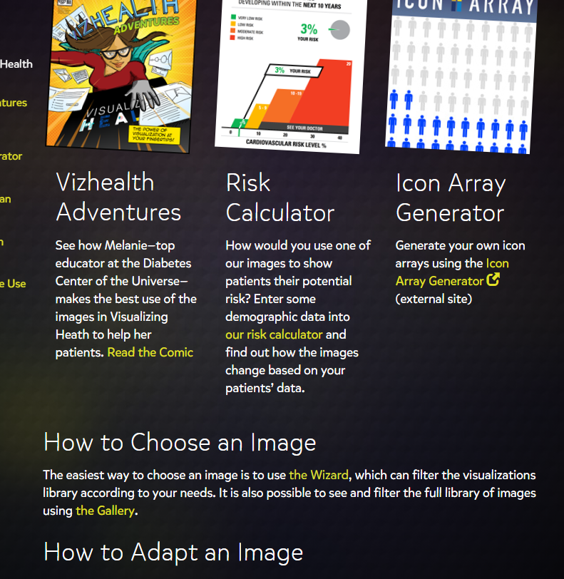
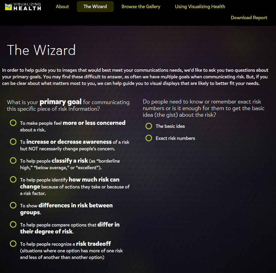
VizHealth is a site that helps users make better decisions about their health to try and help reduce their risks of cancer and diseases. I thought this site was well put together and is extremely useful for people to use to help themselves understand the importance of making good choices to improve their health. The site is very user-friendly and everything you need is clearly labeled and easy to use. Under the using visualizing health tab there are many resources to help users choose and adapt visualizations to their needs. There are even resources to calculate risks by entering demographic data. There are many different visualizations under the browse the gallery section that can be used. The best way that I found to find the visualization that you need is to use the wizard.
The wizard is a built-in tool that allows users to find the right type of visualization by asking the users questions so the algorithm can obtain the relevant visualizations. This is super useful in narrowing down the immense options that are on the site. Once the user answers the 2 questions the results are shown in two sections. The first section is results that match both tags and the second are the ones that only matched one of the tags selected. Users are also able to add more tags after the initial 2 questions if they want to fine-tune their results more. This is because the wizard serves to use what we deem is the primary goal and it utilizes only 2 categories to do so. These tools allow users to create a suitable experience with the data and visualizations they need. This is an amazing resource for people to use.
Click here to visit VizHealth to give it a try for yourself.
Here is a video from VisHealth explaining the purpose of visualizing health.
Infographics: Using Canva
Infographics are a great tool to convey messages and data in a clear manner to viewers. A great tool to help create infographics is Canva. Canva is free but does have a paid subscription for more advanced features. It is very simple to use and only takes an average of 30 minutes to create an infographic. A reason that Canva is easy to use is because of its wide variety of templates that allow the user to input their own information on a prebuilt infographic rather than having to build one from scratch, but that is an option if you wanted to design your own.
Here is an example of a simple infographic create on Canva
I have had personal experience using Canva for the day of service last year with the honors program. We were tasked with designing infographics to teach people American sign language. Before that point, I have never used Canva before, but once I loaded the site it was super simple. It guides the user through each step. First, it’s either picking a template or design your own, then input whatever information or images you desire. Then finally once it’s complete save it to your computer and then you are ready to distribute your newly formed infographic. Canvas interface is easy to use and figure out and by being able to utilize such a simple site, projects you work on in the future will pop more since you will be able to make your own custom infographics.
Also, check out this video on using Canva:
Also, feel free to click here to check out 11 other tools to create infographics
Image link: https://upload.wikimedia.org/wikipedia/commons/f/f9/Platform_Canvas_Original.png
Recent Comments