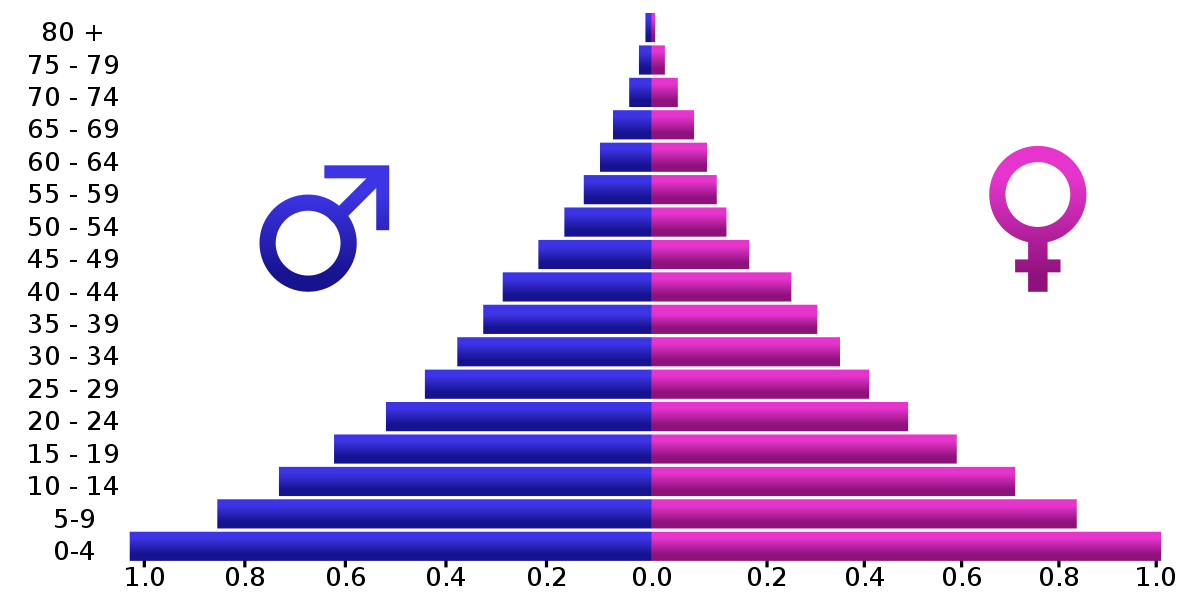
Particular attention of this week’s assignments (and Chapter 3 of Effective Data Visualization) was paid to back-to-back graphs. Although Evergreen’s exercises explored one potential use of back-to-back graphs, perhaps the most common example are population pyramids.
Otherwise known as age-sex pyramids, these graphs aptly measure the distribution of a population based on a sex’s share of age groups. With each graph a snapshot of a particular timeframe (usually for a given year), population pyramids are particularly good at displaying changes over time.
PopulationPyramid.net lets the user explore the age-sex distribution of the world and individual countries. With data from 1950, one can see how populations have changed over time and have been influenced by historic events – for better or worse. One of the most relevant types of statistical data, the site also affords population projections unto the year 2100. With these, organizations and governments can plan ahead in anticipation of what future populations will need; areas with a sizeable young population might consider investing in infrastructure to meet impending housing demands, whereas areas with an aging population might focus on eldercare.
As the video highlights, within a single image, scientists and policymakers are able to gain a “rich and complex understanding of populations and the factors affecting them,” (04:40). Although they might appear as aesthetically plain graphics, population pyramids can be incredibly dense in historical context and implications of what’s to come. An integral part in being able to understand the past and prepare for the future, it is all the more valuable to be able to appreciate the power of population pyramids and properly interpret and utilize them.
Recent Comments