
Visualizing Health is a program that hopes to alleviate the burden put on healthcare professionals when they need to communicate information about a person’s data-rich bodies. Likewise, for individuals, it hopes to clear up what the numbers presented to them mean. Graphics can be a great way of visualizing this data, making it easier for both parties. However, not all visualizations are created equal.
The program beings with “The Wizard”. It only needs to know two things: what the graphic’s primary goal will be and whether or not exact statistics will be used in achieving that goal. From the selections made, the program sifts through its collection of 54 tested visualizations. It then returns the ones best suited to achieve one’s specific goal.
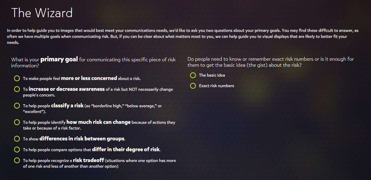
After the initial results, one can make further refinements through the selection of tags that take other factors into consideration. These include the type of data that is available, which specific health conditions are being looked at, and which type of graphic is desired. The selection of more tags yields recommendations better suited for one’s topic and purpose.

Each graphic appears to adhere well to the principles of good chart design that have been explored so far through class assignments. The data is well presented with appropriate, attractive graphs and color schemes, and there is no “chart junk”. Rather, every element has its specific purpose. As these graphics were designed with the medical field in mind, this would be expected.
When it is a matter of a person’s health, there is no benefit in making information ambiguous or hard to follow. The health conditions that Visualizing Health focuses on – cancers, diseases, genetic disorders – are grave topics. Often matters of life or death, the more effective one can be in communicating data about these conditions, the better. Visualizing Health, therefore, provides an immense service to healthcare professionals and patients alike.
However, its utility does not end there. Its expertise in data visualization can extend beyond the field of medicine. As mentioned, many of the principles used in the graphics were introduced before Visualizing Health. They are universal, in a sense, and can apply to any discipline. Every graphic can benefit from the ideals of conciseness, eye appeal, and a “less is more” mindset. What’s more, there is the matter of finding the right visual. Through practice with this program, and with help from “The Wizard”, these tasks become less taxing, making one’s visuals all the more effective.
Recent Comments