The Washington Post and Data Visualizations
Many different sites use certain things to differentiate between their data. An example I chose is from an article written by Brittany Renee Mayes and Emily Giambalvo.
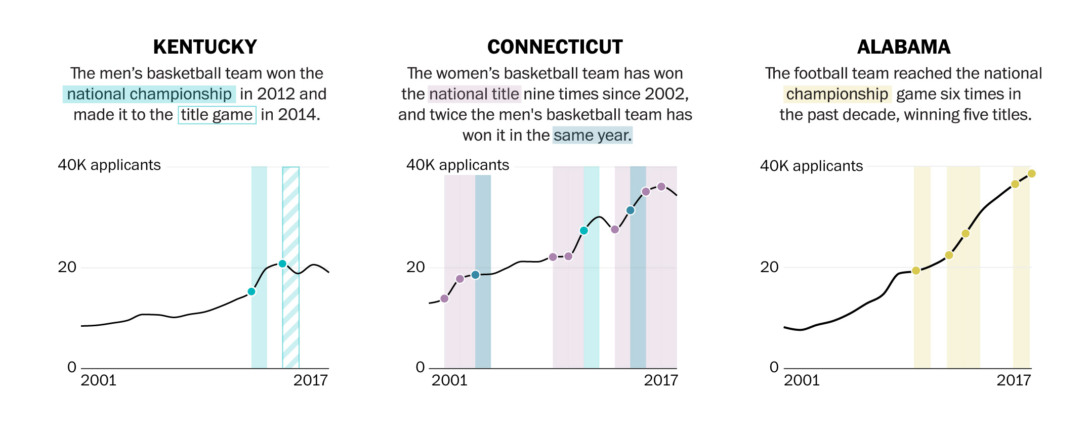
In the illustrations above, you can see the author use colors and solid or gridded squares to compare their data. They even go as far as to highlight the category within the text with the corresponding color on the graph.
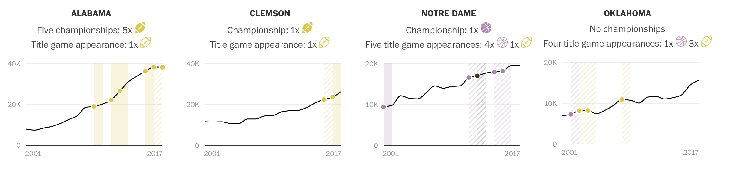
In this visualizations, you can see they use symbols, such as the highlighted and unhighlighted football, to compare their data.
Comparing Data
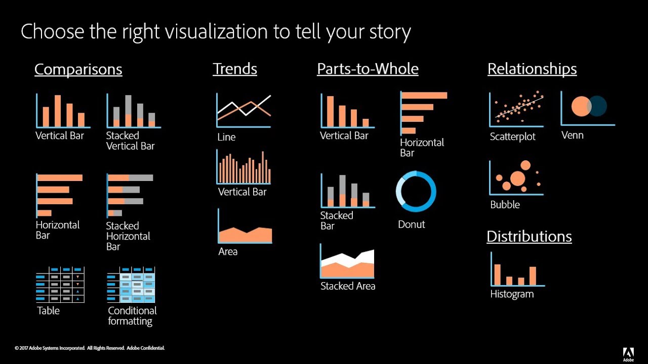
Choosing the right chart is crucial when deciding how you want to compare your data. There are do’s and don’ts when selecting the right visualizations.
This article does a nice job at offering advice on choosing the correct graph to compare data and offers a good do’s and don’ts list for those hard to make decisions.
Every type of data has a visualization that would present it best, and it is up to you as the presenter to choose the right one.
Vizhealth
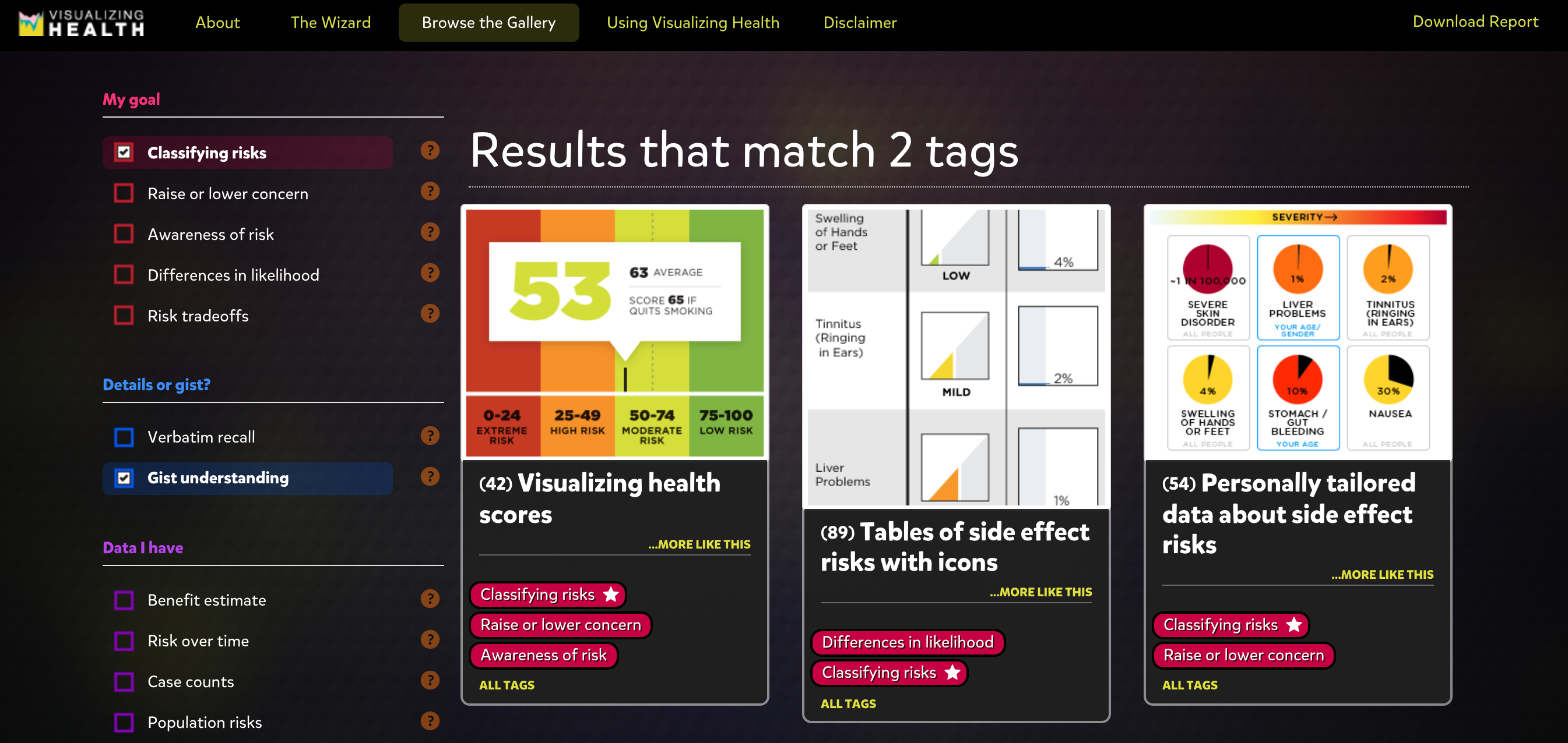
I found this site to be extremely beneficial when exploring graphics. It allows you to select options to narrow down the best fit visuals for your data, which is very helpful.
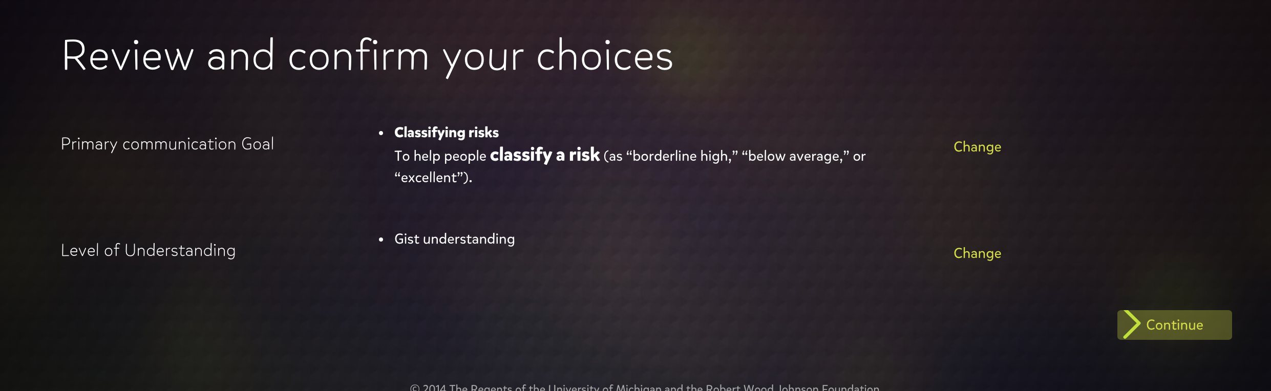
I would definitely utilize this site if I was finding it difficult to pick a correct visual for my data and how I want to present it.
Examples of insightful data visualizations:
When creating data visualizations, one must be mindful of how their targeted audience will read their information, how easy it is to access, and if it can be interpreted easily without much background information or interpretation. Articles like these, explain how important it is to decide what graphic one will use when presenting their data. The author provides great examples such as websites to use, things to consider, and introduces and explains example graphs.
For beginners getting into data visualizations, Excel and Google Sheets may be a good starting point. Once you’ve learned more, it would be beneficial to use a software like SPSS or Tableau. These two softwares are helpful when needing to compile data into a visual, and adding different elements that Excel or Google Sheets may not have had.
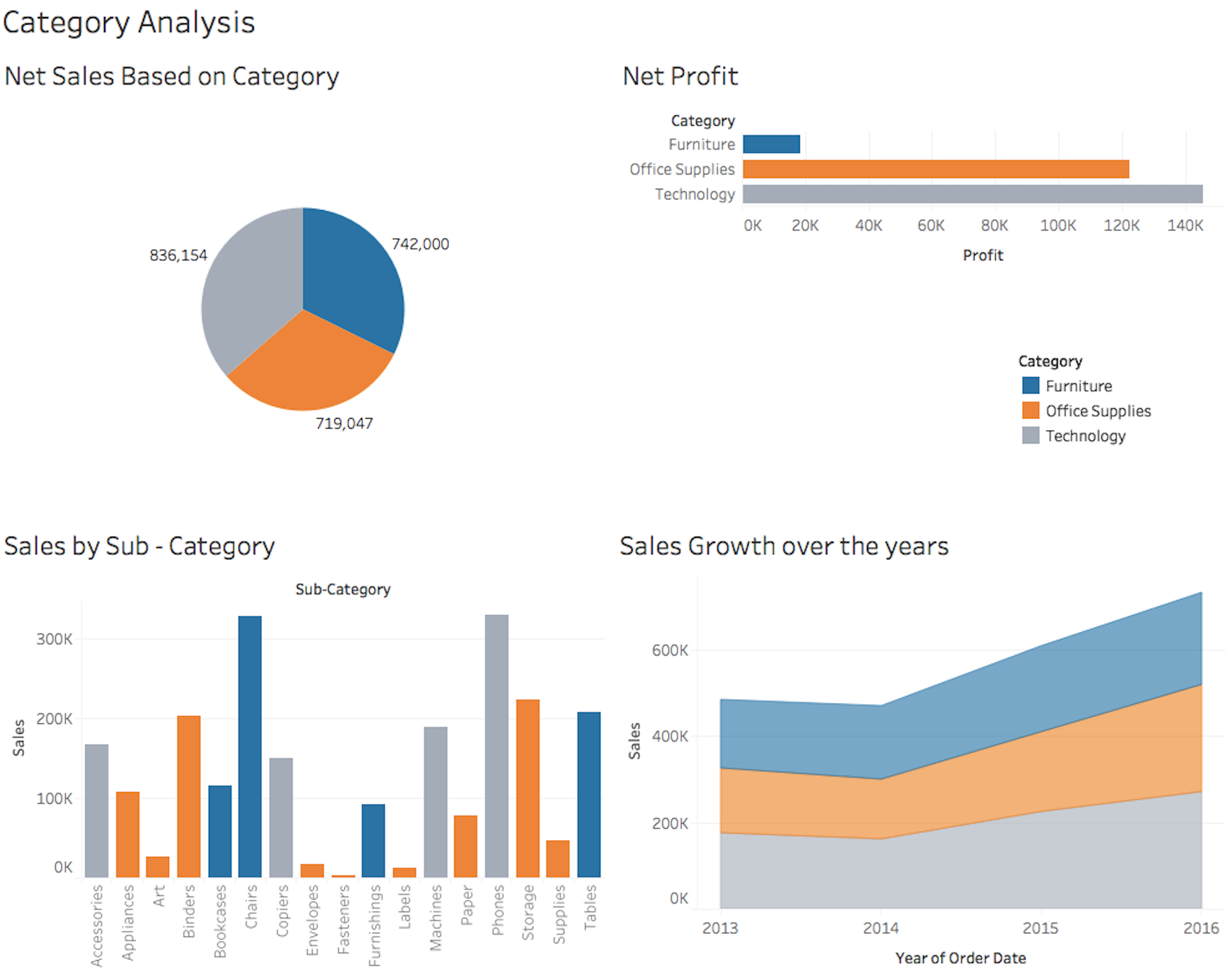
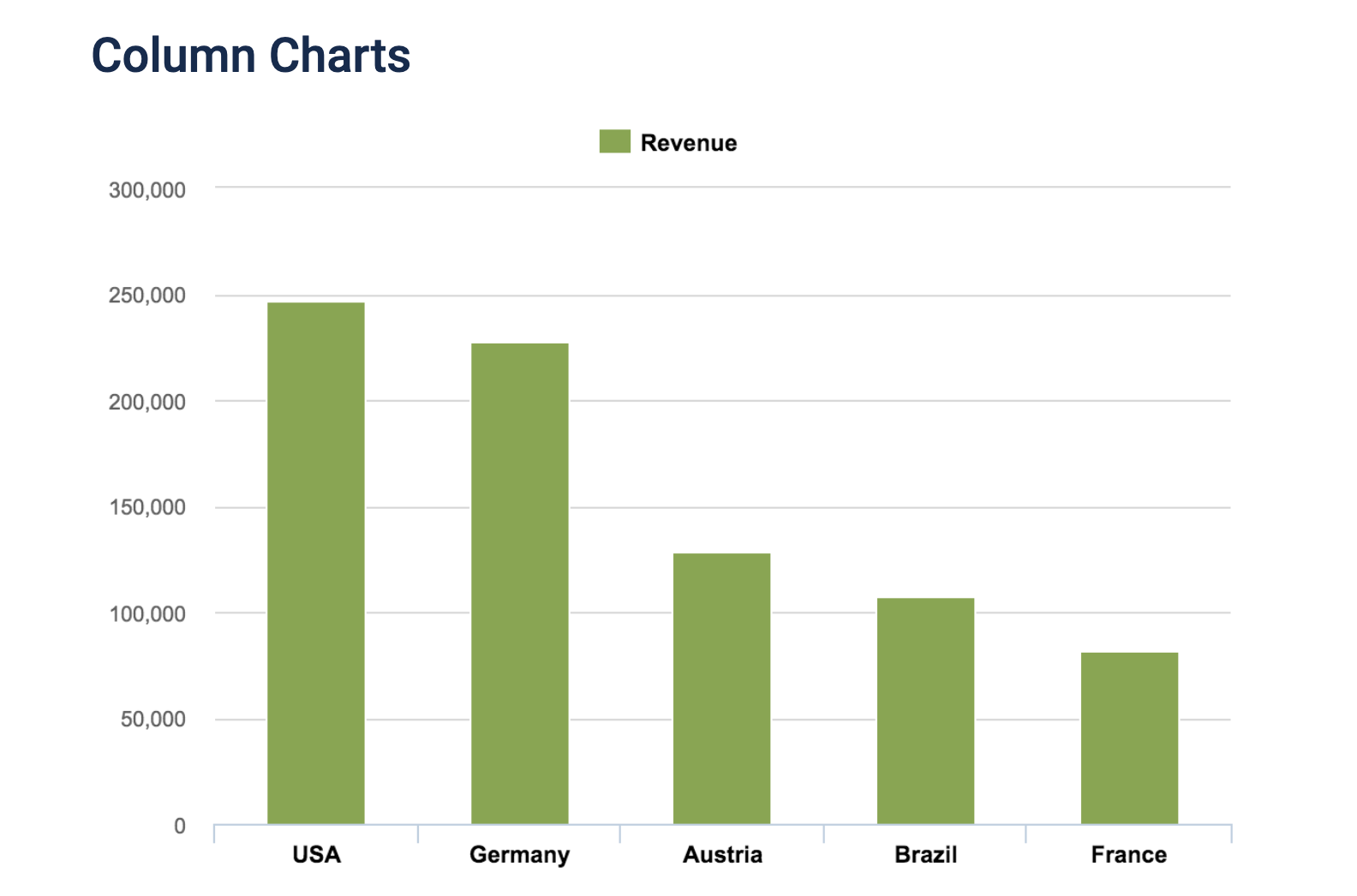
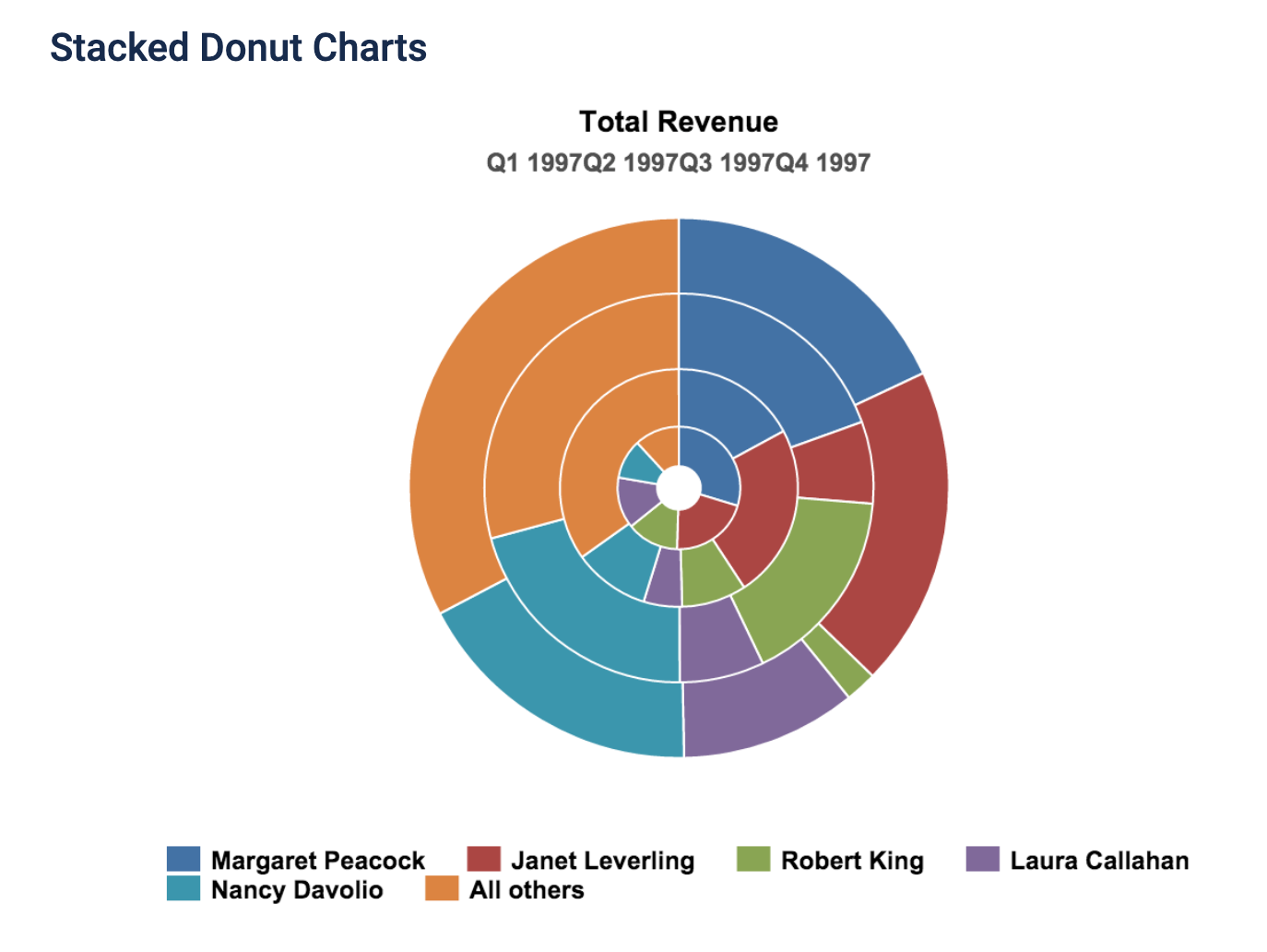
The visualization to the left is an example of what Tableau can produce when used by someone who knows the best way to visualize data. There is a pie chart, a bar graph, and a few other visualizations. It’s important to know that when creating such visualizations, coloring, font, size, and type all matter when determining how to best represent your data.
Recent Comments