The Vizhealth Wizard upon entering introduces the visitor to a gallery of different graphs with a plethora of information concerning risk and personal health.
I was quite impressed with the categorization on different topics. The screenshot posted does not do the categories justice, having more than 5 different subjects and specified tabs for each of them.
Another impressive feature is the amount of charts provided by Vizhealth and the ability to filter different kinds of charts to fit your liking. Not only that, but the design and customization of each graph makes each of them feel truly unique.
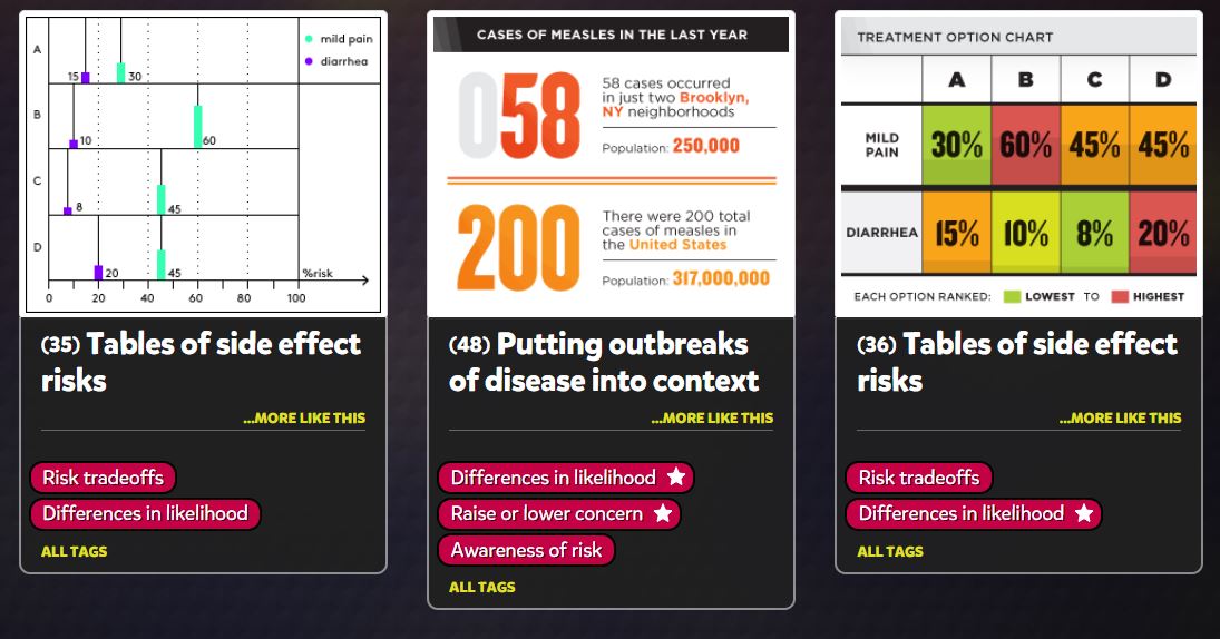
Seeing elements of what we learned so far in the course really shows how valuable infographics truly are and how they can make a positive difference, in this case.
Recent Comments