Immediately when looking at the Visualizing Health website page I could tell that this site is very advanced in its graphics and knew that the infographics it would present me would be very successful in its use of data presentation with visuals.
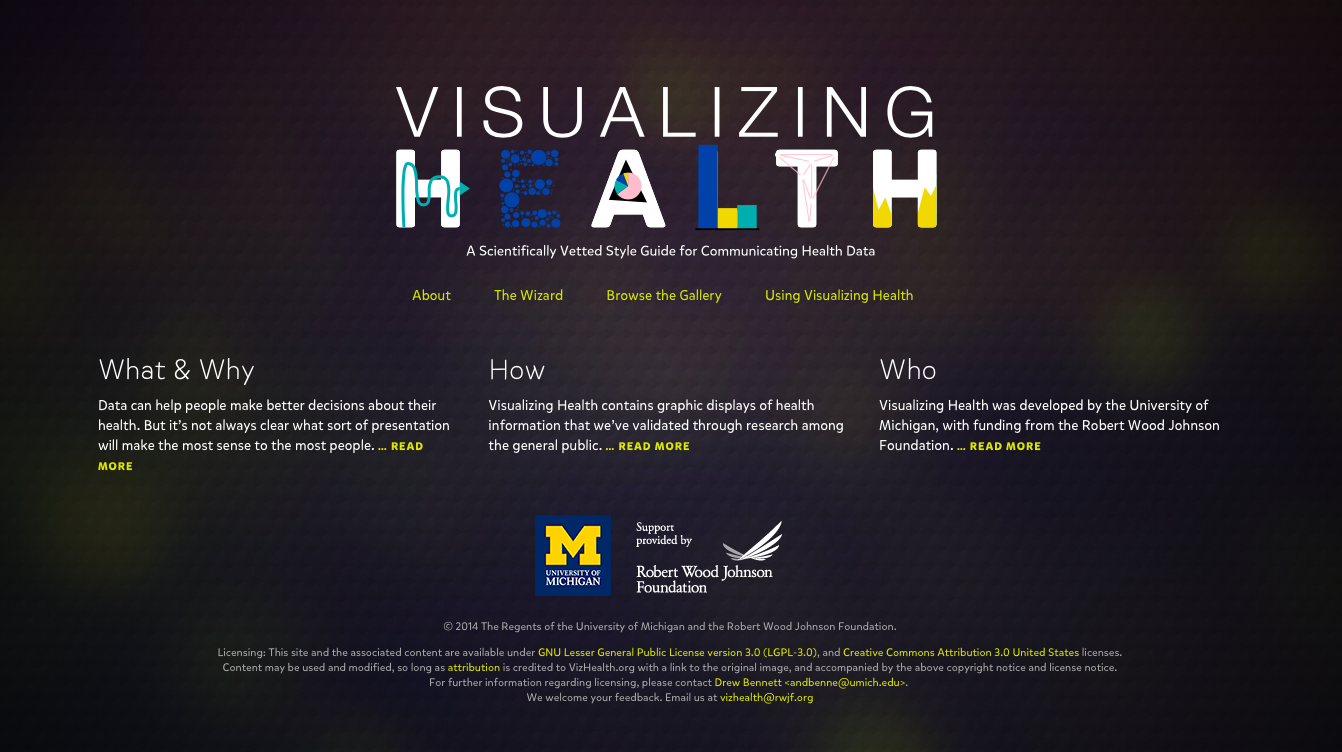
Its homepage is clear and shows where you can go to find more infographics on health data. After clicking on the wizard the site asks a couple questions based on what you are looking for. When you get passed the specifics it brings you to an array of different health infographics. I chose to look at infographics that show differences in risks between groups and doesn’t focus on exact numbers.
Above you can see all the different infographics this site provides as well as filters you can apply to the left. You can apply filters to narrow down your goal, health conditions you are researching, data you are looking for, and even what kind of form you would like to see the data in.
This site overall has very useful tools for not only those interested in infographics but those looking for easy and clear information on medical health.
Recent Comments