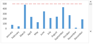
These were the few benchmark graphs that I have found and are slightly different in each graph. The first graph is similar to the last a regular benchmark line but it is dotted instead of solid. This graph is the easiest to understand and visualize it right away because it is simple.
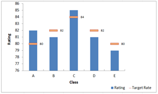
The middle graph has multiple straight lines rather than one just across. The benchmark isn’t the same as the others that’s why they are all individual. There was another like it but the line went up and down it was all connected and was actually more difficult to visualize it.
Recent Comments