Pivot Tables
Saif Mohamed
An important advantage of pivot tables is that it is easy to use. You can easily summarize data by dragging the columns to different sections of the table. The columns can also be re-arranged as you wish with the click of a mouse. Another important benefit of pivot tables is that it helps to summarize data in a quick and easy manner. The table allows you to make a good summary of out of thousands of unorganized data.
Pivot tables are a valuable excel tool because you can make quick decisions on large amounts of data.
I found this article below helpful on my research to find different ways that pivot tables are useful.
https://eitsc.com/blog/the-benefits-of-using-pivot-tables-to-manage-your-data/
Pie Charts
A pie chart is best used when trying to work out the composition of something. If you have categorical data then using a pie chart would work really well as each slice can represent a different category that will all total up to 100%. A pie chart only works well when you have one set of data.
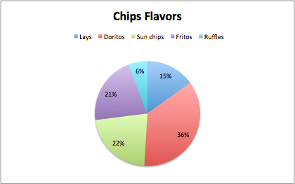
The data that I chose was different chips brand by category. The data is displayed in a pie chart and there are five categories. Each slice of the pie is a different color and is labeled the percentage of students on campus that prefer that chip brand. I think the best way to present this data would be a pie chart. An alternative can be a bar graph which would make sense and work, but a pie chart is the best visual choice for the data. Some design tips that i came across were the color choices and the format data labels which allowed me to add the percentages to each slice to help understand the data because sometimes the slices are close to size. This just gave my pie chart a better look for presenting.
Benchmark comparisons
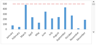
These were the few benchmark graphs that I have found and are slightly different in each graph. The first graph is similar to the last a regular benchmark line but it is dotted instead of solid. This graph is the easiest to understand and visualize it right away because it is simple.
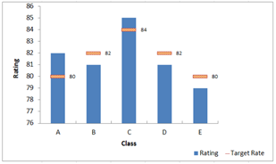
The middle graph has multiple straight lines rather than one just across. The benchmark isn’t the same as the others that’s why they are all individual. There was another like it but the line went up and down it was all connected and was actually more difficult to visualize it.
Comparing numbers
Data visualizations are a vital component of a data analysis, they summarize large amounts of data in graphical format which is really important when you are reviewing and comparing many numbers. Some of these charts to compare numbers in visualization are bar chart, mulit-set bar charts, line graph, stacked area graph, bubble chart, etc. This article below about how to chose the right data visualization for your information provides great points and facts about different chart visuals.
https://chartio.com/learn/charts/how-to-choose-data-visualization/
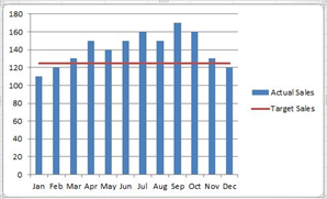
This image below is a back to back bar graph that compares a few sets of data numbers and separates it into two graphs that lets you see all the information on one graph. I enjoyed this graph and I think it really helps when you are comparing numbers in data.

Vizhealth
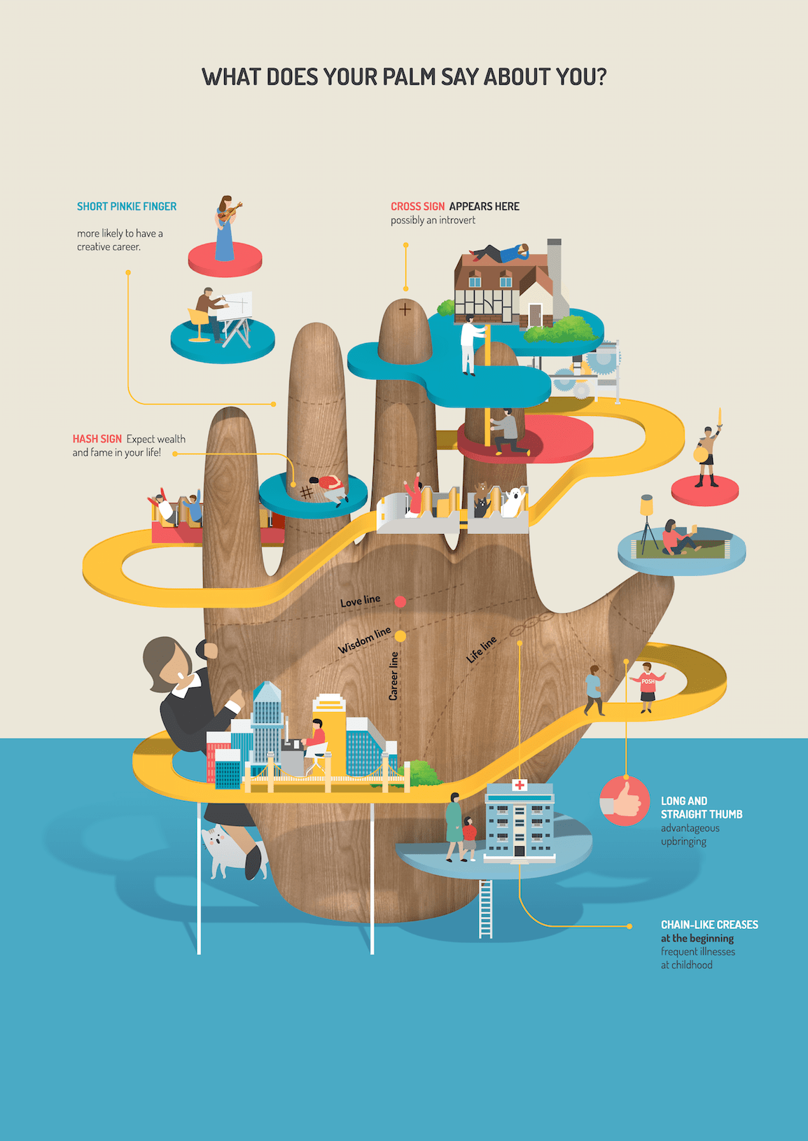
This site is very interesting. It provides you with many visualizations of data. The gallery section is very cool because there is so much information about many different topics all displayed in cool colorful helpful visuals that help you understand the data information well.
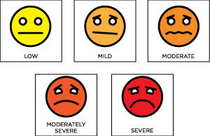
I found this image interesting because you see it in doctors office all the time and it helps children tell the doctor or parent how they really feel. I think it is a really smart way to display the emotion of someone if they are sick or angry.
The wizard is a tool that choses image based on concerns or needs. It is basically designed to clarify your goals. You answer a question in the wizard and then it will guide you to a category that matches your concern. What I liked about this site is the picture that you chose, it has a detailed description of what it is about and the information displayed on it. Overall this was a great site about visualization and the gallery is awesome and the wizard is really helpful.
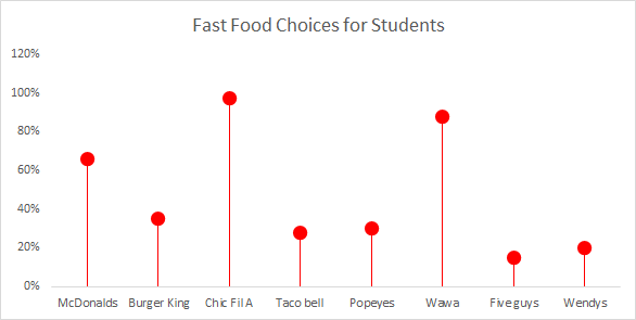
Lollipop Chart
Lollipop chart is a great alternative chart to column and bar graphs. The chart is often easier to read data when its side by side in bar graph format but the lines are thin with the ball at the top so you understand what the chart is explaining. When using mass data, lollipop is helpful because it focuses attention on the values. I like the bar graph when you have less data and the lollipop when you have more because the lines and circles is better to understand rather than clustered bars close together.
Tools that may help us construct Infographics.
Infographics is a really fun and effective visual way to display any information. Infographics are the visual presentation of information and facts supported by graphics, charts, text, and diagrams. The video in the hyperlink shows how easy you can create a well designed effective infographic about any information. There are a number of tools that you can use to create interesting infographics. Some of those tools are:
Canva- Is a go-to tool for editing and touching up images for different social media platforms. Canva offers hundreds of design elements for creating infographics. They have grids, icons, illustrations, and many charts to represent figures in you info graph.
Piktochart- Is another infographic maker that can create interesting infographics. With Piktochart, you can create interactive charts, maps, and graphs. All you have to do is import your numbers, choose the chart or map you want to use for your infographic and you’re done.
Recent Comments