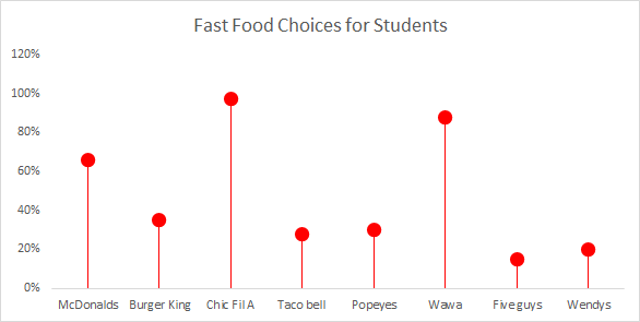
Lollipop chart is a great alternative chart to column and bar graphs. The chart is often easier to read data when its side by side in bar graph format but the lines are thin with the ball at the top so you understand what the chart is explaining. When using mass data, lollipop is helpful because it focuses attention on the values. I like the bar graph when you have less data and the lollipop when you have more because the lines and circles is better to understand rather than clustered bars close together.
Recent Comments