Infographic on Social Media
This infographic is a very relevant one to today population. Almost all people have some form of social media and this infographic clearly and successfully shows who has what and why these platforms are needed.
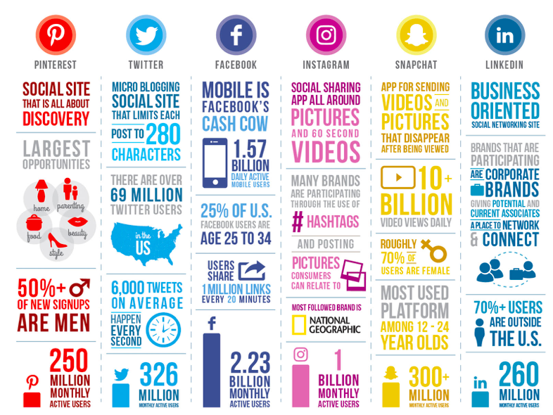
The different colors used is an excellent way to separate each platform while making it clear which data belongs to who. We can see that facebook has the most monthly users standing at 2.23 billion, and at the bottom of the other columns are other monthly user standings. This infographic is a great example of why infographics are useful when done correctly, it’s easy to read has relevant information and is eye catching.
Pivot Tables
Pivot tables are similar to any other tables made to show data the difference is they are interactive. With just one click on data you can further and further break down that data into different categories.
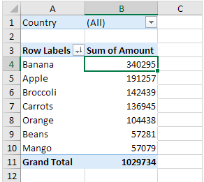
While the chart above looks simple its actually more complex than you think. More specific information can be filtered by clicking the drop down arrows and choosing information relative to what you need. Here we have fruits and how much each is sold for accumulative of all countries but let’s say we just want to see how much France is selling fruit for.
Just click drop down of countries and select France! Pivot takes a lot of data narrows it down or makes it very broad and general so the reader can chose what they want to see making these charts efficient data resources.
What Energies Sources are Most Important
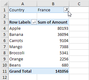
The National Academies of Sciences, Engineering and Medicine have a section of their website where they go over our energy systems. Below you can see each energy and where they go to be used and what energy remains unused.
You may notice each line that connects one part of the visual to the next varies in size, this is no random occurrence. This visual adds different sized lines that lead from the energy source to where they’re used. Depending on the amount that energy source is used the larger the initial line, then it splits to more different sized lines depending on how much energy is used where. Below we can see that solar energy is rarely produced and used rarely anywhere, making solar energies line the thinest.
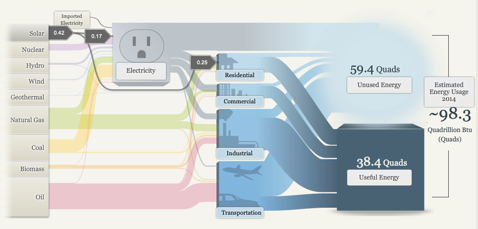
As we all know oil while its the most detrimental energy it is most commonly used making the line the largest and a majority of the initial line flows to transportation as we can see below.
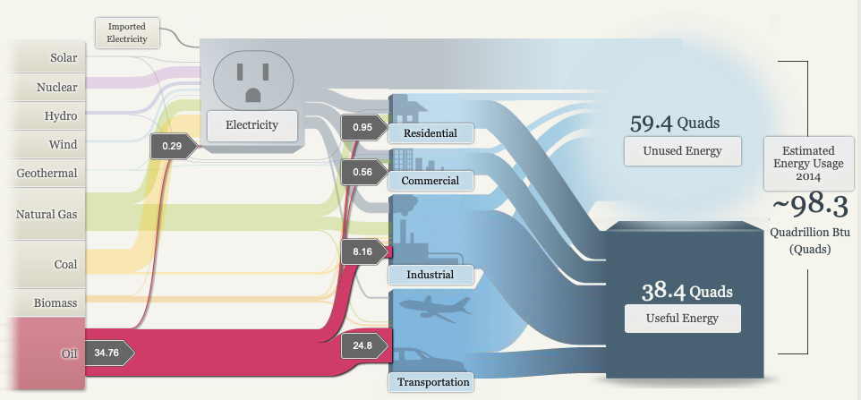
Overall this flow chart is very successful in making a clear presentation of where energies come from where they are used and what remains unused. The use of sizes, images, colors and the flowing pattern all add to the successfulness of this infographic.
Perfect Pie Chart
There are many different types of charts that can be successful at portraying data. Today we will be looking at a pie chart and what kind of data would work with this kind of chart most successfully.
Pie charts are used when a presenter wants viewers to see the relationship between parts of their data and all of their data as a whole, because as we know pie charts are usually based out of 100% and all of our small slices add to that 100%. Pie charts are especially useful visually, the viewer can clearly compare the small fragments to the large. Like we can see below.
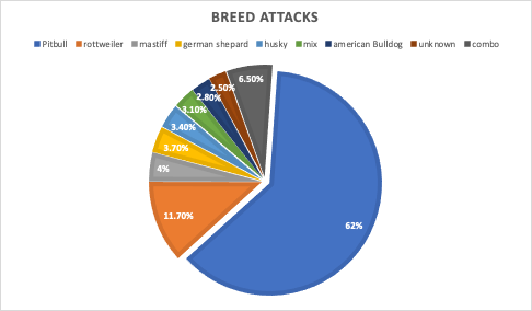
When looking at this pie chart we can see a clear winner on what dog breed is the most aggressive, Pit bulls are taking up more than half the chart at 62% in dog attacks. Then we can still clearly see Rottweilers have the second biggest slice putting them right under pit bulls in attacks. After these two statistic the viewer can further their part to whole understanding by seeing the rest of the data is almost all equal making no clear smallest slice. Data labels play such an important part of pie charts when the slices aren’t enough to convey the data just visually then we can read to find out more information. The data labels above reveal our unknown category is the smallest.
Benchmarking
There are a few kinds of bench marks used when comparing data. Internal is when a company may use information from past years and all within the companies data to compare to itself. Then their external bench marks that look at other sources for data and compare it to their own. What is a bench mark? A bench marks is basically an average score of data and seeing what sources have hit that average and what hasn’t. Like you can see below.
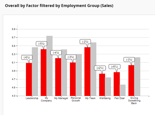
The gray bars are the average while the red is how that company actually did. This is a clear view of what could have been projected for the company and let viewers see if the company did good or bad that year.
Macros: Are they that hard to conquer?
First let’s break down what your Macronutrients. Macro means a large scale and nutrients are a substance that provides nourishment and energy to the body; so to put that together macronutrients are the four categories of nutrients our body mostly gets our energy from. These three main categories include:
-Carbohydrates
-Protein
-Fats
-Fiber
While all of these building blocks are important when it comes to over all health protein is found to be the most effective macronutrient.
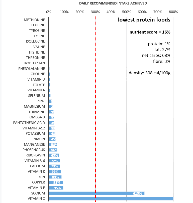
Below is what happens when protein intake is low, daily nutrients are low. There is a high percent of carbs but carbs are not a long term energy source because their expenditure is short and fast, while protein gradually gives you supplemental energy through out the day.
When it comes to protein calorie density is usually less while being more filling and fulfilling in energy.
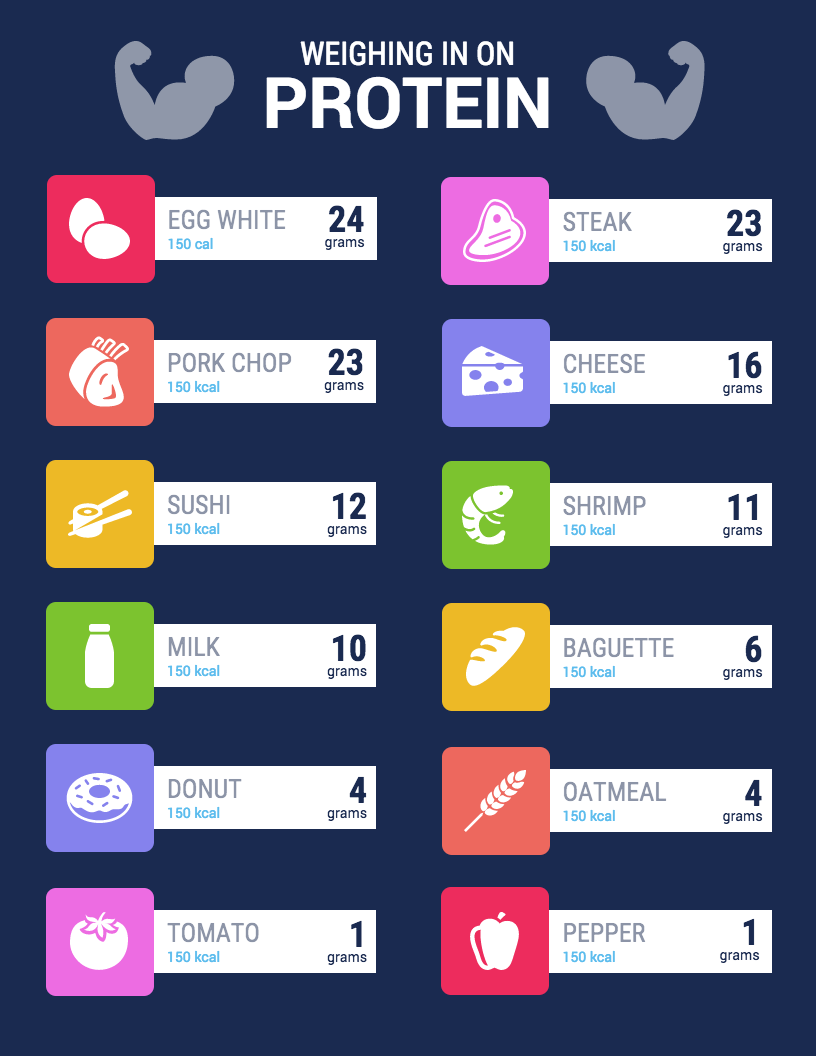
All of the food above has 150 kcal but vary in protein and it is apparent what macro group is lacking in the important nutrient. Carbs. Many people refer to carbohydrates as empty calories, there is usually no benefit besides quick short bursts of energy. That doesn’t mean all carbs are bad tho less process carbs are good for athletes who need those bursts of energy right before a race or game.
Macronutrients may seem hard to understand when you’re not a dietician but with easy to read infographics and sites that provide them like
https://optimisingnutrition.com/macros-vs-micros/
the concept of nutrients no longer seems as hard.
Immediately when looking at the Visualizing Health website page I could tell that this site is very advanced in its graphics and knew that the infographics it would present me would be very successful in its use of data presentation with visuals.
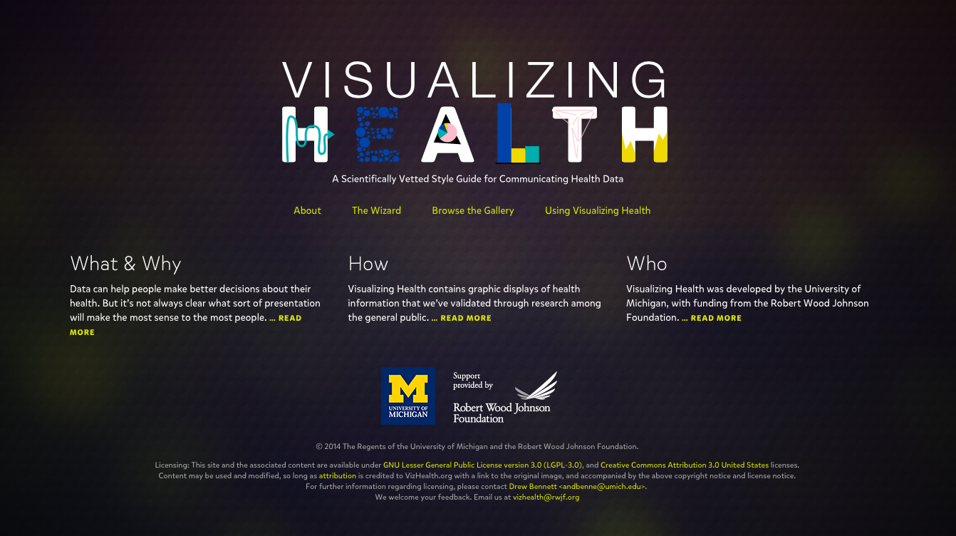
Its homepage is clear and shows where you can go to find more infographics on health data. After clicking on the wizard the site asks a couple questions based on what you are looking for. When you get passed the specifics it brings you to an array of different health infographics. I chose to look at infographics that show differences in risks between groups and doesn’t focus on exact numbers.
Above you can see all the different infographics this site provides as well as filters you can apply to the left. You can apply filters to narrow down your goal, health conditions you are researching, data you are looking for, and even what kind of form you would like to see the data in.
This site overall has very useful tools for not only those interested in infographics but those looking for easy and clear information on medical health.
Recent Comments