As the winter months are quickly approaching climate change begins to appear more in many environmental spaces. The projection of the weather this season will be interesting to hear about, as each year the changes are becoming more and more drastic. Not only are the winter months getting colder, but the summer months are only getting hotter. CNN’s, Jen Christensen, wrote the article “With climate change what will your city’s climate feel like in 60 years?”.
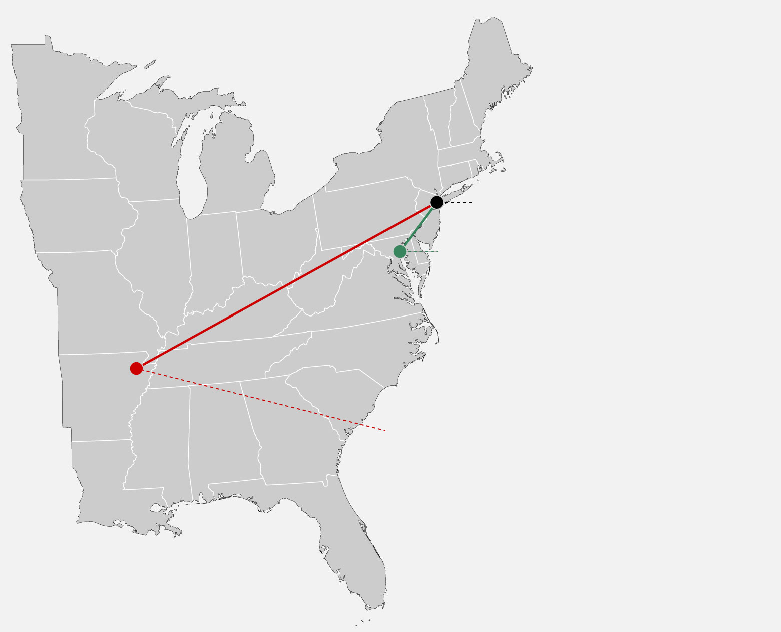
The data in the image uses segments to connect the cities in which NYC will feel like in the future. This helps the audience understand how climate is changing by comparing climate of other places. If the author simply wrote that NYC would be 10 degrees hotter in 2080, that may be frightening. When it is compared to a city that already exists and people live in it brings it down to a simple, easily understood level. The images use simple, bold colored line segments to show a clear connection, and dotted lines of the same color to explain the data with a caption.


Podcast: Play in new window | Download
Recent Comments